Price Impact of Order Book Imbalance in Cryptocurrency Markets

Image for post

Photo by Jen Theodore on Unsplash

Price Impact of Order Book Imbalance in Cryptocurrency Markets

What can we learn from 1.9 million order book observations?

We investigate whether imbalanced order books lead to price changes towards the thinner side of the book. That is, by this hypothesis prices decrease when limit order books have large volumes posted at the ask side relative to the bid side, and if order books are more heavy on the bid side then prices increase. We test this hypothesis and assess whether order book imbalance information can be exploited to profitably predict price movements in the ETHUSD market.

Order book imbalance

We follow the literature, e.g., Cartea et al. (2015), and define the order book imbalance as

Image for post

Equation 1

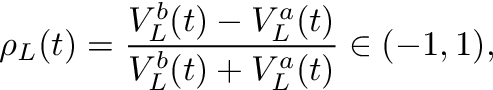
where t indexes the time, V stands for volume at either the bid (superscript b) or ask (superscript a), and L is the depth level of the order book considered to calculate ρ. Figure 1 shows an example how to calculate the imbalance ρ for a given order book.

Image for post

Figure 1: Order Book Imbalance. Example of a limit order book for ETHUSD based on a screenshot from the Coinbase-website showing a depth of L=4. The imbalance for L=1 is calculated as (38.7828–19.1463)/(38.7828+19.1463) ≈ 0.33. By the hypothesis we investigate in this article, a value greater than zero corresponds to a price upward pressure. For L=2 we sum the 2 best prices to calculate the imbalance, that is, (38.7828+1.86–19.1463-0.2505)/(38.7828+1.86+19.1463+0.2505)≈ 0.36.

A ρ-value close to -1 is obtained when market makers post a large volume at the ask relative to the bid volume. A ρ-value close to 1 means there is a large volume at the bid side of the order book relative to the ask side. With an imbalance of zero the order book is perfectly balanced at the given level L. The hypothesis suggests that low imbalance numbers (<0) imply negative returns, high imbalance numbers (>0) imply positive returns, i.e., the price moves into the direction of the imbalance ρ.

What do researchers conclude from stock market data?

Cont et al. (2014) use US stock data to show that there is a price impact of order flow imbalance and a linear relationship between “order flow imbalance” and price changes. The authors define order flow imbalance as the imbalance between supply and demand, measured by aggregating incoming orders over a given period. Their linear model has an R² of around 70%. The study considers the past order flows (that result in an imbalance measure) and compares it to the price change over the same period. Hence, the conclusion is not that order flow imbalances predict future prices, but rather that the order flow imbalances computed over a historic period explains the price change over the same period. So this study reveals no direct insights on current order flow imbalances on future prices. Silantyev (2018) confirms the finding of this study using BTC-USD order book data in his Medium article.

Lipton et al. (2013), us the imbalance measure ρ with L=1 and find that the price change until the next tick can be well approximated by a linear function of the order book imbalance but note that
(1) the change is well below the bid-ask spread, and
(2) the method “does not by itself offer an opportunity for a straightforward statistical arbitrage”.

Cartea et al. (2018) find that a higher order book imbalance measured by ρ is followed by an increased amount of market orders and that the imbalance helps to predict price changes immediately after the arrival of a market order.

In their book, Cartea et al. (2015) present for one particular stock that correlations of past imbalances and price changes are decent (about 25% for a 10-second interval).

Stoikov (2017) defines a mid-price adjustment that incorporates
order book imbalances and bid-ask spreads. He finds that the resulting
price (mid-price plus adjustment) is a better predictor for short-term movements of mid-prices than mid-prices and volume-weighted mid-prices. In this study, the order book imbalance slightly differs from ours, specifically Equation (1) would be adjusted by removing the ask volume from the nominator and fixing the level L to 1. The method estimates the expectation of the future mid-price conditional on current information and is horizon independent. Empirically horizons for which the forecasts are most accurate range from 3 to 10 seconds for the stocks assessed. The adjusted mid-price lives between the bid and the ask for the data presented which indicates that the method by itself does not present a method for statistical arbitrage, but as the author notes can be used to improve upon algorithms.

These studies consider tick-level data at the best bid-ask price (L=1),
we look at longer horizons and delve into a depth of 5 to calculate the order
imbalance. The data in these studies uses stock market data, with the
notable exception of Silantyev (2018), whereas we look into cryptocurrency order books.

Data

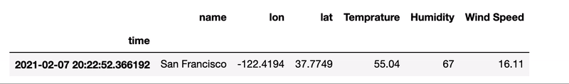
Order book data can be queried via public API from crypto-exchanges. Historical data other than candle data is not generally available. Hence I collected order book data for ETHUSD from Coinbase in 10 second intervals up to a depth of 5 levels from May to December 2019 (2019–05–21 01:46:37 to 2019–12–18 18:40:59). This amounts to 1,920,617 observations. There are some gaps in the data, e.g., due to system downtimes, which we account for in our analysis. We count 592 gaps where the timestamp difference between two subsequent order book observations is larger than 11 seconds. The timestamp between two order books is not exactly 10 seconds in the data since I collected the data using repeated REST requests, rather than, e.g., a continuous Websocket stream.

Distribution of order book imbalance

Before looking at the relationship between price changes and the order book imbalance, we look at the distribution of the imbalance for different order book levels.

We calculate the order book imbalance ρ for all observations and the 5 different levels according to Equation 1 and find the following properties.

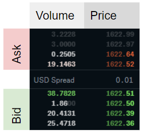
  1. At L=1 the imbalances are often very pronounced or not existent at all. The higher L, the more frequent are balanced order books (i.e., more observations for ρ≈0).
  2. The imbalance is autocorrelated. The deeper the level L, the higher the autocorrelation

We present the first finding in Figures 2 and 3 and the second in Figure 4.

Figure 2 shows a histogram of order book imbalances for level 1. We observe that at this level, the order book is mostly balanced (close to 0), or highly imbalanced (close to -1 or 1).

Image for post

Figure 2: Histogram of Order Book Imbalances. This figure shows the imbalance at level 1, that is, considering only the best bid and best ask price to calculate the imbalance.

As we increase the order book depth to calculate the imbalance, the order books become more balanced, as we see in Figure 3.

Image for post

Figure 3: Order Book Imbalances for different order book depths. This figure shows the imbalance at level 2 (top left), 3 (top right), 4(bottom left) and 5. The order book is more balanced when more levels of depth are considered.

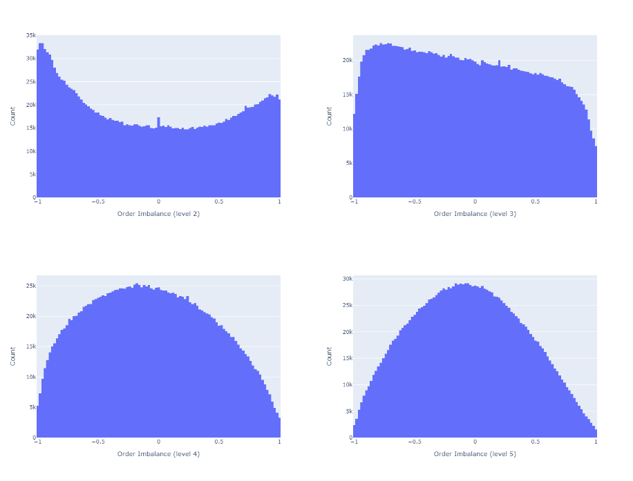
Figure 4 shows the autocorrelation function (ACF). Consistent with Cuartea et al. (2015) we find that imbalances are highly autocorrelated. The correlation for a given lag tends to be higher, the larger the order book depth L for the calculation of the imbalance.

Figure 4: Sticky Order Book Imbalances. The top plot shows the autocorrelation function for an imbalance computed at level 1, the bottom the one for level 5. We observe higher autocorrelations of order book imbalances if we increase the depth in calculating the imbalance.

Do order book imbalances help to predict price movements?

We now investigate the correlation of ρ and future mid-prices. Mid-prices are defined as the average of highest bid price and the lowest ask price.

We first calculate the p-period ahead log-return of the mid-price for each observation of order book imbalance. We then calculate the correlation between these returns and the order imbalances observed at the beginning of the period. We remove observations where the p-periods are on average longer than 11 seconds (1 period ≈ 10 seconds).

Figure 5 and 6 show the correlations of future returns and imbalances as a function of the period over which the return is measured. We conclude as follows.

  1. The correlations are low.
    E.g., Cont et al. (2014) report an R² of about 70% between the price-impact and their measure of order flow imbalance over the same period. For a linear univariate regression model this R² implies a correlation of sqrt(0.70)=0.84. However, the authors measure the price increase over the same period as the order flow imbalance, hence this method does not offer price forecasts
  2. The imbalance measure ρ is more predictive for prices closer to the imbalance observation (the correlation decreases as p increases)
  3. The higher the depth level L of the order book considered to calculate the imbalance, the more the imbalance measure correlates with future price movements
Image for post

Figure 5: Correlation of p-period ahead mid-price returns with order imbalance (L=1). The correlation of the imbalance measure with return is highest for near-term prices.
Image for post

Figure 6: Correlation of p-period ahead mid-price returns with order imbalance (L=5). Comparing to Figure 5, the data suggests that order book imbalances computed with a deeper order book level (L) is a better price predictor than the one computed with low L.

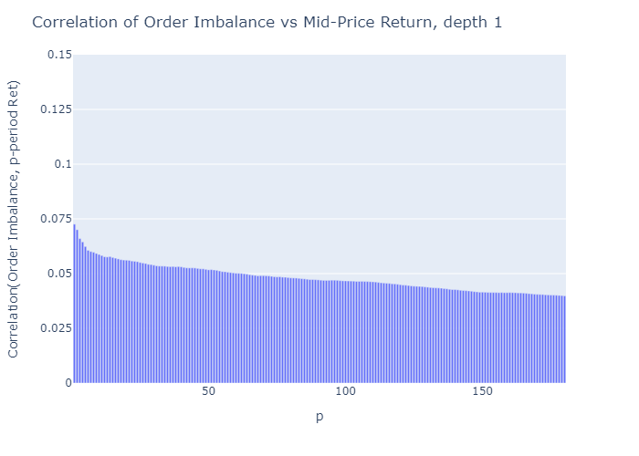
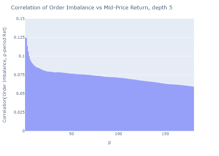
The corresponding plots for depths L=2 to 4 which I don’t show for brevity are consistent with these findings. For Python code for these plots see Appendix A2.

Price uncertainty

The correlations presented above showed that imbalances calculated with higher L correlates better with price increases than imbalances calculated with lower L. More near-term prices have a higher correlation with ρ. Based on this we continue the analysis with only one-period ahead forecasts (≈10s).

Correlation is an average measure, what about the uncertainty of the mid-price moves?

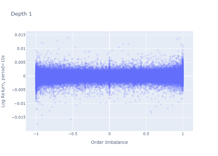
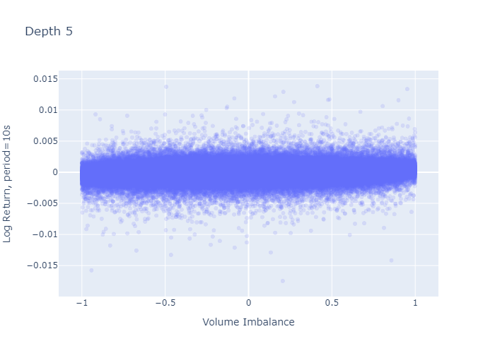
Figure 7 and 8 plot the 1-period log-return against the imbalance observed at the beginning of the period for L=1 and L=5 respectively. The level 1 imbalance plot (Figure 7) looks as if there was a higher variation of log-returns when the imbalance is large (close to -1 or close to 1) or 0, which we don’t observe for level 5 imbalances (Figure 8). However, this seemingly larger variation in the plot stems from the fact that we have more observations for L=1 at the boundaries and at zero (seen in the histograms in Figures 2 and 3) — calculating the standard deviation of returns does not confirm higher variances at the extremes as we see in the next paragraph.

Image for post

Figure 7: One-period Return vs Imbalance for L=1. Each point in the plot represents a return (y-axis) observed over one period after observing the order imbalance (x-axis)
Image for post

Figure 8: One-period Return vs Imbalance for L=5.

Imbalance regimes

We follow Cartea et al. (2018) and bucket our imbalance measure into five regimes chosen to be equally spaced along the points

θ = {-1, -0.6, -0.2, 0.2, 0.6, 1}.

That is, regime 0 has price imbalances between -1 and -0.6, regime 1 from -0.6 to -0.2 and so on. Table 1 shows the standard deviation of 1-period ahead price returns for all 5 regimes.

Table 1: Standard deviation of 1-period mid-price returns per regime.

Table 1 addresses the question from the previous paragraph: the mid-price variance at extreme imbalances (regime 0 and regime 4) is not higher for order book depth level L=1 than for level 5.

Now we take this analysis further and estimate probabilistic bounds for the expected mid-price return in a given regime by constructing confidence intervals. I provide details on this calculation in Appendix A1.

Image for post

Figure 9: Confidence intervals for expected mid-price returns for level 1 (dark) and 5 (bright) imbalances. The vertical markers show the point estimate of the expected return, the horizontal lines represent the boundaries of the 99%-confidence interval of the expected return. The dark lines shows the intervals for imbalance level 1, the brighter lines the one for level 5.

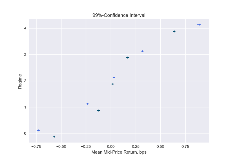
Figure 9 presents confidence intervals for the expected mid-price return in a given regime. We can see that indeed the returns are on average negative for low imbalance numbers (regime 0 and 1) and positive for high imbalance numbers (regime 3 and 4). The means move more into the order imbalance direction when the imbalance is constructed with a higher level, e.g., in regime 4 the mean of the 1-period ahead return when the imbalance is calculated with L=1 (dark line) is smaller than when performing the calculations at a depth of level L=5 (bright line). Note that the confidence intervals shown reflect the uncertainty in the expected value. The standard deviations of Table 1 inform us about the uncertainty of the returns around this expected value.

This analysis confirms the findings from the correlation analysis: there is positive but weak correlation between imbalances and 1-period ahead returns, and the deeper level (L) results in a slightly more predictive imbalance measure.

Empirical probabilities

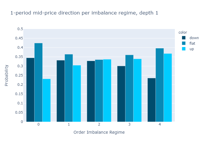
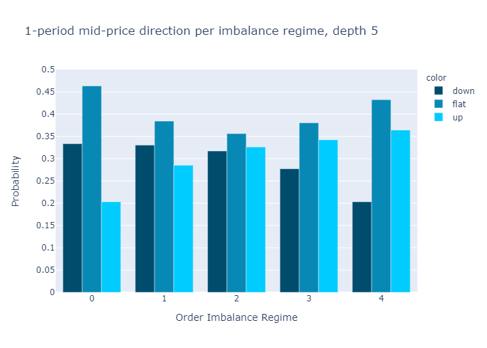
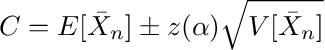
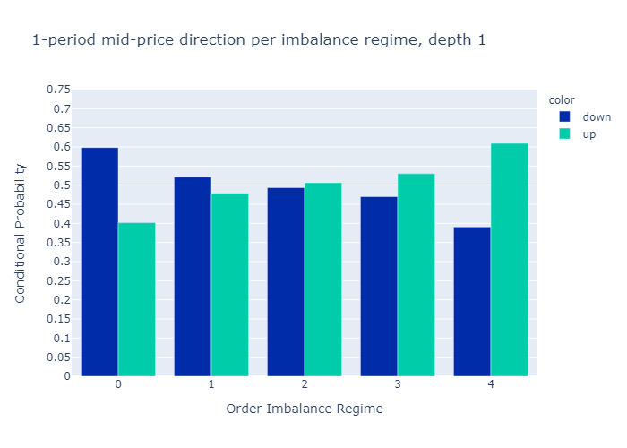
What is the probability that the next period mid-price will go up, stay flat, or go down knowing in which imbalance regime we are?

To see this, we bucket every order imbalance into a regime 0-4 and then count the number of negative returns, zero returns, and positive 1-period returns and divide the count by the number of observation to have an estimate for the probabilities of mid-price moves.

Figures 10 and 11 present the empirical probabilities for imbalances computed for L=1 and L=5 respectively. The figures confirm our initial hypothesis:

There is a higher probability of mid-price decreases in regimes with low values of order book imbalance, and vice versa.

We see qualitatively no difference in the empirical probabilities when calculating the imbalances with only 1 level (Figure 10) or 5 levels (Figure 11). We observe that the probabilities for higher levels L=5 are more discriminatory than for L=1, which is a desired property.

In Appendix A3 we also show the probabilities conditional on observing a non-zero price move. We find that if the price moves, the level 5 imbalance is a slightly better predictor than the level 1 imbalance.

Image for post

Figure 10: Empirical Probability for Mid-Price Move at L=1.
Image for post

Figure 11: Empirical Probability for Mid-Price Move at L=5.

Profitability

Image for post

Photo by Jordan Rowland on Unsplash

Many crypto exchanges have trading fees in the order of 10bps (and we would execute 2 trades). We see from the confidence intervals (Figure 9) that mid-price returns are below 10 basis points for the 10 second periods considered. So from judging by the expected return without considering variances, we can conclude that order imbalances do not directly imply a profitable strategy on its own without even investigating the bid-ask spreads.

To affirm this finding, we look at profitability from another angle and calculate the empirical probabilities of price moves larger than 10 basis points, similar to figures 10 and 11. That is, we count all movements that are in absolute terms below 10 basis points as flat. Table 3 shows that for imbalance calculations with order book levels of both 1 and 5, most trades would end up below an absolute return of 10 basis points in all regimes. This confirms the strategy does not allow for statistical arbitrage on its own.

Table 3: Empirical probabilities per order book imbalance regime. This table shows the empirical probability for up moves, down moves, or relative moves smaller than 10bps (flat) within one period after the order book imbalance observation (regimes 0 to 4). The column probability L1 shows the empirical probabilities computed for Level 1 order book imbalances, and L5 that for level 5 order book imbalances.

Conclusion

Our analysis for ETHUSD order books and mid-price movements is consistent with the findings in the literature on order book imbalances for stock markets:

  • When the imbalance is close to -1 there is a selling pressure and the mid-price is more likely to go down in the near term, when the imbalance is close to 1 there is a buying pressure and the mid-price is more likely to move up.
  • The price impact of the imbalance measure is short-lived and quickly deteriorates with the time horizon.
  • The imbalance measure itself cannot directly be used for statistical arbitrage, however, it can be used to improve upon algorithms.

In addition to what the literature cited on order book imbalances, I have also analyzed the order book imbalance calculated using up to 5 levels and found that the correlation of the imbalance measure with future price moves increases with the level (for the 5 levels assessed). From the expected values and its confidence intervals in Figure 9, however, we see that higher levels do only marginally improve the return direction and we observed that empirical probabilities are only slightly more discriminatory when working with higher levels of order book depths. Therefore, the added value from deeper levels (L>1) does probably not justify the higher complexity (handling deeper levels is typically more time consuming for high frequency algorithms).

Finally, we found the strongest relationship between imbalance and price movements to be within the shortest period (10 seconds) available in the data. Therefore, I conclude that looking into tick data could reveal more insights, as opposed to the 10 second period length examined in this article.

References

Cartea, A., R. Donnelly, and S. Jaimungal (2018). Enhancing trading strategies with order book signals. Applied Mathematical Finance 25 (1), 1-35.

Cartea, A., S. Jaimungal, and J. Penalva (2015). Algorithmic and high-frequency trading. Cambridge University Press.

Cont, R., A. Kukanov, and S. Stoikov (2014). The price impact of order book events. Journal of financial econometrics 12 (1), 47-88.

Lipton, A., U. Pesavento, and M. G. Sotiropoulos (2013). Trade arrival dynamics and quote imbalance in a limit order book. arXiv preprint arXiv:1312.0514 .

Paolella, M. S. (2007). Intermediate probability: A computational approach. John Wiley & Sons.

Silantyev, E. (2018). Order-flow-analysis-of-cryptocurrency-markets. Medium.

Stoikov, S. (2017). The micro-price: A high frequency estimator of future prices. Available at SSRN 2970694 .

Appendix

A1. Confidence intervals

We are interested in the mean of the log-returns conditional on being in a given regime. We construct confidence intervals that allow us to estimate probabilistic bounds for the expected mid-price return in a given regime. The method we present here is standard, see e.g., Paollela 2017.

By the central limit theorem, the sample mean

Image for post

Equation A.1

of i.i.d. random variables Xi are normal:

Image for post

Equation A.2

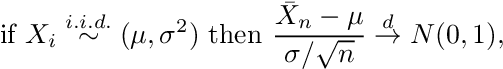
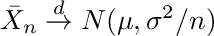
where Xi represent the i=1,…,n observations drawn from a distribution with mean μ and standard deviation σ, the arrow with superscript d denotes convergence in distribution and N(0,1) represents the standard normal distribution. We can express Equation A.2. informally as

Image for post

Equation A.3

that leads to the estimates of mean and variance

Image for post

Equation A.4

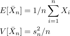
where s is the sample standard deviation. Now, the confidence interval for a level (1-α) is given by

Image for post

Equation A.5

z(α) represents the point on the x -axis of the standard normal density curve such that the probability of observing a value greater than z(α) or smaller than –z(α) is equal to α.

To apply this form of the central limit theorem, the mid-price returns have to be i.i.d.. The autocorrelation of mid-price returns are below 1% (see also A2) and there is no indication that they should stem from different distributions or have another dependency that is not reflected in the correlation, so we can assume the i.i.d. property holds and use Equation A.4.

import scipy.stats as st
import numpy as np
def estimate_confidence(shifted_return,
vol_binned,
volume_regime_num,
alpha=0.1):
"""
Estimate confidence interval for given alpha
:param shifted_return: array of returns for which we calculate
the confidence interval
of its mean, can contain NaN
:type shifted_return: float array of length n
:param vol_binned: volume regimes. Entry i corresponds to the
volume regime associated with
shifted_return[i]
:type vol_binned: float array of length n
:param volume_regime_num: equals np.max(vol_binned)+1
:type volume_regime_num: int
:return: confidence intervals for mean of the returns per regime
:rtype: float array of size volume_regime_num x 2
"""
confidence_interval = np.zeros((volume_regime_num, 2))
z = st.norm.ppf(1-alpha)
for regime_num in range(0, volume_regime_num):
m = np.nanmean(shifted_return[vol_binned == regime_num])
s = np.nanstd(shifted_return[vol_binned == regime_num])
sqrt_n = np.sqrt(np.sum(vol_binned == regime_num))
confidence_interval[regime_num, :] = [m - z * s/sqrt_n,
m + z * s/sqrt_n]
return confidence_interval

A2. Plot the autocorrelation function

The Python code-snippet below calculates autocorrelations and plots. The calculation accounts for (hard-coded) gaps in the time-series that are greater than 11 seconds.

import numpy as np
from datetime import datetime
import plotly.express as px
def shift_array(v, num_shift):
'''
Shift array left (num_shift<0) or right num_shift>0
:param v: float array to be shifted
:type v: array 1d
:param num_shift: number of shifts
:type num_shift: int
:return: float array of same length as original array,
shifted by num_shifts elements, np.nan
entries at boundaries
:rtype: array
'''
v_shift = np.roll(v, num_shift)
if num_shift > 0:
v_shift[:num_shift] = np.nan
else:
v_shift[num_shift:] = np.nan
return v_shift
def plot_acf(v, max_lag, timestamp):
'''
Create figure to plot autocorrelation function
:param max_lag: when to stop the autocorrelation
calculations (up to max_lag lags)
:param timestamp: timestamp array of length n
with entry i corresponding to timestamp of
entry i in v, used to remove time-jumps
v: array with n observation
:return: plotly-figure
'''
corr_vec = np.zeros(max_lag, dtype=float)
for k in range(max_lag):
v_lag = shift_array(v, -k-1)
timestamp_lag = shift_array(timestamp, -k-1)
dT = (timestamp - timestamp_lag) / (k+1)
msk_time_gap = dT > 11000.0
mask = ~np.isnan(v) & ~np.isnan(v_lag) & ~msk_time_gap
corr_vec[k] = np.corrcoef(v[mask], v_lag[mask])[0, 1]
fig_acf = px.bar(x=range(1, max_lag+1), y=corr_vec)
fig_acf.update_layout(yaxis_range=[0, 1])
fig_acf.update_xaxes(title="Lag")
fig_acf.update_yaxes(title="ACF")
return fig_acf

A3. Conditional Empirical Probabilities

Figures A1 and A2 show the empirical probabilities of a mid-price up move/down move conditional on observing a non-zero return. Level 5 imbalances show a better discriminatory power, that is, in regimes 0 and 5 the probabilities are more extreme than at level 1.

If the mid-price moves, the imbalance with L=5 is a better indicator of the price direction than the imbalance of L=1.

Image for post

Figure A1: Conditional Empirical Probabilities for mid-price move (imbalance depth level 1).
Image for post

Figure A2: Conditional Empirical Probabilities for mid-price move (imbalance depth level 5).

Note from Towards Data Science’s editors: While we allow independent authors to publish articles in accordance with our rules and guidelines, we do not endorse each author’s contribution. You should not rely on an author’s works without seeking professional advice. See our Reader Terms for details.

Real-time dashboard in Python

Real-time dashboard in Python

Streaming and Refreshing

Image for post

Data scientists use data visualization to communicate data and generate insights. It’s essential for data scientists to know how to create meaningful visualization dashboards, especially real-time dashboards. This article talks about two ways to get your real-time dashboard in Python:

  • First, we use streaming data and create an auto-updated streaming dashboard.
  • Second, we use a “Refresh” button to refresh the dashboard whenever we need the dashboard to be refreshed.

For demonstration purposes, the plots and dashboards are very basic, but you will get the idea of how we do a real-time dashboard.

The code for this article can be found here: realtime_dashboard.ipynb and realtime_dashboard.py. The content of these two files is completely the same, just in different formats.

Data source

To show how we create this dashboard with a real-world API, we use weather data from the OpenWeather API as an example in this article.

If you would like to try out the code mentioned in this article, you will need to get access to the OpenWeather weather API. You can sign up at the Open Weather website and then get the API keys.

Set up

Before going into the code, let’s install the needed packages. I have created an enviornment.yml file. Please download this file and run the following to create and activate the environment.

conda env create -f environment.yml
conda activate realtime_dashboard

Alternatively, if you want to install all the packages on your own, please conda install datashader holoviews hvplot notebook numpy pandas panel param requests streamz. If you see any issues, the Python version and package versions I am using are noted in the environment.yml.

Import packages

Here we import the packages used for this article:

Streaming data and dashboard

First, we make a function weather_data to get weather data for a list of cities using the OpenWeather API. The output is a pandas dataframe with each row representing each city.

Second, we use streamzto create a streaming dataframe based on San Francisco’s weather data. The function streaming_weather_data is used as a callback function by the PeriodicDataFrame function to create a streamzstreaming dataframe df. streamzdocs documented how PeriodicDataFrame works:

streamz provides a high-level convenience class for this purpose, called a PeriodicDataFrame. A PeriodicDataFrame uses Python’s asyncio event loop (used as part of Tornado in Jupyter and other interactive frameworks) to call a user-provided function at a regular interval, collecting the results and making them available for later processing.

https://streamz.readthedocs.io/en/latest/dataframes.html#streaming-dataframes

The streamzstreaming dataframe df looks like this, with values updated every 30s (since we set interval=’30').

Image for post

Third, we make some very basic plots using hvPlot to plot the streamzdataframe, and then we use panel to organize the plots and put everything in a dashboard. If you would like to know more about how to usehvPlot to plot streamzdataframe, please see hvPlot docs.

Here is what the dashboard looks like. Since the streaming dataframe updates every 30s, this dashboard will automatically update every 30s as well. Here we see that Temperature changed, while humidity and wind speed did not.

Image for post

Great, now you know how to make a streaming dataframe and a streaming dashboard.

If you would like to learn more, here is a great video tutorial on the streaming dashboard by my friend Dr. Jim Bednar. Please check it out!

Refresh dashboard

Sometimes, we don’t really need a streaming dashboard. Instead, we might just like to refresh the dashboard whenever we see it. In this section, I am going to show you how to make a “Refresh” button in your dashboard and refresh the dashboard with new data whenever you click “Refresh”.

First, let’s make a simple function weather_plot to plot weather data on a map given city names and return both the plot and the data.

Image for post

With the plotting function ready, we can start making the refreshable dashboard. I use the param.Action function to trigger an update whenever we click on the button Refresh. In addition, I use the param.ObjectSelector function to create a dropdown menu of the dataframe columns we are interested in plotting and param.ObjectSelector trigger an update whenever we select a different option in the dropdown menu. Then the @param.depends('action', 'select_column') decorator tells the get_plot function to rerun whenever we click the Refresh button or select another column.

Here is what the refresh dashboard looks like:

Image for post

Finally, we can use panel to combine the two dashboards we created.

Deployment

Our final dashboard pane is a panel object, which can be served by running:

panel serve realtime_dashboard.py

or

panel serve realtime_dashboard.ipynb

For more information on panel deployment, please refer to the panel docs.

Now you know how to make a real-time streaming dashboard and a refreshable dashboard in python using hvplot , paneland streamz. Hope you find this article helpful!

References

https://anaconda.cloud/tutorials/4038ae58-286a-4fdc-b8bf-b4b257e2edf3

https://openweathermap.org/api

https://panel.holoviz.org/gallery/param/action_button.html

https://streamz.readthedocs.io/en/latest/dataframes.html

https://hvplot.holoviz.org/user_guide/Streaming.html

https://panel.holoviz.org/user_guide/Deploy_and_Export.html

By Sophia Yang on February 7, 2021

3 Must-have JupyterLab 2.0 extensions

3 Must-have JupyterLab 2.0 extensions

JupyterLab just became a full-fledged IDE with features like Code Assistance, Debugging and Git — welcome to the future of Notebook editing.

Photo by Victor Garcia on Unsplash

I am happy to confirm that JupyterLab just became a full-fledged IDE with the help of the latest extensions. A week ago, I mentioned a couple of deficiencies that I notice while editing Notebooks with JupyterLab — nonexistent code assistance was one of them.

Soon after one of the lead developers of JupyterLab-LSP contacted me and showed me their extension. I gave it a try — it is a massive improvement in the Jupyter ecosystem.

There were still a couple of missing pieces in the JupyterLab ecosystem to make it at least equivalent to PyCharm in terms of features. But not anymore.

Here are a few links that might interest you:

- Labeling and Data Engineering for Conversational AI and Analytics- Data Science for Business Leaders [Course]- Intro to Machine Learning with PyTorch [Course]- Become a Growth Product Manager [Course]- Deep Learning (Adaptive Computation and ML series) [Ebook]- Free skill tests for Data Scientists & Machine Learning Engineers

Some of the links above are affiliate links and if you go through them to make a purchase I’ll earn a commission. Keep in mind that I link courses because of their quality and not because of the commission I receive from your purchases.

In case you’ve missed my previous articles related to this topic:

JupyterLab-LSP

JupyterLab-LSP adds code assistance capabilities to JupyterLab. Read JupyterLab 2.0. to learn more about it:

Code Completion in JupyterLab with JupyterLab-LSP

Debugger

I used to do debugging in JupyterLab with pdb package — it was a painful process. A few days ago, I heard about a new debugging extension and I was really intrigued to give it a try:

A proper debugger is one of the last missing pieces in the JupyterLab ecosystem. All praise to the developers of the latest JupyterLab extensions — install works on a first try, well-written documentation, etc. It was no different with the debugger extension. Note, that debugger supports only JupyterLab ≥ 2.0 and it is still under active development.

How to enable the debugger?

Create a new xpython notebook, enable debugging and open debug pane.

The debugger works in xpython Notebook — x is short for xeus, which is a library meant to facilitate the implementation of kernels for Jupyter. It takes the burden of implementing the Jupyter Kernel protocol so developers can focus on implementing the interpreter part of the kernel.

How to use the debugger?

To use the debugger enable the orange switch in the top right, set a breakpoint and execute the code. Use the debug panel on the right to investigate the variables.

I tried the debugger by investigating the values of variables in a function — this was the biggest pain point when using pdb package — and it works well. I also tried to investigate the values of a class and a DataFrame. It all works flawlessly.

How to install it?

Make sure you have JupyterLab ≥ 2.0 installed and Extension Manager enabled. Then install requirements:

pip install xeus-python==0.7.1
pip install ptvsd

To install the extension, run:

jupyter labextension install @jupyterlab/debugger

JupyterLab-Git

If you’ve ever pushed a Jupyter Notebook to Git, then made some changes to it and pushed it again, you know that Git’s diff functionality is useless — it marks everything. I used a workaround by resetting all outputs before pushing it, but sometimes I forgot (or JupyterLab didn’t save the latest state) and there was a big mess in the end. I am really excited about this one. Will it meet my expectations?

Let’s try it

I open the git panel on the right. Then I remove 3 cells and I add 3 cells. The diff functionality works well.

Wow, I was really amazed by this one. I made a few changes in the Notebook and the diff functionality really works well. Kudos to the jupyterlab-git team.

Tip: When reverting changes in a Notebook , first close the Notebook, then use revert. It works better

Commit history

Exploring the commit history with jupyter-git blame

You can observe commit history — this is a killer feature. It even shows images. You can finally observe what a coworker had changed without going through the whole Notebook.

How to install it?

Make sure you have JupyterLab ≥ 2.0 installed and Extension Manager enabled. Then run:

pip install --upgrade jupyterlab-git
jupyter lab build

After installing it, Extension Manager showed that packages are outdated so I’ve clicked update, waited some time, confirmed the rebuild and restarted the jupyter-lab. Then it worked!

Conclusion

Like I’ve mentioned in my previous articles about JupyterLab — the future of Notebook editing is bright ☀️ I’m going to switch over to JupyterLab 2.x when vim extension and code formatter extensions become available. Until then I going to stick will JupyterLab 1.2.

Before you go

Follow me on Twitter, where I regularly tweet about Data Science and Machine Learning.

Photo by Courtney Hedger on Unsplash

Stylize and Automate Your Excel Files with Python

Python + Excel

Stylize and Automate Your Excel Files with Python

How to utilize Python to create a stylized Excel report using xlwings, a way for beginners to get started with Python.

Photo by Fotis Fotopoulos on Unsplash

Introduction

There is no default gateway to walk through when you first embark on your journey into the realm of Python. Typical uses of the language range from Data Science to Machine Learning to Artificial Intelligence, amongst many other buzzwords. While these are great areas where Python can be implemented quickly, they do not have a use case for a vast majority of the workforce in most companies. Financial Services, along with other industries, still use and heavily rely on Excel for basic data manipulation. Anyone working in this way might be dissuaded from considering Python as a potential solution given the association it has built up over the years with these complex topics.

My exposure to Python stemmed from a need to minimise the time I was investing in manual Microsoft Excel work. Automation of repetitive tasks can free up an extraordinary amount of worker hours, allowing you to focus on the more complex issues at hand. VBA seemed like the ideal solution to speed up this workflow.

It took a few months before I learnt and got to grips with VBA. But even reaching that point of competency, it still felt as if there was an inflexible ceiling strictly defining and constraining how efficient and effective this approach could be. That was when I turned my attention towards Python and it didn’t take long before it was obvious that Python was what I needed.

If you find yourself in the situation where you use Excel daily, are looking into automation of these tasks and are now trying to learn VBA, this article may change your course of action.

Why Excel with Python instead of VBA?

Python contains a vast array of powerful packages built into the standard libraries. Additionally, you can take advantage of easy-to-install third party modules. The combination of these can drastically reduce the amount of code needed as well as the time taken to execute the code in comparison to VBA. A quick example would be the best way of demonstrating this.

You can easily compare how to count each unique value in a column of a dataset using VBA vs Python and Pandas. Both of the following methods are how a beginner might achieve these.

VBA

This code takes advantage of Excel’s =COUNTIF() function and pastes the results to a new workbook.

Sub Macro()Workbooks("Book1").Activate
Workbooks("Book1").Sheets("fruit_and_veg_sales").Activate
Columns("B:B").Select
Selection.Copy
Workbooks.Add
ActiveSheet.Paste
Application.CutCopyMode = False
ActiveSheet.Range("$A:$A").RemoveDuplicates Columns:=1, Header:=xlNo
Range("B1") = "Count"
Range("B2").Formula = "=COUNTIF([Book1]fruit_and_veg_sales!$B:$B,A2)"
Range("B2").Copy
Range("B2:B" & ActiveSheet.UsedRange.Rows.Count).PasteSpecial xlPasteAll
Calculate
Range("B2:B" & ActiveSheet.UsedRange.Rows.Count).Copy
Range("B2:B" & ActiveSheet.UsedRange.Rows.Count).PasteSpecial xlPasteValues
Application.CutCopyMode = False

End Sub

Python

df["col"].value_counts() is all you require in Python using Pandas. (It also sorts the values as an added benefit)

Image for post

Image by Author | Unique value count outputs: Python (left), Excel (right)

Making use of packages already available in Python and outputting the final data to Excel could speed up the entire automation process whilst keeping the output identical for all regular users of the data. The time saved here is not only by writing less lines of code, but also writing code that is far more comprehensible.

This can save an immense amount of time for both you and future users of your code.

You may be able to see now, Python is a far easier language for beginners to pick up. For those of you who are still more reticent to take the plunge, being able to integrate with Excel, to use an interface you are familiar with, is a perfect way to ease yourself into Python.

After taking your first baby steps with Python and Excel, it won’t be long before you’re taking larger strides towards using the language with SQL databases, scraping data from websites and creating dashboards. All can be easily achieved with Python modules.

Getting started with Python can be a great segue into learning these additional skills!

xlwings

Now, how do we get started on creating this report?

Cue xlwings…

xlwings is an open-source Python library which allows easy manipulation and automation of Excel using Python code. xlwings is able to leverage Python’s scientific packages (NumPy, Pandas, SciPy, scikit-learn ,etc.), write tools with Python instead of VBA, and create User Defined Functions in Python to use in Excel. You can even create dashboards to access your Excel data online! In summary, xlwings has the capability to significantly boost your current Excel toolkit and workflow!

If your preferred method of Python installation is Anaconda then, as of the November 2020 release, xlwings 0.20.8 is built into Anaconda’s pre-installed packages. This means if you install Python through Anaconda you will automatically be able to import and use xlwings.

If you do not have this pre-installed pip install xlwings will get you there.

xlwings has been exceptionally useful for me in the automation of Excel-based work and creation of reports. Being able to use Python and interact with Excel has enabled me to focus my time on learning more complex coding topics while pushing Excel into more of a backseat role.

Formatting data into a presentable report

I have created a test dataset of fruit and veg sales in csv format to use for this tutorial.

Data can be downloaded from Github: link

Steps to creating your report!

  1. Import Pandas and xlwings. We will be focusing on xlwings in this tutorial. Pandas will only be used to quickly import our data into Python.
import pandas as pd
Import xlwings as xw

2. We now import the csv file as a DataFrame using Pandas.

df = pd.read_csv(r”path_to_csv/fruit_and_veg_sales.csv”)

Tip: you can also read the csv file directly from Github by running this line instead df = pd.read_csv(r"https://raw.githubusercontent.com/Nishan-Pradhan/xlwings_report/master/fruit_and_veg_sales.csv")

Now that we have the data in Python, you are free to do any manipulation or further calculations. For the purpose of this tutorial we will keep the data as it is.

3. Initialize the Excel Workbook.

wb = xw.Book()

Here we have named our workbook wb and used xlwings Book() to initialize our Excel Workbook.

4. Next, we’ll set our Worksheet reference as a variable and change the name of the sheet.

sht = wb.sheets["Sheet1"]
sht.name = "fruit_and_veg_sales"

here we set our reference to our Excel Sheet1 as shtand renamed our Sheet1 to fruit_and_veg_sales.

5.We now have our DataFrame in Python with our fruit and vegetable sales and have an open Excel Workbook with a sheet named “fruit_and_veg_sales”. The next step is to get our data out from Python and into Excel. We do this by calling:

sht.range("A1").options(index=False).value = df

If you know VBA, you should recognise the familiar syntax of sht.range("A1"). Here, to get our DataFrame df into our Excel document we specified where to place the data (cell “A1”, in this case).

The .options(index=False) avoids copying over the unwanted index. If you require the index of your DataFrame, you can remove this part of the line as this is True by default, i.e. sht.range("A1").value = df.

Don’t forget to include .value , without specifying this you will get a Syntax Error which will look something along the lines of SyntaxError: can't assign a function to a cal. .value tells xlwings that you are talking about the value in your Excel cell rather than any other attributes which we will touch upon shortly.

6. You should now be looking at an Excel file with completely unformatted data in front of you.

Image for post

Image by Author | Excel Worksheet With Data Inserted

7. We have taken the data from Python to Excel. Now we will start on the formatting!

When formatting data within Excel, the first thing you do is select which data you want to format. To do this in xlwings we will create a variable relating to a range in our sheet.

all_data_range = sht.range("A1").expand('table')

Here using sht.range("A1").expand('table') we basically are starting at cell A1 and going then CTRL + SHIFT + ↓ (Down Arrow) then CTRL + SHIFT + → (Right Arrow) to select our data (Windows). This will select the range A1:I1001 and this range reference is saved to our variable named all_data_range.

To check which range you are referencing with your variable in Python run print(all_data_range.address).

Image for post

Image by Author | range.address example

8. With our range reference variable set up, we can now start stylising our report. We will start with the row and column height for our data.

all_data_range.row_height = 22.5
all_data_range.column_width = 12

22.5 and 12 refer to Excel’s measure of size which is in ‘characters of default font’ according to the Microsoft documentation.

9. Next, we’ll change the background colour of the cells. For this we will be using RGB colours in a tuple.

all_data_range.color = (208,206,206)

This will change the background colour of our range to a light grey.

10. To edit our text, the functions needed are slightly different. We will be using xlwings to call into Microsoft’s Excel api. This will be almost identical to using VBA.

all_data_range.api.Font.Name = 'Arial'
all_data_range.api.Font.Size = 8
all_data_range.api.HorizontalAlignment = xw.constants.HAlign.xlHAlignCenterall_data_range.api.VerticalAlignment = xw.constants.HAlign.xlHAlignCenterall_data_range.api.WrapText = True

Here we are changing the font of our data to Arial, setting the font size to 8, making our text centre aligned both horizontally and vertically, and finally, turning on Wrap Text to see all the text in our cells.

11. To make our table look more appealing we’ll add some colours and format our headers.

header_range = sht.range("A1").expand('right')
header_range.color = (112,173,71)
header_range.api.Font.Color = 0xFFFFFF
header_range.api.Font.Bold = True
header_range.api.Font.Size = 9

This block selects a range as we did previously. The main difference with this selection is that we are using .expand('right') to only CTRL + SHFT + → (Right Arrow). This allows us to start at cell A1 and select to I1, which is only our header column in Excel.

Another difference here is that we have chosen to change the font colour to white. To do this we have specified the colour using a hex code 0xFFFFFF.

Image by Author | Half Formatted Document

12. We’ll now format our Transaction ID number column. I want to shade this a lighter shade of green. We can do this using the RGB method previously mentioned. This time we will expand('down') from cell A2.

id_column_range = sht.range("A2").expand('down')
id_column_range.color=(198,224,180)

13. The next step will change the colour of the borders for only our data (not the header column or the Transaction ID# column). Microsoft’s api is slightly awkward for working with the borders but their documentation here is fairly sufficient.

Summarised, top, bottom, left and right borders are specified with the numbers 7,8,9,10 respectively.

data_ex_headers_range = sht.range("A2").expand('table')for border_id in range(7,13):
data_ex_headers_range.api.Borders(border_id).Weight = 2
data_ex_headers_range.api.Borders(border_id).Color = 0xFFFFFF

14. The final step will be saving our report. Call wb.save(), specify the path you wish to save to and the desired filename. Remember to end your filename with a filetype. In this case we are going for .xlsx to keep all of our formatting.

wb.save(r"path_to_folder\fruit_and_veg_report.xlsx")

Bonus!

As an added extra, we will also be changing the tab color to green.

sht.api.Tab.Color = 0x70AD47
GIF by Author | Formatted Excel Sheet Using xlwings

Conclusion

In a few simple lines of code we have managed to create an Excel document with clean and presentable formatting for an end user. This tutorial should give enough xlwings building blocks for you to get creative and make your own aesthetically pleasing reports! Try inserting blank rows, changing font sizes, background colours, border weights and border colours to make your report look even better!

This is only the start of what you can achieve using Python and xlwings!

Code used in this tutorial is available on Github here

If you are stuck, check out the xlwings docs here

If you have any further questions, please leave them in the comments section below.

The Science Behind the New 4-Second Workout

The Science Behind the New 4-Second Workout

Woman working out in her living room.

Photo: Oscar Wong/Getty Images

Researchers are racing to figure out the minimum amount of exercise needed to improve fitness and health. Findings in multiple labs have generated tantalizing headlines suggesting all you need is one lousy minute of effort or, based on one new study, a mere four seconds.

The reality is quite different.

Brief but intense workouts can absolutely improve aerobic fitness, as well as muscle strength and power. In as little as 10 to 15 minutes, you can gain fitness benefits similar to an hour of traditional, less intense exercise. And evidence suggests you can spread the effort into even shorter “exercise snacks” throughout the day.

But these workouts are never easy, nor are they as minimalist as they might sound. The vigorous routines, called high-intensity interval training (HIIT), involve warmups and cool-downs and typically require multiple intervals of strenuous effort to achieve at least 80% of your maximum heart rate, a level that causes heavy breathing and makes normal conversation difficult. And sprint interval training (SIT) workouts, which are even more intense than HIIT, elicit the sort of effort you might summon to evade a marauding velociraptor.

The simple message from all the latest research into short, high-intensity workouts: “Get out of your comfort zone sometimes,” says Martin Gibala, a professor in the Department of Kinesiology at McMaster University in Ontario, Canada, and author of The One-Minute Workout, which, for the record, takes about 10 minutes to complete.

Four seconds of hard effort, again and again and…

A new study in the journal Medicine and Science in Sports and Exercise involved an exercise regimen of multiple four-second intervals of intense effort among sedentary men and women in their fifties and sixties training three times a week for eight weeks. The workouts improved overall fitness on average, including significant increases in cardiovascular capacity (10%) and muscle power (12%).

Unlike some HIIT routines that involve just two or three intervals, these workouts required several all-out four-second sprints on a specialized stationary bike called a Power Cycle, which features a heavy flywheel. Participants typically did either 18 sprints with 30-second rests between each or 30 sprints with 15-second rest periods, explains study team member Edward Coyle, PhD, head of the Human Performance Laboratory in the University of Texas at Austin. All told, the workouts lasted 10 minutes on average.

The sprints require tremendous bursts of power. That’s important, Coyle says, because a typical person starts losing muscle fiber around age 30, and 40% of muscle can be gone by age 70. The fast-twitch muscle fibers needed for power dwindle fastest.

“Many people feel that they don’t have enough time for traditional forms of exercise. However, HIIT provides a viable, time-efficient exercise alternative that people can try.”

As with lightbulbs, the power of a given exercise is measured in watts. A beginner on a bike might average around 75 watts of output during a 30-minute ride. The power output of a typical HIIT interval might range anywhere from 180 watts during sprints lasting more than a minute to 700 watts during 20-second all-out sprints, Coyle says. But the four-second sprints recruit more than 1,000 watts of power. In turn, that level of power output combined with the relatively short rest periods generates a great aerobic session.

“Since the exercise is so powerful, your cardiovascular system is still stimulated during your rest periods,” Coyle explains in a phone interview. “You’re consuming a lot of oxygen, and you’re recovering the energy stores that you used during the sprints.”

For each participant, the first few intervals left them breathing hard, and the last few had them gasping for breath, Coyle says.

No equipment required

Coyle’s workout illustrates what’s possible with the briefest of intervals. But duplicating the effect of his specialized bike at home is impractical. That’s okay, because HIIT can be done in a variety of ways, with or without any equipment. Results can be achieved by sprinting up a hill on foot or on a bike or through a variety of other common exercises. A 2018 study by Gibala and colleagues whipped people into shape with exercise snacks, having them vigorously climb three flights of stairs three times a day but with hours between each effort.

Gibala’s latest research finds that classic calisthenics can also do the trick. His team designed an 11-minute workout session with five bodyweight-only exercises:

Each move is done for one minute at a “challenging pace,” with easy jumping jacks serving as a one-minute warmup, then a minute of walking in place after each exercise. Nine unfit but healthy men and women did the exercises three times per week for six weeks. Endurance rose by about 7% on average, and the exercisers’ legs grew stronger, compared to a control group that did not exercise, the researchers report in a January issue of the International Journal of Exercise Science.

“The latest findings are a reminder that simple, practical strategies like brief bodyweight exercises can be beneficial, without the need for specialized equipment or large time commitment,” Gibala tells Elemental. “It especially resonates in the current reality for a lot of people who are experiencing versions of lockdowns with limited access to fitness facilities and equipment.”

Try it, you might like it

Physical activity guidelines for Americans call for twice-a-week strength training, plus 150 minutes per week of moderate-intensity physical activity or 75 minutes of vigorous output — or a combination of the two. High-intensity efforts lasting less than 10 minutes now count toward that total, based on the latest revision of the guidelines in 2018.

HIIT is not a panacea, Gibala says, noting that many of the HIIT studies involve only a few participants and measure only certain markers of fitness; how these routines might translate into lifetime benefits remains to be studied. But a review of the existing research suggests they might help prevent or manage diabetes, and other experiments have found they reduce levels of bad cholesterol and improve fat metabolism and lower levels of triglycerides, which at high levels raise the risk of heart disease.

What’s more, people don’t find HIIT workouts as unpleasant as you might imagine. Coyle had wondered if the older people in his study might not be able to handle the intensity. “They did great, and they liked it,” he says.

“Just like we do with food, we can create a menu of different types of physical activity we can choose from depending on the situation and our needs. Aim for something that is realistic, attainable, and enjoyable.”

One study, which looked specifically at whether intensity begets displeasure, backs this up. Researchers had 30 people each do three different types of exercise in the lab: HIIT, the more intense SIT, and moderate-intensity continuous training more akin to traditional aerobic exercise. Enjoyment responses were similar for all three types, says study leader Matthew Stork, PhD, a researcher in exercise science at the University of British Columbia, Okanagan. Afterward, the participants were free to exercise on their own for four weeks; 79% of them chose to do at least one session of HIIT.

“Many people feel that they don’t have enough time for traditional forms of exercise,” Stork says. “However, HIIT provides a viable, time-efficient exercise alternative that people can try.”

It’s also important to note that intensity is a relative thing. What would exhaust one person might be easy for someone who’s in shape. Pushing yourself physically is how you gain fitness, but it should be done sensibly, both for safety’s sake and to avoid burnout.

“I personally don’t love the idea of ‘push yourself to the limit’ as something we should be promoting across the board, particularly with individuals who are low active and less experienced with exercise,” Stork says. “For less experienced individuals, pushing too hard too soon has the potential to deter them from continued engagement.”

We humans did not evolve to exercise — working out without the dangling carrots of procreation or survival just isn’t in our nature.

If you struggle to get excited about jogging, aerobics, or other extended workouts, consider some natural activities like a brisk walk, dancing, or gardening, and maybe challenge yourself to a few pushups and maybe even a little HIIT — all proven ways to improve fitness. And it’s never too late to accrue benefits, studies show.

“Just like we do with food, we can create a menu of different types of physical activity we can choose from depending on the situation and our needs,” Stork says. “Aim for something that is realistic, attainable, and enjoyable. That could be a long hike or a short HIIT session—whatever works for you based on your needs and physical capabilities. Every little bit counts.”

Python Can Be Faster Than C++

Python Can Be Faster Than C++

A trick that makes Python faster more than you can imagine

Dec 16, 2020 · 3 min read

Image for post

Photo by Jake Givens on Unsplash

Python is a great versatile programming language. Even though python is used most for machine learning problem solving because of its library and high-level language, it is known to be slower than many other languages. Because of its reputation, many would decide to leave the language behind and stick with other options like C++ for program solving.

In this article, I will show you how Python is faster than C++.

Basic Speed Testing

To test the normal speed difference between Python and C++, I will test the execution time of the Generation of primes algorithm. It is a simple algorithm with clear short steps in both languages.

import math
from time import per_counter
def is_prime(num):
if num == 2:
return True;
if num <= 1 or not num % 2:
return False
for div in range(3,int(math.sqrt(num)+1),2):
if not num % div:
return False
return True
def run program(N):
for i in range(N):
is_prime(i)
if __name__ == ‘__main__’:
N = 10000000
start = perf_counter()
run_program(N)
end = perf_counter()
print (end — start)
#include <iostream>
#include <cmath>
#include <time.h>
using namespace std;bool isPrime(int num)
{
if (num == 2) return true;
if (num <= 1 || num % 2 == 0) return false;
double sqrt_num = sqrt(double(num));
for (int div = 3; div <= sqrt_num; div +=2){
if (num % div == 0) return false;
}
return true;
}int main()
{
int N = 10000000;
clock_t start,end;
start = clock();
for (int i; i < N; i++) isPrime(i);
end = clock();
cout << (end — start) / ((double) CLOCKS_PER_SEC);
return 0;
}
  • Python: 80.137 seconds
  • C++ : 3.174 seconds

As expected, C++ was 25 times faster than Python in our basic test. So the reputation is true, and this is logical as

  • Python is a dynamic language, unlike C++.
  • GIL (Python Global Interpreter) doesn’t allow parallel programming.

This speed difference can be fixed as python was created to be a flexible versatile language. One of the top solutions for the speed problem is using Numba.

Numba

Numba is an open source JIT compiler that translates a subset of Python and NumPy code into fast machine code. ~ Wikipedia

Briefly, Numba is a library that makes Python fast. It is very easy to use and dramatically change how fast your code. To start using Numba, just install it using the console use

pip install numba

Python Implementation After Using Numba

import math
from time import per_counter
from numba import njit, prange
@njit(fastmath=True, cache=True)
def is_prime(num):
if num == 2:
return True;
if num <= 1 or not num % 2:
return False
for div in range(3,int(math.sqrt(num)+1),2):
if not num % div:
return False
return True
@njit(fastmath=True, cache=True,parallel=True)
def run program(N):
for i in prange(N):
is_prime(i)
if __name__ == ‘__main__’:
N = 10000000
start = perf_counter()
run_program(N)
end = perf_counter()
print (end — start)

Results

Python: 1.401 seconds
C++ : 3.174 seconds

So Python is faster than C++. So it is possible to speed up your algorithms in Python to be faster than C++.

Are You Still Using Pandas to Process Big Data in 2021?

Are You Still Using Pandas to Process Big Data in 2021?

Pandas doesn’t handle well Big Data. These two libraries do! Which one is better? Faster?

Photo by NASA on Unsplash

I recently wrote two introductory articles about processing Big Data with Dask and Vaex — libraries for processing bigger than memory datasets. While writing, a question popped up in my mind:

Can these libraries really process bigger than memory datasets or is it all just a sales slogan?

This intrigued me to make a practical experiment with Dask and Vaex and try to process a bigger than memory dataset. The dataset was so big that you cannot even open it with pandas.

What do I mean by Big Data?

Photo by ev on Unsplash

Big Data is a loosely defined term, which has as many definitions as there are hits on Google. In this article, I use the term to describe a dataset that is so big that we need specialized software to process it. With Big, I am referring to “bigger than the main memory on a single machine”.

Definition from Wikipedia:

Big data is a field that treats ways to analyze, systematically extract information from, or otherwise, deal with data sets that are too large or complex to be dealt with by traditional data-processing application software.

What are Dask and Vaex?

Photo by JESHOOTS.COM on Unsplash

Dask provides advanced parallelism for analytics, enabling performance at scale for the tools you love. This includes numpy, pandas and sklearn. It is open-source and freely available. It uses existing Python APIs and data structures to make it easy to switch between Dask-powered equivalents.

Vaex is a high-performance Python library for lazy Out-of-Core DataFrames (similar to Pandas), to visualize and explore big tabular datasets. It can calculate basic statistics for more than a billion rows per second. It supports multiple visualizations allowing interactive exploration of big data.

Dask and Vaex Dataframes are not fully compatible with Pandas Dataframes but some most common “data wrangling” operations are supported by both tools. Dask is more focused on scaling the code to compute clusters, while Vaex makes it easier to work with large datasets on a single machine.

In case you’ve missed my articles about the Dask and Vaex:

The Experiment

Photo by Louis Reed on Unsplash

I’ve generated two CSV files with 1 million rows and 1000 columns. The size of a file was 18.18 GB, which is 36.36 GB combined. Files have random numbers from a Uniform distribution between 0 and 100.

Two CSV files with random data. Photo made by the author
import pandas as pd
import numpy as np
from os import pathn_rows = 1_000_000
n_cols = 1000
for i in range(1, 3):
filename = 'analysis_%d.csv' % i
file_path = path.join('csv_files', filename)
df = pd.DataFrame(np.random.uniform(0, 100, size=(n_rows, n_cols)), columns=['col%d' % i for i in range(n_cols)])
print('Saving', file_path)
df.to_csv(file_path, index=False)
df.head()
Head of a file. Photo made by the author

The experiment was run on a MacBook Pro with 32 GB of main memory — quite a beast. When testing the limits of a pandas Dataframe, I surprisingly found out that reaching a Memory Error on such a machine is quite a challenge!

macOS starts dumping data from the main memory to SSD when the memory is running near its capacity. The upper limit for pandas Dataframe was 100 GB of free disk space on the machine.

When your Mac needs memory it will push something that isn’t currently being used into a swapfile for temporary storage. When it needs access again, it will read the data from the swap file and back into memory.

I’ve spent some time thinking about how should I address this issue so that the experiment would be fair. The first idea that came to my mind was to disable swapping so that each library would have only the main memory available — good luck with that on macOS. After spending a few hours I wasn’t able to disable swapping.

The second idea was to use a brute force approach. I’ve filled the SSD to its full capacity so that the operating system couldn’t use swap as there was no free space left on the device.

Your disk is almost full notification during the experiment. Photo made by the author

This worked! pandas couldn’t read two 18 GB files and Jupyter Kernel crashed.

If I would perform this experiment again I would create a virtual machine with less memory. That way it would be easier to show the limits of these tools.

Can Dask or Vaex help us and process these large files? Which one is faster? Let’s find out.

Vaex vs Dask

Photo by Frida Bredesen on Unsplash

When designing the experiment, I thought about basic operations when performing Data Analysis, like grouping, filtering and visualizing data. I came up with the following operations:

  • calculating 10th quantile of a column,
  • adding a new column,
  • filtering by column,
  • grouping by column and aggregating,
  • visualizing a column.

All of the above operations perform a calculation using a single column, eg:

# filtering with a single column
df[df.col2 > 10]

So I was intrigued to try an operation, which requires all data to be processed:

  • calculate the sum of all of the columns.

This can be achieved by breaking down the calculation to smaller chunks. Eg. reading each column separately and calculating the sum and in the last step calculating the overall sum. These types of computational problems are known as Embarrassingly parallel — no effort is required to separate the problem into separate tasks.

Vaex

Photo by Photos by Lanty on Unsplash

Let’s start with Vaex. The experiment was designed in a way that follows best practices for each tool — this is using binary format HDF5 for Vaex. So we need to convert CSV files to HDF5 format (The Hierarchical Data Format version 5).

import glob
import vaex
csv_files = glob.glob('csv_files/*.csv')for i, csv_file in enumerate(csv_files, 1):
for j, dv in enumerate(vaex.from_csv(csv_file, chunk_size=5_000_000), 1):
print('Exporting %d %s to hdf5 part %d' % (i, csv_file, j))
dv.export_hdf5(f'hdf5_files/analysis_{i:02}_{j:02}.hdf5')

Vaex needed 405 seconds to covert two CSV files (36.36 GB) to two HDF5 files, which have 16 GB combined. Conversion from text to binary format reduced the file size.

Open HDF5 dataset with Vaex:

dv = vaex.open('hdf5_files/*.hdf5')

Vaex needed 1218 seconds to read the HDF5 files. I expected it to be faster as Vaex claims near-instant opening of files in binary format.

From Vaex documentation:

Opening such data is instantenous regardless of the file size on disk: Vaex will just memory-map the data instead of reading it in memory. This is the optimal way of working with large datasets that are larger than available RAM.

Display head with Vaex:

dv.head()

Vaex needed 1189 seconds to display head. I am not sure why displaying the first 5 rows of each column took so long.

Calculate 10th quantile with Vaex:

Note, Vaex has percentile_approx function which calculates an approximation of quantile.

quantile = dv.percentile_approx('col1', 10)

Vaex needed 0 seconds to calculate the approximation of the 10th quantile for the col1 column.

Add a new column with Vaex:

dv[‘col1_binary’] = dv.col1 > dv.percentile_approx(‘col1’, 10)

Vaex has a concept of virtual columns, which stores an expression as a column. It does not take up any memory and is computed on the fly when needed. A virtual column is treated just like a normal column. As expected Vaex needed 0 seconds to execute the command above.

Filter data with Vaex:

Vaex has a concept of selections, which I didn’t use as Dask doesn’t support selections, which would make the experiment unfair. The filter below is similar to filtering with pandas, except that Vaex does not copy the data.

dv = dv[dv.col2 > 10]

Vaex needed 0 seconds to execute the filter above.

Grouping and aggregating data with Vaex:

The command below is slightly different from pandas as it combines grouping and aggregation. The command groups the data by col1_binary and calculate the mean for col3:

group_res = dv.groupby(by=dv.col1_binary, agg={'col3_mean': vaex.agg.mean('col3')})
Calculating mean with Vaex. Photo made by the author

Vaex needed 0 seconds to execute the command above.

Visualize the histogram:

Visualization with bigger datasets is problematic as traditional tools for data analysis are not optimized to handle them. Let’s try if we can make a histogram of col3 with Vaex.

plot = dv.plot1d(dv.col3, what='count(*)', limits=[0, 100])
Visualizing data with Vaex. Photo made by the author

Vaex needed 0 seconds to display the plot, which was surprisingly fast.

Calculate the sum of all columns

Memory is not an issue when processing a single column at a time. Let’s try to calculate the sum of all the numbers in the dataset with Vaex.

suma = np.sum(dv.sum(dv.column_names))

Vaex needed 40 seconds to calculate the sum of all columns.

Dask

Photo by Kelly Sikkema on Unsplash

Now, let’s repeat the operations above but with Dask. The Jupyter Kernel was restarted before running Dask commands.

Instead of reading CSV files directly with Dask’s read_csv function, we convert the CSV files to HDF5 to make the experiment fair.

import dask.dataframe as ddds = dd.read_csv('csv_files/*.csv')
ds.to_hdf('hdf5_files_dask/analysis_01_01.hdf5', key='table')

Dask needed 763 seconds for conversion. Let me know in the comments if there is a faster way to convert the data with Dask. I tried to read the HDF5 files that were converted with Vaex with no luck.

Best practices with Dask:

HDF5 is a popular choice for Pandas users with high performance needs. We encourage Dask DataFrame users to store and load data using Parquet instead.

Open HDF5 dataset with Dask:

import dask.dataframe as ddds = dd.read_csv('csv_files/*.csv')

Dask needed 0 seconds to open the HDF5 file. This is because I didn’t explicitly run the compute command, which would actually read the file.

Display head with Dask:

ds.head()

Dask needed 9 seconds to output the first 5 rows of the file.

Calculate the 10th quantile with Dask:

Dask has a quantile function, which calculates actual quantile, not an approximation.

quantile = ds.col1.quantile(0.1).compute()

Dask wasn’t able to calculate quantile as Juptyter Kernel crashed.

Define a new column with Dask:

The function below uses the quantile function to define a new binary column. Dask wasn’t able to calculate it because it uses quantile.

ds['col1_binary'] = ds.col1 > ds.col1.quantile(0.1)

Filter data with Dask:

ds = ds[(ds.col2 > 10)]

The command above needed 0 seconds to execute as Dask uses the delayed execution paradigm.

Grouping and aggregating data with Dask:

group_res = ds.groupby('col1_binary').col3.mean().compute()

Dask wasn’t able to group and aggregate the data.

Visualize the histogram of col3:

plot = ds.col3.compute().plot.hist(bins=64, ylim=(13900, 14400))

Dask wasn’t able to visualize the data.

Calculate the sum of all columns:

suma = ds.sum().sum().compute()

Dask wasn’t able to sum all the data.

Results

The table below shows the execution times of the Vaex vs Dask experiment. NA means that the tool couldn’t process the data and Jupyter Kernel crashed.

Summary of execution times in the experiment. Photo made by the author

Conclusion

Photo by Joshua Golde on Unsplash

Vaex requires conversion of CSV to HDF5 format, which doesn’t bother me as you can go to lunch, come back and the data will be converted. I also understand that in harsh conditions (like in the experiment) with little or no main memory reading data will take longer.

What I don’t understand is the time that Vaex needed to display the head of the file (1189 seconds for the first 5 rows!). Other operations in Vaex are heavily optimized, which enables us to do interactive data analysis on bigger than main memory datasets.

I kinda expected the problems with Dask as it is more optimized for compute clusters instead of a single machine. Dask is built on top of pandas, which means that operations that are slow in pandas, stay slow in Dask.

The winner of the experiment is clear. Vaex was able to process bigger than the main memory file on a laptop while Dask couldn’t. This experiment is specific as I am testing performance on a single machine, not a compute cluster.

Before you go

- AI in Education [Video]- Free skill tests for Data Scientists & Machine Learning Engineers- Data Science for Business Leaders [Course]- Intro to Machine Learning with PyTorch [Course]- Become a Growth Product Manager [Course]- Labeling and Data Engineering for Conversational AI and Analytics

Some of the links above are affiliate links and if you go through them to make a purchase I’ll earn a commission. Keep in mind that I link courses because of their quality and not because of the commission I receive from your purchases.

Follow me on Twitter, where I regularly tweet about Data Science and Machine Learning.

Photo by Courtney Hedger on Unsplash

Deploy Your Jupyter Notebooks the Easy Way — Python Edition

Using Binder Repos to deploy notebooks

Deploy Your Jupyter Notebooks the Easy Way — Python Edition

Get your Jupyter notebooks running on someone else’s machine in 7 easy steps

Photo by Lidya Nada on Unsplash

Intro

In this article I going to help you never say —

“But…it worked on my laptop 😥” ever again.

I’ll show you how to deploy your notebooks in 7 easy steps 😄.

Picture this. You’ve spent time building an awesome machine learning pipeline in a Jupyter notebook. It runs end to end on your computer, and now you want to share it with your boss or LinkedIn network to show how awesome you are.

“This is the easy part”, you say to yourself naively.

“I’ll just attach this to an email or post a link to a GitHub repository holding the notebook and….voila”.

If you’ve ever been in this situation, you’ll know the frustrations of trying to share your work.

The list of likely complications you would have faced are:

😡 The code in the notebook errors due to library dependencies.

😡 The user is not able to interact with the notebook.

😡 The data used in the notebook is sat on your local machine.

The good news is there is actually an amazingly simple (and free) way to deploy your Jupyter notebooks and avoid all of these common issues. And, you don’t have to be a software engineering whiz either.

👍We can deploy our notebooks with Binder Repositories.

Before getting into the details, let’s talk briefly about binder repositories.

What is a Binder Repository?

A Binder is a code repository that contains at minimum two elements:

☑️Code or content that you want people to be able to run. For our purposes this will be a Jupyter notebook

☑️ Configuration files for the environment. These are used by the binder to build the environment required for the code to run.

The great thing is there are online, open source, binder repo services that make deploying your Jupyter notebooks easy.

For this tutorial we will be using My Binder. An easy-to-use service that is maintained by the Binder community, serving as both a binder service and a demonstration of the BinderHub tech.

Let’s get started!

Pre-requisites

This tutorial is focused on deploying python based Jupyter notebooks. Therefore, I’ll assume the reader is already familiar with Jupyter notebooks.

You’ll need a GitHub account to store your project, including any csv/data used. If you don’t have a GitHub account, you should create one before proceeding.

Deploy Your Notebook

I have created a small Jupyter notebook that plots some data for our deployment tutorial. I’ll make this available on GitHub.

Step 1 — Create a GitHub repository to hold the projects, you can name your GitHub repo as you like.

I’ve called mine “deploy_notebook_example” (…very creative, I know).

Step 2 — Create a Jupyter notebook with the following code:

Read CSV from GitHub
Plot bar chart

The first piece of code is a function that reads CSV files from a GitHub repository. You’ll need to change the url to the location of your data files in your repository.

Step 3 — Create a requirements text file and upload to GitHub.

This file contains all the library dependencies for your Jupyter notebook. It’s how the Binder will know what libraries to install to recreate the environment needed for your notebook to run smoothly on someone else’s machine.

The easiest way to do this is by running “pip freeze” in your Jupyter notebook. This will show you all the libraries installed in your environment. Simply copy and paste the libraries you have used in your notebook into a notepad and save as “requirements”.

Note it’s important that the libraries include the version too.

If done correctly, your requirements file should look like this:

Image by author: requirements file

⭐You should only copy the libraries you have imported to the notebook!

Step 4 — Upload your Jupyter notebook, your csv file, and your requirements text file to your GitHub repo.

Your GitHub repo should look something like this.

Image by author: GitHub repo:

Step 5 — Got to My Binder

MyBinder link here

Paste the GitHub URL for your repository containing the project into the window.

Where it says Git ref type in main.

Where it says path to notebook type in the notebook file name. You can get the notebook file name by clicking on the notebook in your GitHub repository and copying the file path.

Once this is done simply hit the launch button. My Binder will construct your binder repo in a few minutes.

Once built, you can share the link to this with anybody you want to run your project on their machine.

🚀 Grab your link by clicking the binder button!

image by author: binder example

Step 6 — Grab your Binder link and share it with the world!

Here’s one I prepared earlier

Step 7 — Celebrate

See that was easy, and hopefully you’ll never have to say “But…it worked on my laptop” ever again.

🌈 If you found this helpful, please leave some feedback or share with a friend who wants to showcase their Jupyter notebook.

Thanks

Players, Positions, and Probability in the NBA

Players, Positions, and Probability in the NBA

Using Supervised Machine Learning to build an NBA Position Classifier

Kobe Bryant shoots a free throw during a game against the Sacramento Kings. Photo by Ramiro Pianarosa on Unsplash

Let’s start this blog with an important question: Why would you need to use machine learning to classify NBA players by position? A casual basketball fan would likely have watched enough basketball to identify which player plays which position. Even a person with no knowledge of the game could find some YouTube clips of the all time greats to understand what each position does. So what extra information might a machine learning algorithm offer us that would justify its use?

Well, when it comes to the task of classification, machine learning algorithms are using a predicted probability to decide whether or not something belongs to a group. In the case of an NBA positions, a machine learning algorithm is going to predict the probability that the player is either a point guard, shooting guard, small forward, power forward, or center. The algorithm will give us a probability for each position for any given player. It’s these probabilities that could prove to be useful to a front office or discussion among NBA analysts. With each new generation of NBA talent, we have seen more hybridization amongst players when it comes to their skill set. Centers are no longer strictly close-to-the-basket low post players that only come to the 3 point line to set a screen. Modern centers drift out to the three point line to take and make 3’s, and some have the requisite skills to effectively run a fast break. With positional probabilities assigned to a player we can begin to understand the versatility of a player. If we know the positional probabilities of each player on a team, that can be used for a lineup analysis of your own team or the opponent.

Let’s also consider another use for these positional probabilities. Each year a panel of sportswriters and broadcasters vote for various awards like Most Valuable Player, Defensive Player of the Year, and the All-NBA teams. Per an article on hoopsrumors.com, players are eligible for a supermax contract (30% of a team’s salary cap) if they meet the following criteria:

  • Make an All-NBA team in the previous season or in 2 of the 3 previous seasons
  • Be named Defensive Player of the year in the previous season or in 2 of the 3 previous seasons
  • Be named Most Valuable Player in at least one of the three previous seasons

Given that these media members’ vote can affect the future earnings of players it is paramount that we have metrics that are equitable when evaluating and comparing players. The inputs to an NBA position classifier algorithm would be some group of recorded statistics that describe a player’s performance and impact on a game. The algorithm would then take those inputs, perform some kind of math and provide us with the position probabilities. Assuming we make the right assumptions with our input and appropriately train the model, we can generate something like this:

Positional Probabilities for Lebron James during the 2015–2016 season. (Image by Author)

If deciding between two potential MVP candidates, an award voter might use a tool like the one shown above and decide to go with the player who had greater positional diversity.

Data Collection

To create a model that can produce probabilities shown above we first have to collect data for each of the players. Per 100 possession stats and advanced stats were collected from basketball-reference.com. Player tracking data was collected from stats.nba.com via the nba_stats_tracking library for Python. The documentation for this library can be found here. Only player data from the 2015–16 through the 2018–19 season was used. I chose not to use the 2019–20 player data due to the abrupt suspension caused by COVID-19 and the inconsistent total number of regular season games played. Player tracking data from the NBA website is only available going back to the 2013–2014 season. As we’ll soon see, the NBA has gone through a bit of an evolution when it comes to shot selection. There has been a significant increase in the number of 3 pointers attempted and made across all teams in the NBA. By using 4 seasons of data that distinctly fall within the 3 point era, my goal was to prevent the model from making incorrect assumptions about a player due to statistical differences from year to year. Only regular season data was used. The different sources were combined into a single Pandas dataframe using the name of the player and the season. Each player was treated as a single observation (i.e. 2015–16 LeBron James is different from 2017–18 LeBron James). I chose to treat each player as a single observation for three reasons:

  1. To ensure that there was enough data for training and testing the model
  2. Rosters are very rarely the same from year to year. The introduction of a new player whether it be from the draft, a trade, or free agency may cause a coach to have to adjust lineups and the players themselves may alter their play for the betterment of team success.
  3. Just like everyone else, NBA players get older every year. Whether it be due to age or an injury, time does affect how players play. An explosive point guard who suffered a major injury might look to rely more on jump shooting after recovering and be better suited as shooting guard while letting another player run the offense.

Data Exploration

In order to build my final model, I ended up using 51 variables for each player. Obviously it would take an incredible amount of time to produce and analyze each of those statistics so I’ll only include a few in this blog. I’ll leave a link to my Github repo below where can you see more analysis and visualizations.

I briefly mentioned that 3 point shooting has become an increasingly important skill in today’s NBA. Let’s look at 3 point shooting across 4 seasons by position:

3 Point Shooting Percentage And Attempts by Position (Image by Author)

Each position has taken an increasing number of 3 pointers per 100 possessions over the past 4 seasons and we can also see that power forwards and centers have improved their percentage over time. Although power forwards and centers don’t make 3’s at the same rate as the perimeter positions, this is one metric that demonstrates that the increasingly level of talent from players requires that

2 Point Shooting Percentage And Attempts by Position (Image by Author)

We see that as the number of 3 point attempts increases, it holds true that the number of 2 point attempts must decrease. There has been an overall positive trend across all positions for percentage made. The year over year increase in 2 point percentage is likely attributed to a higher frequency of 2 point shots taken near the basket as opposed to a mid-range shot. Here is good article to see how shot selection has changed over the years in the NBA.

Let’s also take a look a player tracking metric such as time of possession.

Average Time of Possession by Position (Image by Author)

What’s important to note here is that there seems to be a clear pecking order for who holds the ball the most. Statistics were we can see a clear delineation between positions is only going to help our classification model perform better. Similar to time of possession, we see some distinction when looking at the number of 3 point attempts per 100 possessions or 2 point percentage per 100 possessions.

Model Selection

Before we get to final model I used for this project, I’ll first discuss some of the other models that I tried and discuss the reasons why they were not a good fit.

Logistic Regression

Why it’s not a good fit: Logistic Regression requires the variables to be independent of each other.

As previously mentioned, I had 51 input variables for each player to determine their position. For example, I chose to include catch-and-shoot 3 point attempts as well as overall 3 point attempts. As catch-and-shoot 3 point attempts increases, so will the number of 3 point attempts. I would make the argument that number catch-and-shoot 3 pointers is an important metric when attempting to predict their position. We might expect a greater percentage of shooting guards to take catch-and-shoot 3’s compared to centers.

K Nearest Neighbors

Why it’s not a good fit: Accuracy scores were mediocre at best.

Starting with 3 neighbors, the model accuracy was only 64.5%. Repeating the process with more neighbors only led to an incremental increase in accuracy. 11 neighbors resulted in a model accuracy of 68.8%. Although we could continue to increase the number of neighbors in hopes that accuracy keeps improving, that might prove to be risky.

Why is it risky? Let’s recap how the K Nearest Neighbor algorithm works using two NBA players

Imagine we are trying to classify players just by the number of assists per game and rebounds per game. If we were to plot each player (assists on the x-axis and rebounds on the y-axis), players with high assist and rebound numbers would be clustered together and players with low assist and rebound numbers would be clustered together. LeBron James has averaged 7.4 assists per game (APG) and 7.4 rebounds per game (RPG) for his career, Russell Westbrook has averaged 8.3 assists and 7.1 rebounds per game, and Jason Kidd has averaged 8.7 APG and 6.3 RPG. Russell Westbrook and Jason Kidd are point guards, while LeBron James (at least for the majority of his career) is a small forward. The nearest neighbor algorithm would choose in this case to classify LeBron as a point guard. Obviously, we can make the case for LeBron being a point guard (or better yet a point forward) but that is a slightly different discussion.

Random Forests

Why it’s not a good fit: Serious problems with overfitting.

Using both random forests and XGBoost, I was able to get a training accuracy of 78.2% and 83.8% respectively. Unfortunately, model accuracy on the test set was only 68.6% and 69.5% respectively. Obviously, the difference in accuracy makes the random forest algorithm not feasible for this problem. When we think about how random forests work, we can develop some intuition as to why this algorithm might not work for this data. Essentially the random forest is just a group of decision trees, and each of those decision trees is establishing a threshold to split our data into groups. If one of the decision trees in the random forest created some threshold where all players with averages of at least 5 PPG, 5 APG, and 5 RPG were small forwards, we would quickly see that that decision tree in particular would be wrong very often. There are definitely a number of players across all positions who have met or exceeded those averages. If we have a random forest with decision trees like the one described above applied to an unseen test set, those thresholds might not be applicable.

So what model did work?

The best performing model for this data was a support vector machine. I was able to get a cross-validated training accuracy of 74% and a testing accuracy of 73%. Those two accuracy scores are close enough that we could conclude that we have a generalized model that can classify NBA players by position. For reference, below are the optimal parameters for this model found using GridSearchCV :

{'svc__C': 1,
'svc_gamma': 'scale',
'svc_kernel': 'linear',
'svc_proability: True}

We know that there are many players in the NBA who are talented enough to play multiple positions. This means that we may able to live with some misclassifications from the model. To better understand how the model performed, let’s discuss some numbers and look at a confusion matrix (read this article to understand how to interpret a multi-class confusion matrix).

Confusion Matrix for Position Predictions (Image by Author)

Looking at the confusion matrix above, 24% of power forwards were classified as centers, 22% of small forwards were classified as shooting guards, and 20% of shooting guards were classified as small forwards. Considering that those positions may be interchangeable depending on the player (and team), we would need to look at specific player misclassifications to understand whether or not those would be acceptable.

The worst misclassifications above are likely the one center who was predicted to be a small forward and the two shooting guards predicted to be power forwards. We might also look at the group of 14 power forwards that were misclassified as small forwards. It would not be a surprise in today’s NBA if some of those power forwards were to have the requisite shooting ability and ball handling skills to play the small forward position.

A Quick Flashback to the 2016 NBA Finals

In order to see the positional probabilities for a player I created a Player class with a method called .position_breakdown() that allows us to easily visualize how the model sees each player. Conveniently, basketball-reference.com has a similar feature which estimates the percentage of minutes spent at a certain position for a player. These estimates can provide a benchmark for the positional probabilities the model predicts.

We would instantiate a player object and call the .position_breakdown() method as follows to produce the pie plot seen earlier:

LeBron = Player('LeBron', 'James', '15-16')LeBron.position_breakdown()

As I mentioned in the introduction, we can use the positional probabilities to evaluate different lineups and hopefully gain an understanding as to what advantages or disadvantages those lineups have when pitted against their opponents.

First up, the 2015–2016 Cleveland Cavaliers:

Positional Probabilities for a starting Cavs lineup in 2015–2016 (Image by Author)

2015–2016 Golden State Warriors:

Positional Probabilities for a starting Warriors lineup in 2015–2016 (Image by Author)

With the exception of Andrew Bogut, it’s reasonable to assume that the starting players from the 2016 NBA Finals are capable of playing more than one position. When paired with game film and scouting reports, the Cleveland coaching staff might use these positional probabilities to take advantage of Andrew Bogut on offense by possibly forcing him to switch onto a smaller more mobile player and taking advantage of that mismatch. The coaching staff might also elect to sub in a wing player for Tristan Thompson and have Kevin Love shift to center and LeBron shift to power forward. Kevin Love’s ability to shoot from 3 might pull Bogut out of the paint and allow the Cavaliers to execute plays where LeBron has a clearer lane to the basket.

With further model tuning we might also look at these positional probabilities alongside a plus/minus statistic so that we could evaluate the production of different lineups.

Food for Thought: Year over Year Changes

Here are some more player position breakdowns that I thought were of interest! Basketball is a team game and your role/position on the court is going to be influenced by who else is on the court with you.

Here’s what it looks like for Kevin Durant with the Oklahoma City Thunder in 2015–16 versus Kevin Durant with the Golden State Warriors in 2016–17:

Year to year comparison of Kevin Durant positional probabilities (Image by Author)

And here’s what the positional probabilities look like for Russell Westbrook in the same years:

Year to year comparison of Russell Westbrook positional probabilities (Image by Author). Recall that in 2016–17 Russell Westbrook averaged a triple double for the first time since Oscar Roberston accomplished the feat in 1962. Westbrook was also NBA MVP that year.

Next Steps and Future Considerations

Now that we have a baseline model that can predict positional probabilities we would certainly want to improve it! One possible way to improve the model would be to use Principal Component Analysis to try and reduce the number of features required to make a prediction. The support vector machine described above used 51 different variables and by eliminating those variables that are insignificant we might be able to improve model accuracy. Fewer variables would also be more helpful when explaining model performance and the significance of various statistics to the non-technical stakeholders (e.g. coaches, scouts, or the front office).

A future NBA position classifier might also be useful in evaluating college draft prospects or unsigned free agents. Certain college players may be better fits at different positions with an NBA team as compared to their college team. Unfortunately, player tracking data isn’t as readily available for college or basketball leagues in other countries. I think it would also be beneficial to create these same models for the WNBA and women’s college basketball, but the adoption of player tracking systems is lagging behind in women’s basketball.

Building an NBA position classifier also raises another important question. With a model that is 73% accurate, are the traditional 5 positions still sufficient in describing the various styles of play? We saw that across three of the 5 positions, at least 25% of those players were misclassified. I’d argue that some of those players weren’t misclassified at all, but rather that have a versatile enough skillset that they don’t fit into one of the five traditional positions. You may have heard of terms like a combo guard, 3&D, stretch 4, or point forward. While these aren’t new terms and there is evidence of these types of players going back to earlier eras of NBA basketball, they have become more frequent used terms in the NBA lexicon. Fortunately there is already research and analysis that has been done in terms of trying to better describe the different roles of players on an NBA roster (definitely read this article if any of the above has been interesting to you).

If you made it this far, thanks so much for reading! It was a bit long, but I wanted to write a blog that would be insightful for basketball fans and data scientists alike. As always, any and all feedback is welcome. You can find my project in its entirety at my Github.

Feel free to reach out on LinkedIn or Twitter if you want to discuss more about data science or basketball analytics!

Analyzing Erasmus Study Exchanges with Pandas

Analyzing Erasmus Study Exchanges with Pandas

The results of analyzing a dataset with the 200k study exchanges that took place in the Erasmus program 2011–12

Photo by Windows on Unsplash

Since 1987, the Erasmus program gives hundreds of thousands of European students every year the opportunity of spending a semester or a year abroad, in another European country, offering them an easy exchange process, as well as economic support. It’s a truly valuable experience, which opens their minds and hearts to the diverse people, languages, and cultures of Europe.

I did my Erasmus exchange in Vienna, Austria, and it was also an unforgettable experience. I had a course there where we had to do a project on data analysis, and Hilke van Meurs and I decided to do an analysis of the Erasmus exchange data for the academic year 2011–12, available in the European Union Open Data Portal. Today, one year later, I’m sharing with you this project.

Setup

The main requirements we had in this assignment were to use JupyterLab as the working environment, Python as programming language, and Pandas as the data processing library. In addition, we had to use Matplotlib for plotting some graphs, as well as Scipy and Numpy for performing some operations.

Understanding the Data

The dataset, downloaded from the European Union Open Data Portal, is a CSV file where each row represents a single student, and the columns give information about her exchange, like country and university she’s coming from and going to, area of study, exchange length…

Preview of the Erasmus dataset

There are a lot of columns, and many of them useless for this project, so instead describing each of them now, I’ll be explaining its meaning whenever we need to use them. Another important fact is that this dataset offers information not only about the study exchanges, but also other type of Erasmus placements, like internships. Since this project will only focus on study exchanges, the others will be dropped, as we will shortly see.

Downloading and Cleaning the Data

So let’s get to work! First of all, let’s start by creating a new notebook in JupyterLab, importing some basic libraries we’ll need, and setting up the plotting styles:

Then we have to download the dataset from the European Union Data Portal servers and convert it to a Pandas DataFrame:

Finally, since this dataset covers both studying and internships exchanges and we want to focus only in the study exchanges, we’ll remove the rows and columns corresponding to placements:

Analyzing Single-Variables

Age, received grant, and number of credits

Now that our data is ready to be analyzed, let’s begin by calculating the minimum, maximum, average, and standard deviation for some single variables, like the age of the students, the grant they receive, or the number of ECTS (credits) they study. For better understanding that data, we’ll also plot it in histograms.

For example, let’s see how to get those statistical indicators for the student’s age (column AGE):

The youngest Erasmus student in the 2011–12 year was only 17 years old, amazing! But what is most surprising is that the oldest was 83 years old, that’s unbelievable. We were so shocked that we searched in the dataset for more information about this person, and out of the blue, it was not only one, but two British gentlemen who decided to go on this exchange program. Nevertheless, the average age is 22 years.

The same would apply for the total (STUDYGRANT) and monthly (STUDYGRANT/LENGTHSTUDYPERIOD) received grant and number of credits (TOTALECTSCREDITS) –you can find the code in the complete notebook–.

Gender percentage

It can also be very interesting to determine the male-female percentage. This can be done by getting the GENDER column from the DataFrame and counting the number of occurrences of ‘F’ (female) and ‘M’ (male):

Easy, right? It looks like 60.59% of the students were women, against a 39.41% of men. However, I this ratio varies enormously across different destination universities, as we’ll see later.

60.59% of the students were women and 39.41% men

Sending and receiving universities

Are you curious about which are the European universities that send more students abroad? Then, just get the column ‘HOMEINSTITUTION’ from the DataFrame, calculate its unique values and its frequency with the value_counts() method, and plot it in a bar graph:

Top 10 of sending institutions

If you want to get the top 10 for receiving institutions, just replace ‘HOMEINSTITUTION’ with ‘HOSTINSTITUTION’ and voilà! It goes without saying that 8 out of the 10 top sending institutions are also in the top 10 receiving ones.

Languages

English is considered to be the universal language, but that doesn’t mean that European students take their courses in the Shakespeare language when they go abroad for an exchange. For each student in the dataset, the LANGUAGETAUGHT column give us the language in which they received their courses, so let’s plot the ten most popular languages for the courses:

As we would expect, English is by far the most popular, with 103k students, followed by Spanish, with 27k, almost 4 times lower.

English is, by far, the most taught language

So, does this mean that in the UK and Ireland the percentage of Erasmus students taking their courses in English is much higher than in Spain taking them in Spanish, French in France and so on? Let’s find it out!

Top 10 countries where Erasmus students study in the local language

Not at all! 91.9% of the Erasmus students in the UK are learning in English (so even in the UK there are courses in foreign languages, despite the omnipotence of English language), followed by a 86.8% in Ireland. In third place, a 84.5% of the Erasmus students in Spain took their courses in Spanish, and in fourth place, 81.1% of the students in France took them in French. The difference between the 1st and 5th country (UK and Italy) is just of a 14%.

Subject areas

Another essential question is which are the most and less popular subject areas of the Erasmus students. According to the UNESCO’S ISCED classification, there are nine study areas: Education, Humanities & Arts, Social sciences & business & law, Science, Engineering & manufacturing & construction, Agriculture, Health & Welfare, and Services. For each row of our dataset, a number representing the subject area of the student is available at the column SUBJECTAREA. However, from that field we only need the first digit, so pay attention to the code, since it has a tricky lambda function:

With more than 80k students, the most popular study area by far is Social Sciences, business and law. The silver and bronze medals go to Humanities & Arts and Engineering, Manufacturing & Construction, with 44.7k and 30.8k students respectively.

Analyzing Multiple Variables

Gender proportion by receiving university

Have you ever thought if there is a “girls university” or “boys university” in Europe? Well, we were quite surprised to know that there are many institutions that only received male or female students, did you know it? We can easily make a ranking of the top 30 universities in percentage of incoming female students and another with the top 30 for incoming men.

Surprisingly, in both rankings, the percentage of men or women is 100%. You won’t see a ratio lower than 100% of men unless you print the first 123 universities, neither for women unless you list the first 256 institutions.

Average age by receiving university

Wondering which are the universities that receive the oldest students, and which ones the youngest?

While in the youngest ranking the difference is very little, ranging from 18 (IES Poblenou, Barcelona –in fact, it’s not an university, but a technical college center–) to 19.5 years in the top 10, in the oldest ranking the difference is higher: 45 years for Hochschule 21 in Germany, while the 10th place is for the Lyceé Albert Camus, in France, with its incoming students having an average age of 32 years.

Ratio of incoming and outgoing students for each country

The country where I was born, Spain, it’s one of the most desired destinations for European students going abroad. Nevertheless, a lot of Spanish students go on an Erasmus too, like I did, so the proportion is quite balanced. However, there are countries that send a lot of students abroad, but barely receive any, and vice versa. With a bar plot, we can easily see the sending/receiving ratio for each country.

Analyzing Correlations Between Variables

Home and host country

The home and destination countries are categorical variables, not numeric, so calculating a correlation index wouldn’t be straightforward. For this reason, we opted for something more visual, like a heatmap.

In the heatmap above, each row represents a home country and each column a destination. The results are normalized for each home country, meaning that the colors represent the percentage of students from each country (rows) that chose each of the destinations (columns). From that chart, it looks like the entropy of this pair of variables is quite low, meaning that for a specific home country, it’s quite predictable which will be the preferred destinations. Let’s check it for one country:

If there were no correlation between the home and destination countries, for each home country, each destination country would receive 2.86% of the students. However, both in the heatmap and the pie chart above, it does not look like so. For instance, in the pie chart we can see how Spanish students have a huge preference for Italy (21.3%), France (12.4%), Germany (11.1%), UK (9.4%), Portugal (6.8%) and Poland (6.6%).

Destination and subject area

There are very prestigious universities around Europe, but it’s very difficult to find one that excels in every knowledge area. For that reason, it would be interesting to find out if for each subject area, there is a preference towards some institutions over others. Since we’re dealing again with categorical variables, let’s apply the same technique as before.

If the correlation between the subject area and the destination university were null, for each subject area, each destination university would receive 0.04% of the students. However, for most of the subject areas, the institution receiving more students has between a 1% and 3.7%, showing that the entropy between those two variables is not high. However, in this sense, we couldn’t find any university highlighting over the rest. The percentages for the “General” category are remarkable, with only three institutions receiving almost the 50% of the students.

Home and host country and monthly grant

When I was doing the paperwork for my Erasmus exchange in 2019, I remember that the Spanish government set three groups of destination countries according the cost of life, giving a different monthly grant for each of them. Once I was there, I was surprised to see how some friends coming from other European countries received more or less money than I did. Then, what does the monthly grant depend on: the country you’re going to, or the one you’re coming from? Let’s find it out!

Box plot of the monthly grant for each destination country
Box plot of the monthly grant for each sending country

Comparing the two plots and obviating the enormous amount of outliers, it’s evident that the home country is a more deterministic factor than the destination country in the amount of money received by the students. In the first plot, it looks like the average of the monthly grant for each destination country is quite homogenous, and for most of them, the variance is very high, ranging from a 50% to a 150% of the average value, while in the second plot, the variance is really low, and the average grants are very heterogenous. Therefore, as I supposed before doing this analysis, the monthly grant depends mostly in the country you come from.

I hope that the post wasn’t too long for you. In fact, in this post I skipped some insights we made, to not make it too long, so if you’re interested, here you have the complete notebook. I would also like to give a shout-out again to Hilke van Meurs for the work put into this project. And of course, if you have any question or suggestion, please let me know in the comments.

Reference