After cleaning the data, creating beautiful visualizations, and getting some helpful insights, you want to share your findings with your social network, friends, or managers, but find it difficult to do so using Jupyter Notebook.
There are ways for you to share your notebook using Binder or GitHub, but they are not interactive, and it takes time for you to do so.
Is there a way that you can create a report for your findings like below in a few lines of code using Python?
Created by Author
That is when Datapane comes in handy.
What is Datapane?
Datapaneis an API for people who analyze data in Python and need a way to share their results. I have explained some basic component of Datapane in the previous article such as:
but Datapane has introduced many more components since my last article including:
DataTable
Code, HTML, and files
Layout, pages, and select
To install Datapane, type
pip install -U datapane
Sign up on Datapane to get your own token and use that token to login in Datapane:
import datapane as dp dp.login('YOUR_TOKEN')
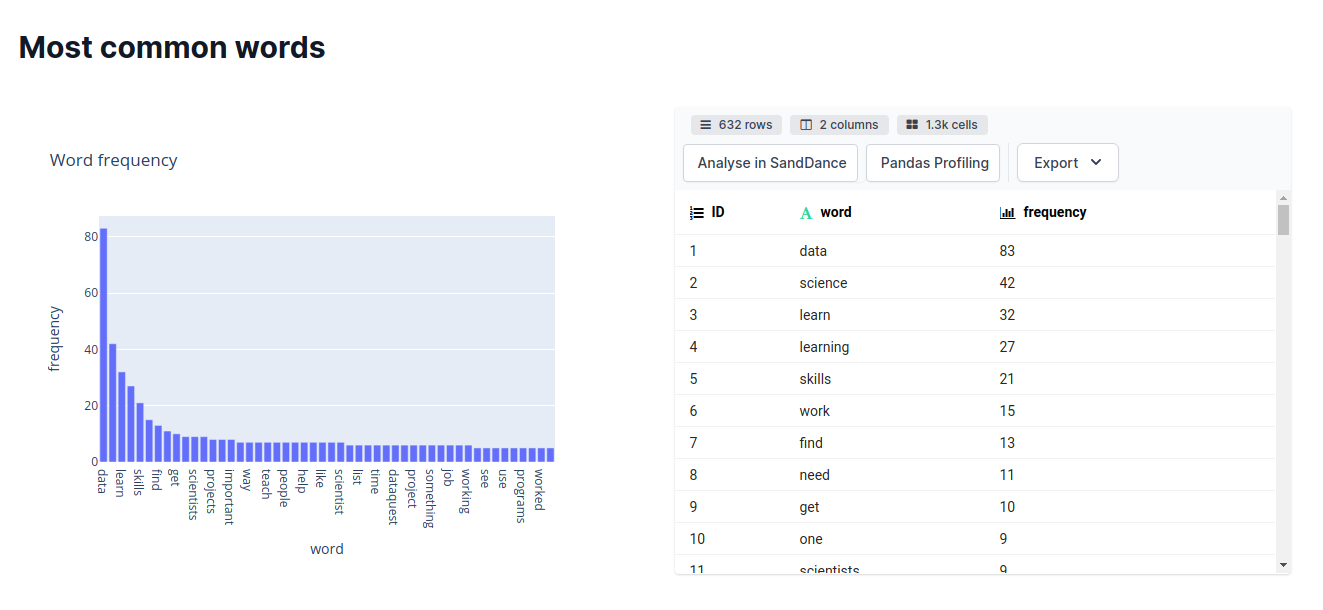
DataTable
The DataTable block renders a pandas DataFrame as an interactive table in your report, along with advanced analysis options such as SandDance and Pandas Profiling.
Let’s create a report for iris dataset using the DataTable block. Use dp.DataTable to create a table. Use dp.Report(table).publish() to create a website for your report.
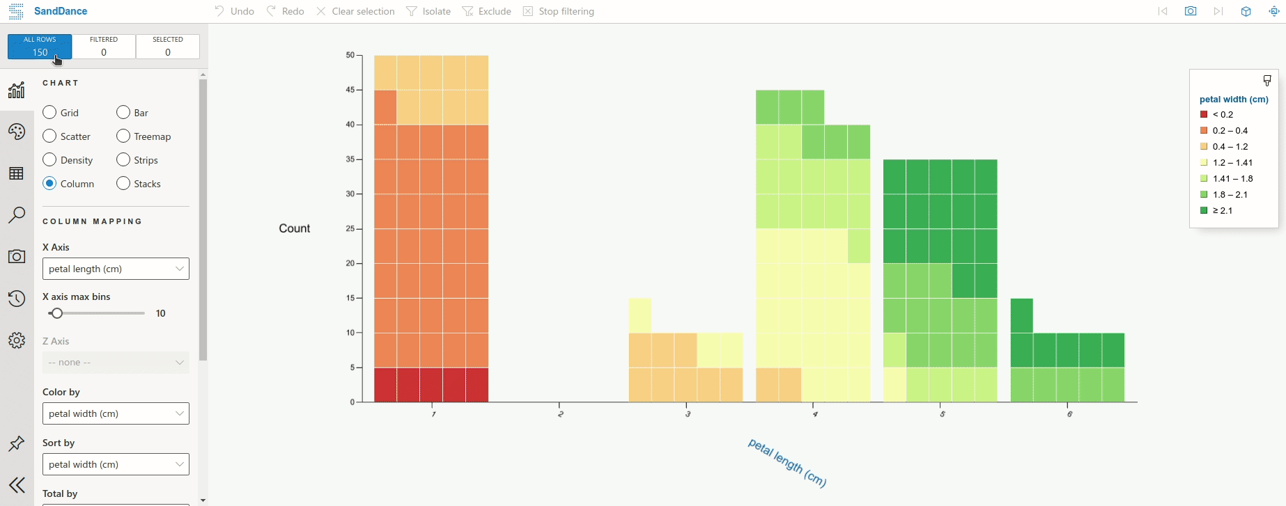
Click “Analyse in SandDance” to visualize the table like below.
GIF by Author
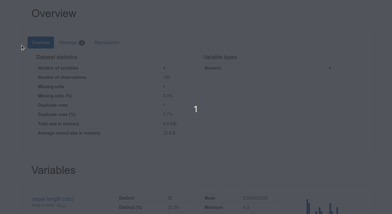
Click “Pandas Profiling” to generate a profile report from a pandas DataFrame. You should see something like below.
GIF by Author
By using DataTable, not only do you have a nice table on a website, but you can also analyze the data using SandDance or Pandas Profiling without adding any code!
File and Code
Image
You can render an image or file in your report using datapane.File :
Created by Author
Code
Sometimes, you might not only want to show the output but also want to show the code snippet used to create that output. To render code in your report, simply wrapdatapane.Code around your code.
And a beautiful code like below will be rendered in your report!
Created by Author
Layout, Pages, and Select
The default view of a Datapane report is nice as it is, but if you want to customize it further, you can use components such as Group, Page, and Select.
Tabs and Selection
If you want to switch between multiple blocks interactively in your reports, such as switching between the output and the source code, you can use dp.Select .
Now you can click the “WordCloud” tab to view the image and click the “Source code” tab to view the source code!
Group
If you want to have two or three components side-by-side, you can use dp.Group
Now your table and plot should lay side-by-side like below!
Created by Author
Page
Page is a higher-level component compared to Select and Group. Page allows you to have multiple pages within one report.
And
By running the code above, your report should have 2 pages such as WordCloud and Iris like below!
Created by Author
Bonus: An End-to-End Project Using Datapane
That’s it! If you want to see a complete project using Datapane’s components, I created an end-to-end project that generates a report summarizing an article, finding keywords, and getting the most common words of that article.
Below is the report of that project. Feel free to play with the source code here.
Created by Author
Conclusion
Congratulations! You have just learned how to use the new features of Datapane to create a beautiful report in Python. Instead of sharing boring code, now you can create a report that showcases your analysis results and share it with your teammates, stakeholders, or your social network!
I like to write about basic data science concepts and play with different data science tools. You could connect with me on LinkedIn and Twitter.
Star this repo if you want to check out the codes for all of the articles I have written. Follow me on Medium to stay informed with my latest data science articles like these:
This article was co-written by Barr Moses, CEO and co-founder of Monte Carlo, and Jit Papneja, a global insights & analytics leader at several Fortune 100 companies, including The Coca-Cola Company, Johnson & Johnson, and Nestlé.
You’re on Snowflake and Looker? Great. But for most companies, having a cloud data stack is just the tip of the iceberg when it comes to operationalizing their data and analytics at scale. We share five non-obvious roadblocks businesses face when becoming data driven and highlight what some of the industry’s leading data engineering and analytics teams are doing to overcome them.
In2021, you’ll be hard-pressed to find a company that doesn’t want to be seen as “data-driven” or “data-first.” Yet for most, data analytics is just a buzzword, not an innovative source of critical business value.
In order for your business’s data analytics strategy to reach its full potential, you have to build a culture of data appreciation and adoption across the entire organization. We share five of the most common challenges that stand in the way of analytics excellence — and how you can tackle them.
Challenge #1: Too many pilots, too few scaled initiatives
Many times, data is used to solve siloed problems within the context of pilots and experiments, not fully productionalized projects. This is common, especially in the early stages of building a data-driven enterprise, but it’s a landmine you should address sooner rather than later.
Too many pilots create a misperception in the rest of the company — that data is for experiments, not creating business value. This perception makes it difficult to start building buy-in and a shared understanding of the possible value of data and analytics.
As swiftly as possible, move to a strategic position by aligning your data and analytics vision with your overall business strategy. Identify priorities where data and analytics solutions can explicitly deliver on the most critical elements — and work to unlock trapped value by quickly moving proven proofs-of-concept pilots into production.
As you identify key priorities, ask yourself —what is the goal of your data and analytics solutions? What business questions are you trying to answer? And what actions will you empower business leaders to take based on your work? What value these initiatives will create?
Challenge #2: Organizational bottlenecks
Even if you have well-structured data in place, you need to have the right people with the right skill sets on the right teams to make use of it. The same team that develops a brilliant idea for how to leverage data to solve a problem may not be equipped to test and scale up the solution, creating bottlenecks and eroding confidence in data-backed initiatives.
One proven approach to address this challenge is to adopt a “Hub-and-Spoke” model, with a dedicated hub owning the strategy and governance, talent management, and providing a companywide set of data and analytics services for the entire organization to leverage.
“Hub” accelerates business value by delivering critical services with the right capabilities to the enterprise. “Spoke” teams work on functional roadmaps and execute functional data and analytics initiatives as they have deep functional knowledge, function-specific skill set and understand functional needs and processes better. “Spokes” follow common guidelines and principles set by the “hub”, and are accountable for adoption and value realization of cross-functional enterprise wide initiatives, championed by “Hub.” You should also form agile delivery squads, a cross-functional team of teams with its own defined goal, which they work towards autonomously. Each squad has a ‘product owner’ and prioritize work to be done.
Take a step back and examine your organizational structure.Do you have the right mix of talent with the right tools and access to take an idea to a proof-of-concept to full production? Do you have clearly defined roles and responsibilities and ways of working?Are teams function as One Team, in One Voice, and towards One Goal?
Challenge #3: Lots of data but little insight
When companies try to improve their ROI on analytics, the data itself is rarely the challenge — it’s the ability for employees to glean meaningful insights from a large volume of data. Teams need to know what data is used for which purpose, where they can find it, and how they can access it. We call this data democratization.
To address this challenge, set two major end goals employees should have a single source of truth for data, and the organization should treat data as a strategic, valuable asset that shouldn’t be misused or wasted.
This is not a simple task. The team of teams need to work across several cross-functional teams to get data out of siloed ownership by implementing a common data acquisition framework, and introducing a standard data governance program. You should also implement a proven data catalog system, which enables employees to find and access datasets shared across the entire organization, and to trust that it has reliable data to use in their daily work.
Big accomplishments don’t happen overnight, but leaders can start building momentum by hosting informational sessions or ‘lunch and learns’ that show your teams how to leverage the data and analytics they can access right now in their day-to-day jobs.
As you move towards data democratization, ask yourself: Do you have a clearly defined data strategy? How can you communicate your strategy, and build an appetite within your entire organization to adopt a shared approach to data and analytics?
Challenge #4: Trying to be everything for everyone
Machine learning and other AI disciplines have emerged as powerful solutions for driving profitable growth while generating and scaling analytics. However, as many companies rush to adopt ML and AI, data and analytics leaders face the challenge of trying to be everything for everyone — applying new technologies and methodologies simply because you could, without stopping to determine if you should.
Similar to the first challenge, as you start to introduce AI into your data program, begin by identifying the problems where machine learning and other automated solutions can be most effective and drive meaningful business outcomes.
For example, data quality management, a necessary component of any serious data strategy, often requires significant manual threshold setting and metadata entry. ML-first approaches, like end-to-end data observability, allows data engineers and analysts to focus on projects that actually move the needle, as opposed to ad hoc firefighting or manual toil. With data teams spending 80 percent of their time and companies wasting $15 million annually on data quality issues, data observability enables teams to increase data accuracy with little effort as you apply data across the entire organization.
ML is also used to make predictions, such as how Uber directs its drivers to an area about to surge in demand or how Airbnb recommends prices to maximize revenue in dynamic markets. In every case, the quality of the predictions are entirely dependent on the quality of the data used to train the machine learning models.
If you plan to build custom models, first make sure you have enough data to do the project justice — and be aware of the potential biases that will likely come into play.
Answer the following before leveraging AI and ML: Are our datasets clean enough and accurate enough to remove manual oversight? Have we identified the points where biases may come into play, and do we know how to detect and correct them? Again, this is where a robust approach to data observability can help.
Challenge #5: Security, privacy, and governance
As always, security and privacy are ever-present factors that will impact the success of your data program. As you work to break down silos and increase access to data, you need to make sure that data — including every access point and pipeline it touches — is secure.
Getting the right data governance approach in place early on, with your long-term goals and outcomes in mind, will help you implement and scale analytics more easily over time. You should ensure your entire data stack, including warehouses, catalogs, and BI platforms, are compliant with data governance guidelines for your company, industry and region.
All of these challenges are significant, but not insurmountable. With these best practices, a strategic vision, and the right technology, your data analytics program can drive meaningful change across every business unit and be a force multiplier for years to come.
Implementing a data analytics strategy at your company? We’re all ears! Reach out to Barr Moses or Jit Papneja.
To learn more about what we’re up at Monte Carlo to help companies overcome these bottlenecks and achieve reliable data, check us out!
In my other posts you learned how ABN AMRO makes data available in a data mesh style architecture. In this blogpost you will learn about how to break big data monoliths apart.
Data-driven decision-making shift
In the years since data warehouses became a commodity, much has changed. Distributed systems have gained great popularity, data is larger and more diverse, new database designs have popped up, and the advent of cloud has separated compute and storage for increased scalability and elasticity. Combine these trends with the shift from centralized to domain-oriented data ownership, and you will immediately understand the importance of changing the way data-intensive applications must be designed.
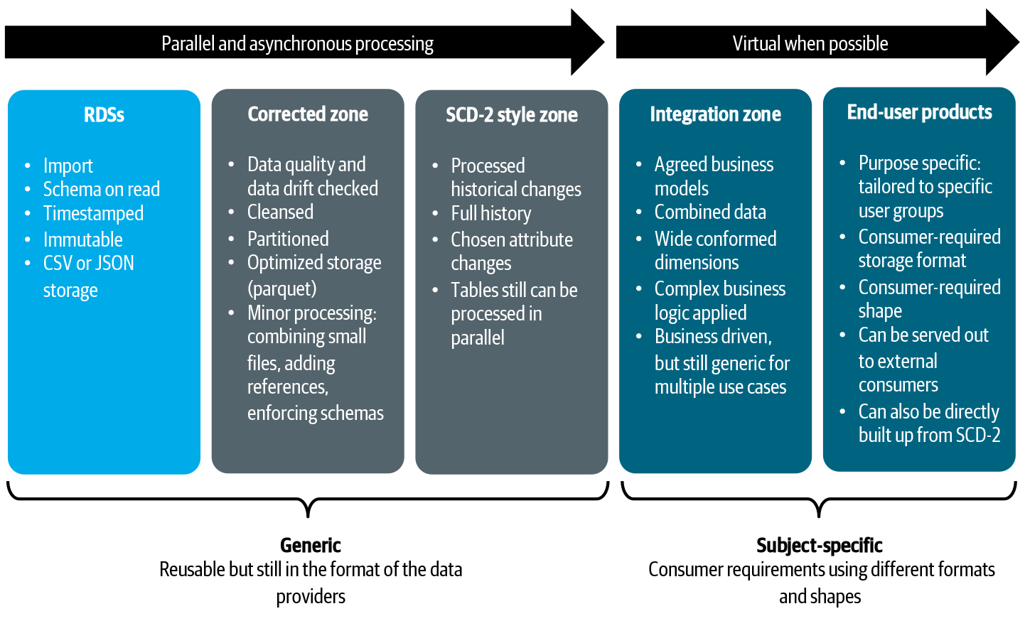
In our data architecture we made a clear split between direct data consumption and creation of new data. In the data distribution architecture, as you can read here and here, we have positioned Read Data Stores (RDS) to capture and serve out larger volumes of immutable data repeatedly to consumers. In this pattern, data is read but no new data is created. Consuming applications or users use the RDSs directly as their data sources and might perform some lightweight integration based on mappings between similar data elements. The big benefit of this model is that it does not require data engineering teams creating and maintaining new data models. You don’t extract, transform, and load data into a new database. Transformations happen on the fly, but these results don’t need a permanent new home. This approach is particular useful for data exploration, lightweight reporting and simple analytical models that don’t require complex data transformation.
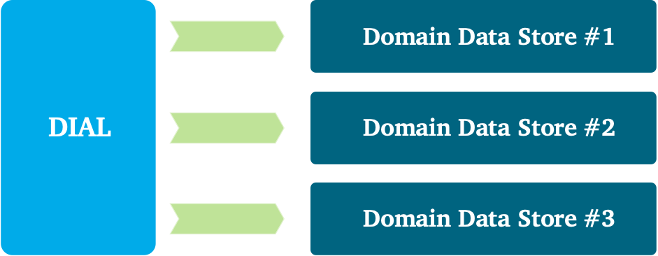
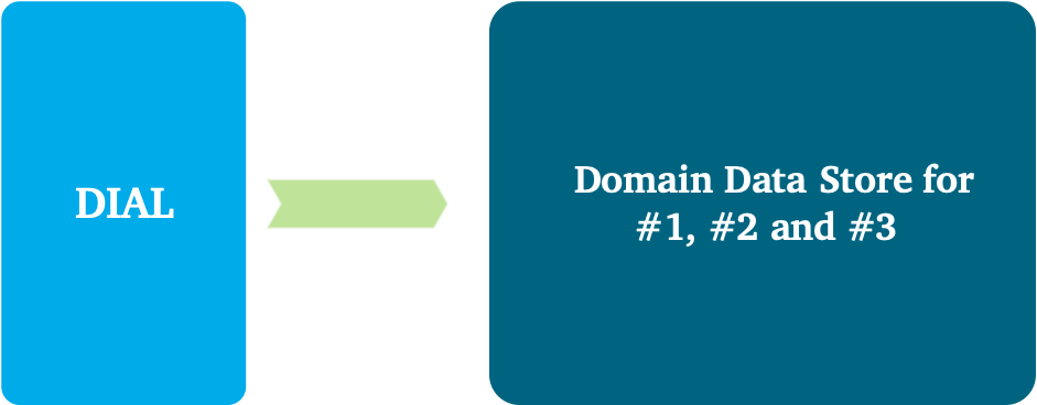
The problem, however, is that the consumers’ needs can exceed what RDSs offer. In some cases, there is a clear need for new data creation: for example, complex business logic followed by analytical models that generate new business insights. To preserve these insights for later analysis, you need to retain this information somewhere, for example, in a database. Another situation can be that the amount of data that needs to be processed exceeds what the RDS platform can handle. In such a case, the amount of data processing; for example, of historical data, is so intense that you would be justified in incrementally bringing data over to a new location, processing it, and pre-optimizing it for later consumption. One more situation would be when multiple RDSs need to be combined and harmonized. This typically requires orchestrating many tasks and bringing data together. Making users wait until all of these tasks are finished will negatively affect user experience. These implications bring us to the second pattern of data consumption: creating Domain Data Stores (DDSs).
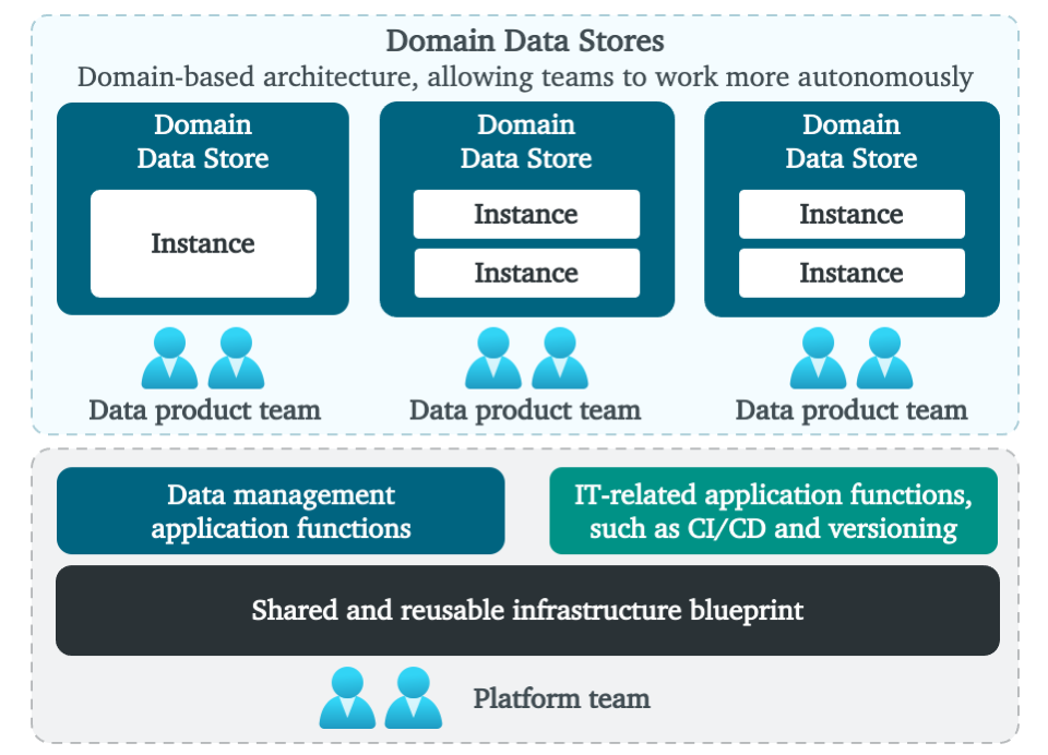
Domain Data Stores
We want to manage newly created data more carefully, while at the same time increasing agility. This is what DDSs are positioned for. This type of application has the role to intensively process data, store the newly created data, and facilitate the consumer’s use case. To unlock the value at large, we have designed a new architecture, which includes a platform for data engineering teams. Let’s look side and evaluate the characteristics.
What we envision is an ecosystem that allows rapid delivery of new data-driven decision use cases. It facilitates data engineering and intensive processing at large, while staying in control and not seeing a proliferation of technologies. We foresee a shift from generic (enterprise) data integration towards business specific data creation; a shift from integration specialists to community building and seamless collaboration; and a shift from rigid data models toward more flexible or “schema-light” approaches.
At high-level the ecosystem looks like Figure 1 above; a fully managed platform that allows fast data ingestion, transformation and usage. At the bottom, you see managed infrastructure, which main goal is to hide away complexity from all data engineering teams. There are reusable functions to support data engineering teams in a self-service manner. These include reusable and managed database technologies, central monitoring and logging, lineage, identity and access management, orchestration, CI/CD, data and schema versioning, patterns for batch-, API- and event-based ingestion, integration with business intelligence and advanced analytics capabilities, and so on. The underpinning platform is managed using a Team Topologies approach: a central platform team manages the underlying platform, while supporting all other teams. The main purpose is to simplify all services, governing and securing the platform and with that reducing the overhead for data engineering teams.
On top, you see DDSs in which data is managed by the data engineering teams. These domain teams focus on either data products, customer journeys or business use cases. The boundaries around DDSs also determine data responsibilities. These include data quality, ownership, integration and distribution, metadata registration, modeling, and security. I’ll come back to the granularity and domain boundaries later.
For the functional requirements, we ensure business objectives and goals are well-defined, detailed, and complete. Understanding them is the foundation for your solution and requires you to clarify the criteria for what business problems need to be solved, what data sources are required, what solutions need to be operational, what data processing must be performed in real time or offline, what the integrity and requirements are, and what out‐ come is subject to reuse by other domains.
For the non-functional requirements, we made choices about how many and what type of data store technologies are offered. You can think of a common set of reusable database technologies or data stores and patterns to ensure leveraging the strength of each data store. For example, mission-critical and transitional applications might only be allowed to go with strong consistency models, or business intelligence and reporting might only be allowed with stores that provide fast SQL access.
Different data stores manage and organize their data internally. One common way of organizing is to separate (either logically or physically) the concerns of ingesting, cleansing, curating, harmonizing, serving, and so on. Within our domain data stores, we encourage using various zones with different storage techniques, such as folders, buckets, databases, and the like. Zones also allow us to combine purposes, so a store can be used to facilitate operations and analytics at the same time. For all stores and zones, the scope must be very clear.
For the data models, we encourage to shift away from rigid data models toward more “schema-light” approaches. However, any architectural style is allowed. If teams embrace schema-on-read or prefer directly building up simple dimensional models, we encourage them to do so. Kimball, or Data Vault modeling can be also applied. It all depends on the needs and size of the use case, which brings me to the next subject.
Domain Data Store Granularity
When we transition away from our enterprise data warehouses into more fine-grained DDS designs, we need to consider the granularity and logically segment our data. Determining the scope, size, and placement of logical DDS boundaries is difficult and causes challenges when distributing data between domains. Typically, the boundaries are subject-oriented and aligned with business capabilities. When defining the logical boundaries of a domain, there is value in decomposing it into subdomains for ease of data modelling activities and internal data distribution within the domain.
The important task is to think carefully about the logical role of your DDS. This covers as well the business granularity and technical granularity:
The business granularity starts with a top-down decomposition of the business concerns: the analysis of the highest-level functional context, scope (i.e., ‘boundary context’) and activities. These must be divided into smaller ‘areas’, use cases and business objectives. This exercise requires good business knowledge and expertise on how to divide efficiently business processes, domains, functions etc. The best practice is to use business capabilities as a reference model, study common terminology (ubiquitous language) and overlapping data requirements.
The technical granularity is performed towards specific goals such as: reusability, flexibility (easy adaptation to frequent functional changes), performance, security and scalability. The key point of balance is about making the right trade-offs. A business domain might use the same data, but if the technical requirements are conflicting with each other it might be better to separate the concerns. For example, if one specific business task needs to intensively aggregate data, and another one only quickly selects individual records, it can be better to separate the concerns. The same might apply for flexibility. One use case might require daily changes, the other one must remain stable for at least a quarter. Again, you should consider separating the concerns. Therefore, we decomposed DDSs in such a way that instances are allowed within a DDS boundary.
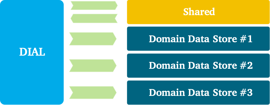
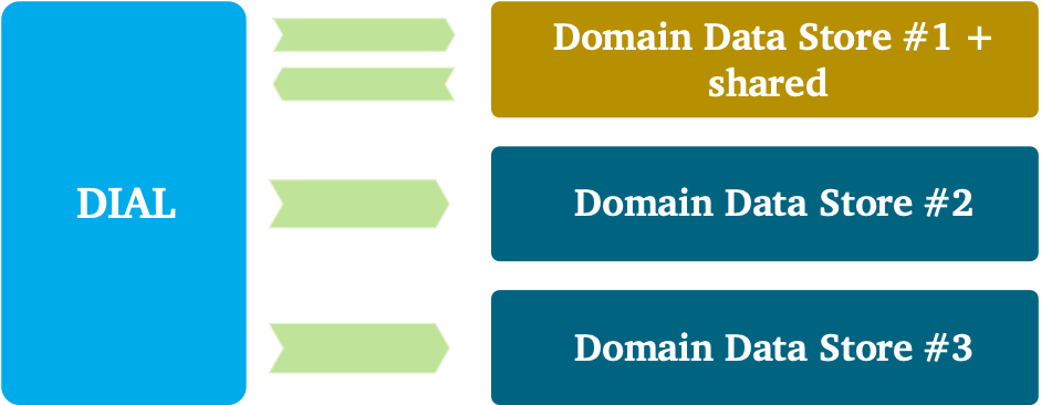
The story of organizing data internally can become more complex when a domain is larger and composed of several subdomains. The DDS in this view is more abstract: instances and zones can be shared between multiple subdomains, and zones can be exclusive. Let me try to make this concrete with an example. For a large domain, you could plot a boundary around all the various zones of one DDS. Within this DDS, for example, the first two zones can be shared between multiple subdomains. So cleaning, correcting, and building up historical data is commonly performed for all subdomains. For the transformation, the story becomes more complex because data is required to be specific for a subdomain or use case. So, there can be pipelines that are shared and pipelines that are solely specific to one use case. This entire chain of data, including all of the pipelines, belong together and thus can be seen as one giant DDS implementation. Inside this giant DDS implementation, as you just learned, you see different boundaries: boundaries that are generic for all subdomains and boundaries that are specific.
Decomposing a domain is especially important when a domain is larger, or when subdomains require generic — repeatable — integration logic. In such situations it could help to have a generic subdomain that provides integration logic in a way that allows other subdomains to standardize and benefit from it. A ground rule is to keep the shared model between subdomains small and always aligned on the ubiquitous language. For the overlap, we use different patterns from domain-driven design.
Imagine three illustrative use cases in which data requirements overlap. Different integration and distribution patterns can be applied within and across the different teams. Let’s explore which different approaches you can apply.
The separate ways pattern can be used if the associated cost of duplication is preferred over reusability. This pattern is typically a choice when high flexibility and agility are required. It can also be a choice when little or nothing is in common from a modeling perspective.
Teams can work use a partnership pattern to accommodate the shared development needs of all parties when overlap is large. All teams must be willing to cooperate with and regard each other’s needs. A big commitment is needed from everybody, because each cannot change the shared logic freely. Data engineering teams, in this approach, are both data consumers and providers: they capture, extract and load it into data stores, and republish or distribute it.
A customer-supplier pattern can be used if one team is strong and willing to take ownership of the data and needs of downstream consumers. The drawbacks of this pattern can be conflicting concerns, forcing downstream teams to negotiate deliverables and schedule priorities.
A conformist pattern can be used to conform all parties entirely to all requirements. This pattern can also be a choice when the integration work is extremely complex, no other parties are allowed to have control, or when vendor packages are used.
The architecture that we have been building throughout this chapter helps you to understand how we manage data-intensive applications at scale. You’ve seen that to achieve a faster time to value, it’s important to decomposition data using domain boundaries. By smashing silos and keeping dependencies between DDSs to a minimum, we let teams stay focused.
The architecture that we discussed throughout this blogpost helps us manage data at scale. If you are curious to learn more, I engage you to have a look at the book Data Management at Scale.
As every writer knows, a picture is worth a thousand words; and in the field of data science, a goodvisualization is worth its weight in gold. As someone still incredibly new to this industry and skillset, I can’t speak from a place of expertise, but as a neophyte data engineer, I arrived at my new company with some pandas in my pocket and the bright city lights in my eyes. My team had been collecting a wealth of fantastic, mostly clean data…but nobody had the time or expertise to transform it into something actionable. What they had discovered in their quest for understanding was perhaps the greatest tool for fledgling data scientists: Google Data Studio.
When I first began playing with its interface, I scoffed and huffed. It wasn’t Pandas, it wasn’t Seaborn, and I’d just spent hundreds of hours learning how to use my fancy new Python skills in the work place so I was determined to do so. That said, the more I worked with it, the more I came to understand the truly powerful nature of Google Data Studio, or GDS, as the cool kids call it.
Everyone likes graphs. Seriously, they do. Even people who hate data like a good graph. Does the line go up? How pretty is it? But most importantly, does the line go up?
I’m kidding (mostly), but in the business world, our job isn’t to play with data, it’s to translate it for those who don’t. Time and time again, you’ll find that a pretty graph will beat a number any day. Not only that, but when you work with a team that gobbles up metrics like candy, you’ll need to provide a multitude of graphs as as fast as possible. Because of this, Google Data Studio is your gal Friday.
Before we get into the power of this program, it’s important to know that it isn’t for everyone. It’s a tool that bridges the gap between data novices and data scientists. Can it do machine learning? No. Should you use it for data cleaning? Dear god, no. Even merging has its limitations. But anyone who has coded a stacked bar chart from scratch will almost be offended at how easy it is to dump a beautiful and accurate chart into a report in less time than it takes to fry an egg (if your data’s clean, of course!).
Where Google Data Studio excels is in the utterly malleable nature of its data manipulation. Every numeric column has a customizable default aggregation, so jumping from detailed rows to a grouped sum is easier than saying ‘Pivot table, schmivot table’. Not only that, but it makes data exploration a drag-and-drop dream. Finally, and most importantly, it is one of the few free programs that allows you to privately share data with your team without having to hassle with hosting it on a closed-access website. I am fully aware of the power and customizability of Streamlit, and I still plan to use that program extensively in the future, but for sharing sensitive data with my team, GDS has been a god-send. I can say, in no small terms, GDS has transformed the way my team works. But why tell you, when I can show you?
The first you’ll notice is how shockingly easy it is to create a fully populated and interactive report within minutes. Remember, GDS is an aggregation tool, so make sure your data is clean and consistent. As the adage goes: “trash in equals trash out,” so you should never expect the fine folks at Google to do the real data engineering work for you.
Step 1: Load your Data
There are several options for loading your data. GDS can handle null values pretty well, but make sure you understand your nulls before you do so as well as the semantic configurations of your columns. One of the most common frustrations when you start is realizing your configurations are all over the place and your data breaks when it comes across a value it doesn’t understand.
GDS has several convenient options for loading your data, though all of them have their pros and cons. Be sure to read your documentation before connecting your data because you won’t notice row-loss until it’s way too late. Data connectors include:
PostgresSQL/MySQL (limit of 100k rows per query)
Google Sheets (data limits without a premium account)
CSV File upload (max dataset size is 100mb)
Google Big Query (I have never used)
Google Analytics/Google Ads (limited to the last three months without the paid version)
And several more Google products
My personal favorite is a Google Sheets. You can connect the two programs in seconds and GDS will treat the sheet as an active Database, so you will see changes reflected in your reports whenever you hit the refresh button at the top of the report page. With most of my reporting, I go with file uploads so I can have as many rows and columns as I please without getting close to the 100mb limit.
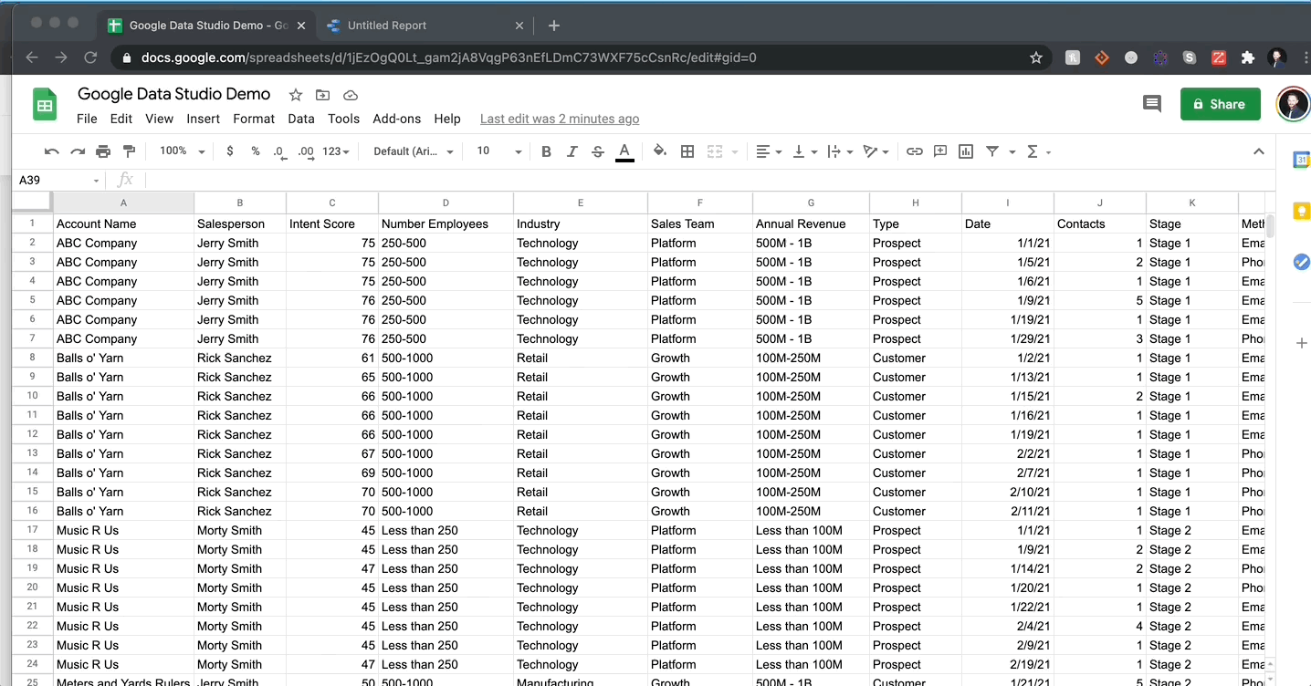
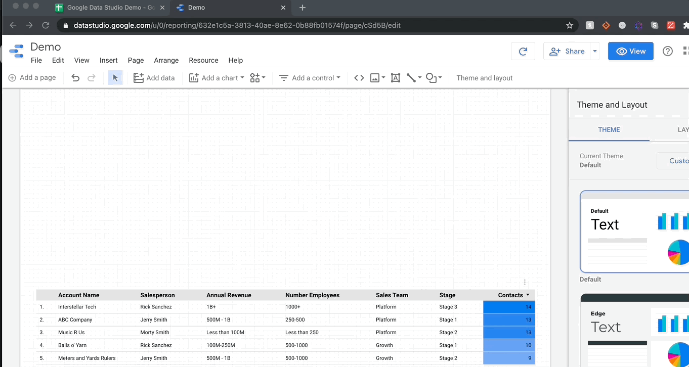
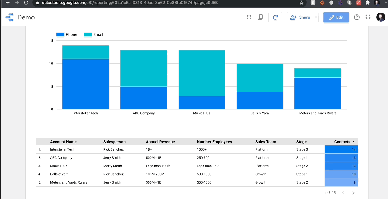
I created a fake dataset to demonstrate how easy it is to load and visualize data. I can tell you emphatically that it took me longer to come up with the fake company names than it did the create my GDS report. My data includes a combination of data types: categorical strings, integers, and dates. Below you can see me connecting this data to GDS and create a table within seconds:
There is nothing more to it than that. I will say, you should ALWAYS check the semantic configuration of your data before manipulating, which I did after I uploaded the data.
Step 2: Visualize
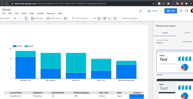
Let me show you how mind-bogglingly easy it is to visualize in GDS. Here’s me adding a stacked bar chart to my report and then changing the dimensions so we can see the breakdown of contact methods per account.
It’s as simple as that! Every chart pulls data from columns (fields in green) while aggregating over metrics (fields in blue). If you want to sum over a a numeric column, just drag it into the metrics and select sum (or average, median, max etc.). For object columns, you have the option of count or count distinct. Finally, there is a specific dimension specifically for date ranges, and that’s where GDS gets really fun.
Step 3: Filters
Anyone can give their team a powerpoint with ready-made graphs, but GDS goes one further. The program is designed to be fully interactive for all team members and that interaction takes the form of filters. In most programs, if you had 3 sales teams, you’d need to make a different report for each team, but in GDS you can create filters to change the report at the click of a button. Filters can control any column in your data.
3A. Filter Control Boxes
You can see the basic interactive filters available on the left. I typically use Drop Down for almost everything, I encourage you to play around and see what works. For every filter, you pick which column it will control and then the metric you want displayed to show what differentiates the column. Let’s say I want to only see accounts for a sales team and the metric I want to see is how many different accounts are in that category. All you have to do is select ‘Account Name’ as your metric and then set aggregation to Count Distinct. And that’s it! Here’s a quick how to:
You can even control which filters affect which charts by grouping report elements. Without grouping, a filter will affect anything with a shared data source, but with grouping you can create complex reports that are still user friendly. You also have the option to apply fixed filters on any report object, with the option to apply said filters to entire groups en masse.
3B. Date Controls
One of the most useful elements of GDS is its live-reporting capabilities. When you connect a Google Analytics data source, it will pull live data directly from your website and aggregate it based on your report. Granted, some data connectors are far faster than others (CSV file uploads tend to be the fastest in my experience, but then data updates are manual). That said, if you’re keeping an eye on longitudinal data, date ranges might be important. GDS is very adept at parsing date columns automatically, but, even if you’re having trouble with a column, you can always create a custom field using the PARSEDATE() function. I won’t get into custom fields now, that will be for another post, but rest assured, if you pass either a datetime column or an object column in the format ‘YYYY-MM-DD’ GDS will translate this just fine, even if there are nulls present.
Date controls affect a specific data field in every chart and field. No matter what object you place on your report, they all have a ‘Date Range’ option. You can also apply date range to groups as well. From there, you can set default date ranges that can be as simple as the last week or as complicated as 47 days before last Wednesday.
3C. Apply Filter
My last little filter pitch is a genius button labeled ‘Apply Filter’ on all chart objects. By switching on this button, you can click a row on a table or a column on a chart and the report will automatically filter based on that object. Check it out:
It’s that easy! Hopefully you can see now how many tools are at your disposal in this free, out-of-the-box package.
CONCLUSION
Google Data Studio has changed my life as the sole data guy on my team, but it certainly has its limitations. I plan on writing a lot more about both the strengths and drawbacks, as well as some helpful how-tos that I discovered while blending data. Here is a quick overview of what makes GDS so powerful:
PROS
Incredibly easy to use (even for non-data people)
A wealth of data connectors with solid documentation
FREE
Excellent for private data sharing within teams
Interactive reports that are very customizable
Uses same field functions as Google Sheets/Excel and provides docstrings for easy reference
Beautiful dynamic charts
The filters are worth the price of admission alone
No coding necessary
CONS
You have to know your data before you force it into a report
There are limitations on upload sizes without upgrading to Google 360 (which costs $150k a year!)
No technical support outside of documentation and forums
Merging data sources has EXTREME limitations (i.e. you cannot join multiple data sources using multiple join keys. ALL tables must have a common join column)
Sometimes it just breaks and the error messages are cryptic at best
Overall, Google Data Studio feels like Data Science-Lite, but outside of Streamlit for teams (which is still in beta) I haven’t found a better, easier option for sharing beautiful, complex, interactive reports with non-data teammates.
I’ll post more how-tos in the future such as the following:
Building a Data Pipeline using the Google Sheets api
Best Data Communication Practices for non-Data Teammates
Data Blending
Thanks, friends! Leave comments if you have questions or thoughts and I’ll do my best to answer.
Cosmos is a computing platform that combines the best aspects of microservices with asynchronous workflows and serverless functions. Its sweet spot is applications that involve resource-intensive algorithms coordinated via complex, hierarchical workflows that last anywhere from minutes to years. It supports both high throughput services that consume hundreds of thousands of CPUs at a time, and latency-sensitive workloads where humans are waiting for the results of a computation.
A Cosmos service
This article will explain why we built Cosmos, how it works and share some of the things we have learned along the way.
Background
The Media Cloud Engineering and Encoding Technologies teams at Netflix jointly operate a system to process incoming media files from our partners and studios to make them playable on all devices. The first generation of this system went live with the streaming launch in 2007. The second generation added scale but was extremely difficult to operate. The third generation, called Reloaded, has been online for about seven years and has proven to be stable and massively scalable.
When Reloaded was designed, we were a small team of developers operating a constrained compute cluster, and focused on one use case: the video/audio processing pipeline. As time passed the number of developers more than tripled, the breadth and depth of our use cases expanded, and our scale increased more than tenfold. The monolithic architecture significantly slowed down the delivery of new features. We could no longer expect everyone to possess the specialized knowledge that was necessary to build and deploy new features. Dealing with production issues became an expensive chore that placed a tax on all developers because infrastructure code was all mixed up with application code. The centralized data model that had served us well when we were a small team became a liability.
Our response was to create Cosmos, a platform for workflow-driven, media-centric microservices. The first-order goals were to preserve our current capabilities while offering:
Observability — via built-in logging, tracing, monitoring, alerting and error classification.
Modularity — An opinionated framework for structuring a service and enabling both compile-time and run-time modularity.
Productivity — Local development tools including specialized test runners, code generators, and a command line interface.
Delivery — A fully-managed continuous-delivery system of pipelines, continuous integration jobs, and end to end tests. When you merge your pull request, it makes it to production without manual intervention.
While we were at it, we also made improvements to scalability, reliability, security, and other system qualities.
Overview
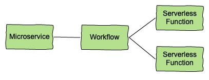
A Cosmos service is not a microservice but there are similarities. A typical microservice is an API with stateless business logic which is autoscaled based on request load. The API provides strong contracts with its peers while segregating application data and binary dependencies from other systems.
A typical microservice
A Cosmos service retains the strong contracts and segregated data/dependencies of a microservice, but adds multi-step workflows and computationally intensive asynchronous serverless functions. In the diagram below of a typical Cosmos service, clients send requests to a Video encoder service API layer. A set of rules orchestrate workflow steps and a set of serverless functions power domain-specific algorithms. Functions are packaged as Docker images and bring their own media-specific binary dependencies (e.g. debian packages). They are scaled based on queue size, and may run on tens of thousands of different containers. Requests may take hours or days to complete.
A typical Cosmos service
Separation of concerns
Cosmos has two axes of separation. On the one hand, logic is divided between API, workflow and serverless functions. On the other hand, logic is separated between application and platform. The platform API provides media-specific abstractions to application developers while hiding the details of distributed computing. For example, a video encoding service is built of components that are scale-agnostic: API, workflow, and functions. They have no special knowledge about the scale at which they run. These domain-specific, scale-agnostic components are built on top of three scale-aware Cosmos subsystems which handle the details of distributing the work:
Optimus, an API layer mapping external requests to internal business models.
Plato, a workflow layer for business rule modeling.
Stratum, a serverless layer called for running stateless and computational-intensive functions.
The subsystems all communicate with each other asynchronously via Timestone, a high-scale, low-latency priority queuing system. Each subsystem addresses a different concern of a service and can be deployed independently through a purpose-built managed Continuous Delivery process. This separation of concerns makes it easier to write, test, and operate Cosmos services.
Separation of Platform and Application
A Cosmos service request
Trace graph of a Cosmos service request
The picture above is a screenshot from Nirvana, our observability portal. It shows a typical service request in Cosmos (a video encoder service in this case):
There is one API call to encode, which includes the video source and a recipe
The video is split into 31 chunks, and the 31 encoding functions run in parallel
The assemble function is invoked once
The index function is invoked once
The workflow is complete after 8 minutes
Layering of services
Cosmos supports decomposition and layering of services. The resulting modular architecture allows teams to concentrate on their area of specialty and control their APIs and release cycles.
For example, the video service mentioned above is just one of many used to create streams that can be played on devices. These services, which also include inspection, audio, text, and packaging, are orchestrated using higher-level services. The largest and most complex of these is Tapas, which is responsible for taking sources from studios and making them playable on the Netflix service. Another high-level service is Sagan, which is used for studio operations like marketing clips or daily production editorial proxies.
Layering of Cosmos services
When a new title arrives from a production studio, it triggers a Tapas workflow which orchestrates requests to perform inspections, encode video (multiple resolutions, qualities, and video codecs), encode audio (multiple qualities and codecs), generate subtitles (many languages), and package the resulting outputs (multiple player formats). Thus, a single request to Tapas can result in hundreds of requests to other Cosmos services and thousands of Stratum function invocations.
The trace below shows an example of how a request at a top level service can trickle down to lower level services, resulting in many different actions. In this case the request took 24 minutes to complete, with hundreds of different actions involving 8 different Cosmos services and 9 different Stratum functions.
Trace graph of a service request through multiple layers
Workflows rule!
Or should we say workflow rules? Plato is the glue that ties everything together in Cosmos by providing a framework for service developers to define domain logic and orchestrate stateless functions/services. The Optimus API layer has built-in facilities to invoke workflows and examine their state. The Stratum serverless layer generates strongly-typed RPC clients to make invoking a serverless function easy and intuitive.
Plato is a forward chaining rule engine which lends itself to the asynchronous and compute-intensive nature of our algorithms. Unlike a procedural workflow engine like Netflix’s Conductor, Plato makes it easy to create workflows that are “always on”. For example, as we develop better encoding algorithms, our rules-based workflows automatically manage updating existing videos without us having to trigger and manage new workflows. In addition, any workflow can call another, which enables the layering of services mentioned above.
Plato is a multi-tenant system (implemented using Apache Karaf), which greatly reduces the operational burden of operating a workflow. Users write and test their rules in their own source code repository and then deploy the workflow by uploading the compiled code to the Plato server.
Developers specify their workflows in a set of rules written in Emirax, a domain specific language built on Groovy. Each rule has 4 sections:
match: Specifies the conditions that must be satisfied for this rule to trigger
action: Specifies the code to be executed when this rule is triggered; this is where you invoke Stratum functions to process the request.
reaction: Specifies the code to be executed when the action code completes successfully
error: Specifies the code to be executed when an error is encountered.
In each of these sections, you typically first record the change in state of the workflow and then perform steps to move the workflow forward, such as executing a Stratum function or returning the results of the execution (For more details, see this presentation).
Latency-sensitive applications
Cosmos services like Sagan are latency sensitive because they are user-facing. For example, an artist who is working on a social media post doesn’t want to wait a long time when clipping a video from the latest season of Money Heist. For Stratum, latency is a function of the time to perform the work plus the time to get computing resources. When work is very bursty (which is often the case), the “time to get resources” component becomes the significant factor. For illustration, let’s say that one of the things you normally buy when you go shopping is toilet paper. Normally there is no problem putting it in your cart and getting through the checkout line, and the whole process takes you 30 minutes.
Resource scarcity
Then one day a bad virus thing happens and everyone decides they need more toilet paper at the same time. Your toilet paper latency now goes from 30 minutes to two weeks because the overall demand exceeds the available capacity. Cosmos applications (and Stratum functions in particular) have this same problem in the face of bursty and unpredictable demand. Stratum manages function execution latency in a few ways:
Resource pools. End-users can reserve Stratum computing resources for their own business use case, and resource pools are hierarchical to allow groups of users to share resources.
Warm capacity. End-users can request compute resources (e.g. containers) in advance of demand to reduce startup latencies in Stratum.
Micro-batches. Stratum also uses micro-batches, which is a trick found in platforms like Apache Spark to reduce startup latency. The idea is to spread the startup cost across many function invocations. If you invoke your function 10,000 times, it may run one time each on 10,000 containers or it may run 10 times each on 1000 containers.
Priority. When balancing cost with the desire for low latency, Cosmos services usually land somewhere in the middle: enough resources to handle typical bursts but not enough to handle the largest bursts with the lowest latency. By prioritizing work, applications can still ensure that the most important work is processed with low latency even when resources are scarce. Cosmos service owners can allow end-users to set priority, or set it themselves in the API layer or in the workflow.
Throughput-sensitive applications
Services like Tapas are throughput-sensitive because they consume large amounts of computing resources (e.g millions of CPU-hours per day) and are more concerned with the completion of tasks over a period of hours or days rather than the time to complete an individual task. In other words, the service level objectives (SLO) are measured in tasks per day and cost per task rather than tasks per second.
For throughput-sensitive workloads, the most important SLOs are those provided by the Stratum serverless layer. Stratum, which is built on top of the Titus container platform, allows throughput sensitive workloads to use “opportunistic” compute resources through flexible resource scheduling. For example, the cost of a serverless function invocation might be lower if it is willing to wait up to an hour to execute.
The strangler fig
We knew that moving a legacy system as large and complicated as Reloaded was going to be a big leap over a dangerous chasm littered with the shards of failed re-engineering projects, but there was no question that we had to jump. To reduce risk, we adopted the strangler fig pattern which lets the new system grow around the old one and eventually replace it completely.
Still learning
We started building Cosmos in 2018 and have been operating in production since early 2019. Today there are about 40 cosmos services and we expect more growth to come. We are still in mid-journey but we can share a few highlights of what we have learned so far:
The Netflix engineering culture famously relies on personal judgement rather than top-down control. Software developers have both freedom and responsibility to take risks and make decisions. None of us have the title of Software Architect; all of us play that role. In this context, Cosmos emerged in fits and starts from disparate attempts at local optimization. Optimus, Plato and Stratum were conceived independently and eventually coalesced into the vision of a single platform. The application developers on the team kept everyone focused on user-friendly APIs and developer productivity. It took a strong partnership between infrastructure and media algorithm developers to turn the vision into reality. We couldn’t have done that in a top-down engineering environment.
Microservice + Workflow + Serverless
We have found that the programming model of “microservices that trigger workflows that orchestrate serverless functions” to be a powerful paradigm. It works well for most of our use cases but some applications are simple enough that the added complexity is not worth the benefits.
A platform mindset
Moving from a large distributed application to a “platform plus applications” was a major paradigm shift. Everyone had to change their mindset. Application developers had to give up a certain amount of flexibility in exchange for consistency, reliability, etc. Platform developers had to develop more empathy and prioritize customer service, user productivity, and service levels. There were moments where application developers felt the platform team was not focused appropriately on their needs, and other times when platform teams felt overtaxed by user demands. We got through these tough spots by being open and honest with each other. For example after a recent retrospective, we strengthened our development tracks for crosscutting system qualities such as developer experience, reliability, observability and security.
Platform wins
We started Cosmos with the goal of enabling developers to work better and faster, spending more time on their business problem and less time dealing with infrastructure. At times the goal has seemed elusive, but we are beginning to see the gains we had hoped for. Some of the system qualities that developers like best in Cosmos are managed delivery, modularity, and observability, and developer support. We are working to make these qualities even better while also working on weaker areas like local development, resilience and testability.
Future plans
2021 will be a big year for Cosmos as we move the majority of work from Reloaded into Cosmos, with more developers and much higher load. We plan to evolve the programming model to accommodate new use cases. Our goals are to make Cosmos easier to use, more resilient, faster and more efficient. Stay tuned to learn more details of how Cosmos works and how we use it.
Pandas is dominating the data analysis and manipulation tasks with small-to-medium sized data in tabular form. It is arguably the most popular library in the data science ecosystem.
I’m a big fan of Pandas and have been using it since I started my data science journey. I love it so far but my passion for Pandas should not and does not prevent me from trying different tools.
I like to try comparing differenttools and libraries. My way of comparison is to do the same tasks with both. I usually compare what I already know with the new one I want to learn. It not only makes me learn a new tool but also helps me practice what I already know.
One of my colleagues told me to try the “data.table” package for R. He argued that it is more efficient than Pandas for data analysis and manipulation tasks. So I gave it a try. I was impressed by how simple it was to accomplish certain tasks with “data.table”.
In this article, I will go over several examples to make a comparison between Pandas and data.table. I’m still debating if I should change my default choice of data analysis library from Pandas to data.table. However, I can say that data.table is the first candidate to replace Pandas.
Without further ado, let’s start with the examples. We will use a small sample from the Melbourne housing dataset available on Kaggle for the examples.
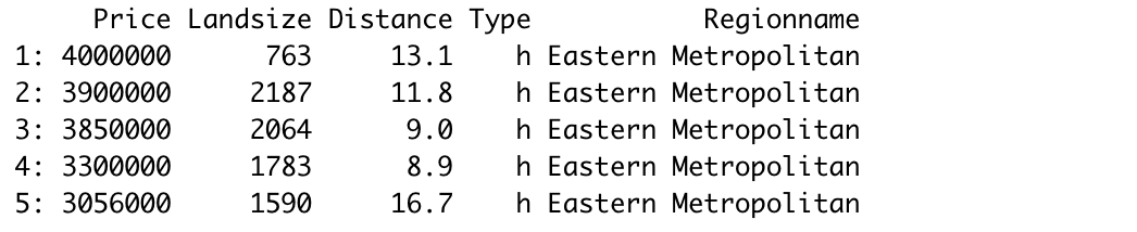
The first step is to read the dataset which is done by the read_csv and fread functions for Pandas and data.table, respectively. The syntax is almost the same.
#Pandas
import numpy as np
import pandas as pdmelb = pd.read_csv("/content/melb_data.csv",
usecols = ['Price','Landsize','Distance','Type', 'Regionname'])#data.table
library(data.table)melb <- fread("~/Downloads/melb_data.csv", select=c('Price','Landsize','Distance','Type', 'Regionname'))
The first 5 rows (image by author)
Both libraries provide simple ways of filtering rows based on column values. We want to filter the rows with type “h” and distance greater than 4.
We only write the column names in data.table whereas Pandas requires to with the name of the dataframe as well.
The next task is to sort the data points (i.e. rows). Consider we need to sort the rows by region name in ascending order and then by price in descending order.
Here is how we can accomplish this task with both libraries.
The logic is the same. The columns and the order (ascending or descending) are specified. However, the syntax is much simple with data.table.
Another advantage of data.table is that the indices are reset after sorting which is not the case with Pandas. We need to use an additional parameter (ignore_index) to reset the index.
Pandas (image by author)
data.table (image by author)
Another common task in data analysis is to group observations (i.e. rows) based on the categories in a column. We then calculate statistics on numerical columns for each group.
Let’s calculate the average price and land size of the houses for each category in the type column. We also want to see the number of houses in each category.
With Pandas, we select the columns of interest and use the groupby function. Then the aggregations functions are specified.
Edit: Thanks Henrik Bo Larsen for the heads up. I overlooked the flexibility of the agg function. We can do the same operation without selecting the columns first:
We use the “by” parameter to select the column to be used in grouping. The aggregate functions are specified while selecting the columns. It is simpler than Pandas.
Let’s also add a filtering component and calculate the same statistics for houses that cost less than 1 million.
The filtering component is specified in the same square brackets with data.table. On the other hand, we need to do the filtering before all other operations in Pandas.
Conclusion
What we covered in this article are common tasks done in a typical data analysis process. There are, of course, many more functions these two libraries provide. Thus, this article is not a comprehensive comparison. However, it sheds some light on how tasks are handled in both.
I have only focused on the syntax and the approach to complete certain operations. Performance related issues such as memory and speed are yet to discover.
To sum up, I feel like data.table is a strong candidate to replace Pandas for me. It also depends on the other libraries you frequently use. If you heavily use Python libraries, you may want to stick with Pandas. However, data.table is definitely worth a try.
Thank you for reading. Please let me know if you have any feedback.
Pandas is a highly popular data analysis and manipulation library. It provides numerous functions to perform efficient data analysis. Furthermore, its syntax is simple and easy-to-understand.
In this article, we focus on a particular function of Pandas, the groupby. It is used to group the data points (i.e. rows) based on the categories or distinct values in a column. We can then calculate a statistic or apply a function on a numerical column with regards to the grouped categories.
The process will be clear as we go through the examples. Let’s start by importing the libraries.
import numpy as np
import pandas as pd
We also need a dataset for the examples. We will use a small sample from the Melbourne housing dataset available on Kaggle.
I have only read a small part of the original dataset. The usecols parameter of the read_csv function allows for reading only the given columns of the csv file. I have also filtered out the outliers with regards to the price and land size. Finally, a random sample of 1000 observations (i.e. rows) is selected using the sample function.
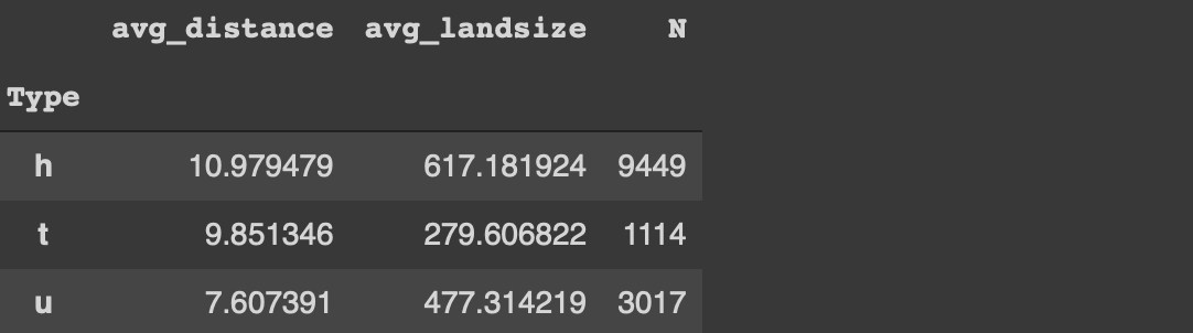
Before starting on the tips, let’s implement a simple groupby function to perform average distance for each category in the type column.
df[['Type','Distance']].groupby('Type').mean()
(image by author)
The houses (h) are further away from the central business district than the other two types on average.
We can now start with the tips to use the groupby function more effectively.
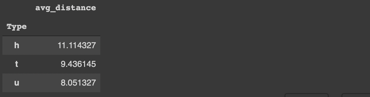
1. Customize the column names
The groupby function does not change or customize the column names so we do not really know what the aggregated values represent. For instance, in the previous example, it would be more informative to change the column name from “distance” to “avg_distance”.
One way to accomplish this is to use the agg function instead of the mean function.
We can always change the column name afterwards but this method is more practical.
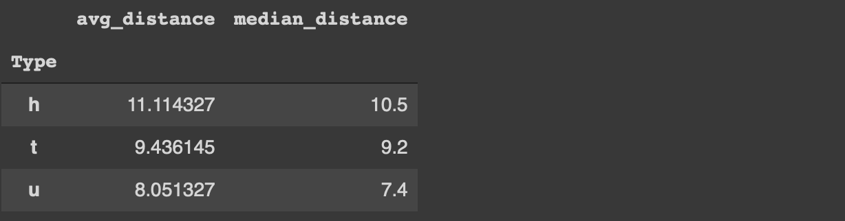
Customizing the column names becomes more important if we aggregate multiple columns or apply different functions to one column. The agg function accepts multiple aggregations. We just need to specify the column name and the function.
For instance, we can calculate the average and median distance values for each category in the type column as below.
Lambda expression is a special form of functions in Python. In general, lambda expressions are used without a name so we do not define them with the def keyword like normal functions.
The main motivations behind the lambda expressions are simplicity and practicality. They are one-liners and usually only used at once.
The agg function accepts lambda expressions. Thus, we can perform more complex calculations and transformations along with the groupby function.
For instance, we can calculate the average price for each type and convert it to millions with one lambda expression.
If we want to perform analysis on this dataframe later on, it is not practical to have the type and region name columns as index. We can always use the reset_index function but there is a more optimal way.
If the as_index parameter of the groupby function is set to false, the grouped columns are represented as columns instead of index.
The groupby function ignores the missing values by default. Let’s first update some of the values in the type column as missing.
df.iloc[100:150, 0] = np.nan
The iloc function selects row-column combinations by using indices. The code above updates the rows between 100 and 150 of the first column (0 index) as missing value (np.nan).
If we try to calculate the average distance for each category in the type column, we will not get any information about the missing values.
df[['Type','Distance']].groupby('Type').mean()
(image by author)
In some case, we also need to get an overview of the missing values. It may affect how we aim to handle the them. The dropna parameter of the groupby function is used to also calculate the aggregations on the missing values.
The groupby functions is one of the most frequently used functions in the exploratory data analysis process. It provides valuable insight into the relationships between variables.
It is important to use the groupby function efficiently to boost the data analysis process with Pandas. The 4 tips we have covered in this article will help you make the most of the groupby function.
Thank you for reading. Please let me know if you have any feedback.
Notebooks have always been a tool for the incremental development of software ideas. Data scientists use Jupyter to journal their work, explore and experiment with novel algorithms, quickly sketch new approaches and immediately observe the outcomes.
This interactivity is what makes Jupyter so appealing. To take it one step further, Data Scientists use Jupyter widgets to visualize their results or create mini web apps that facilitate navigating through the content or encourage user interaction.
However, IPyWidgets are not always easy to work with. They do not follow the declarative design principles pioneered by front-end developers, and the resulting components cannot be transferred as is in a browser environment. Also, the developers created these libraries mostly to cover the visualization needs of Data Scientists. Thus, they fall short of features that popular front-end frameworks like React and Vue bring to the table.
It is time to take the next step; This story introduces IDOM: a set of libraries for defining and controlling interactive webpages or create visual Jupyter components. We will discuss the latter.
Learning Rate is a newsletter for those who are curious about the world of AI and MLOps. You’ll hear from me every Friday with updates and thoughts on the latest AI news and articles. Subscribe here!
IDOM: React design patterns in Python
So, let’s get started with IDOM. For those familiar with React, you’ll find many similarities in the way IDOM does things.
We will create a simple TODO application inside Jupyter. Yes, I don’t know how this would help a Data Scientist, but what I’m trying to do is showcase IDOM’s capabilities. If you find any Data Science use cases, please leave them in the comments!
First, the code. Then, we will walk through one line at a time to understand how it works.
The idom.component decorator creates a Component constructor. This component is rendered in the screen using the function below it (e.g., todo()). Then, to display it, we need to call this function and create an instance of this component at the end.
Now, let’s get into what this function does. First, The use_state() function is a Hook. Calling this method returns two things: a current state value and a function that we can use to update this state. In our case, the current state is just an empty list.
Then, we can use the update function inside an add_new_task() method to do whatever we want. This function takes an event and checks if the event was produced by hitting your keyboard’s Enterkey. If that’s true, it retrieves the event’s value and appends it to the list of tasks.
To store the tasks that the user creates, we append their name in a separate tasks Python list, alongside a simple delete button. The delete button, when pressed, calls the remove_task() function, which updates the state just like the add_new_task() function. However, instead of adding a new item to the current state, it removes the selected one.
Finally, we create an input element to create TODO tasks and an HTML table element to hold them. In the last step, we render them using a div HTML tag.
It gets better
So far, so good. However, the power that IDOM gives us is not limited to displaying HTML elements. The real power of IDOM comes from its ability to install and use any React ecosystem components seamlessly.
In this example, let’s use victory, a set of React components for modular charting and data visualization. To install victory, we can use the IDOM CLI:
!idom install victory
Then, let’s use it in our code:
Congrats! You’ve just created a Pie chart with victory in a Jupyter Notebook! Of course, it is also straightforward to import and use your existing JavaScript modules. See how in the documentation.
Conclusion
Data Scientists use Jupyter widgets to visualize their results or create mini web apps that facilitate navigating through the content or encourage user interaction.
However, IPyWidgets are not always easy to work with. They also have some drawbacks: they do not follow declarative design principles, and the resulting components cannot be transferred as is in a browser environment.
It is time to take the next step; This story examined IDOM: a set of libraries for defining and controlling interactive webpages or create visual Jupyter components.
The IDOM API is described more exhaustively in the documentation. Also, you can play with idom-jupyter on Binder, before installing.
About the Author
My name is Dimitris Poulopoulos, and I’m a machine learning engineer working for Arrikto. I have designed and implemented AI and software solutions for major clients such as the European Commission, Eurostat, IMF, the European Central Bank, OECD, and IKEA.
If you are interested in reading more posts about Machine Learning, Deep Learning, Data Science, and DataOps, follow me on Medium, LinkedIn, or @james2pl on Twitter. Also, visit the resources page on my website, a place for great books and top-rated courses, to start building your own Data Science curriculum!
One of the often-overlooked parts of sequence generation in natural language processing (NLP) is how we select our output tokens — otherwise known as decoding.
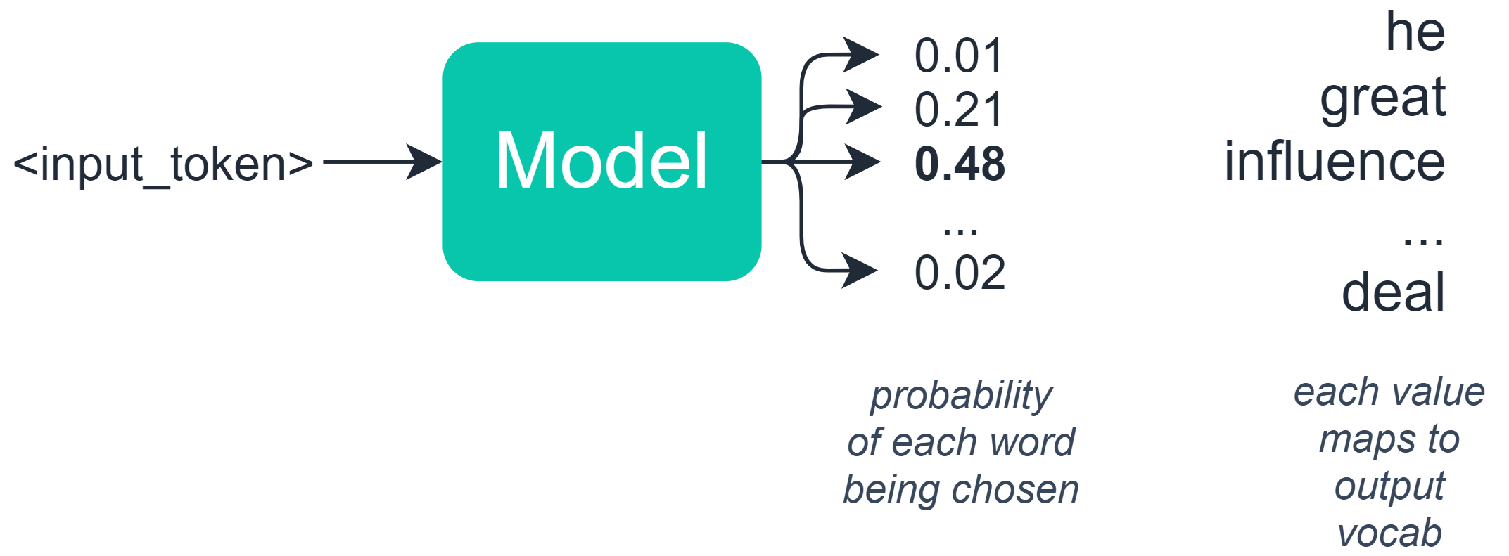
You may be thinking — we select a token/word/character based on the probability of each token assigned by our model.
This is half-true — in language-based tasks, we typically build a model which outputs a set of probabilities to an array where each value in that array represents the probability of a specific word/token.
At this point, it might seem logical to select the token with the highest probability? Well, not really — this can create some unforeseen consequences — as we will see soon.
When we are selecting a token in machine-generated text, we have a few alternative methods for performing this decode — and options for modifying the exact behavior too.
In this article we will explore three different methods for selecting our output token, these are:
> Greedy Decoding> Random Sampling> Beam Search
It’s pretty important to understand how each of these works — often-times in language applications, the solution to a poor output can be a simple switch between these four methods.
If you’d prefer video, I cover all three methods here too:
I’ve included a notebook for testing each of these methods with GPT-2 here.
Greedy Decoding
The simplest option we have is greedy decoding. This takes our list of potential outputs and the probability distribution already calculated — and chooses the option with the highest probability (argmax).
It would seem that this is entirely logical — and in many cases, it works perfectly well. However, for longer sequences, this can cause some problems.
If you have ever seen an output like this:
The default text is what we fed into the model — the green text has been generated.
This is most likely due to the greedy decoding method getting stuck on a particular word or sentence and repetitively assigning these sets of words the highest probability again and again.
Random Sampling
The next option we have is random sampling. Much like before we have our potential outputs and their probability distribution.
Random sampling chooses the next word based on these probabilities — so in our example, we might have the following words and probability distribution:
Random sampling allows us to randomly choose a word based on its probability previously assigned by the model
We would have a 48% chance of the model selecting ‘influence’, a 21% chance of it choosing ‘great’, and so on.
This solves our problem of getting stuck in a repeating loop of the same words because we add randomness to our predictions.
However, this introduces a different problem — we will often find that this approach can be too random and lacks coherence:
So on one side, we have greedy search which is too strict for generating text — on the other we have random sampling which produces wonderful gibberish.
We need to find something that does a little of both.
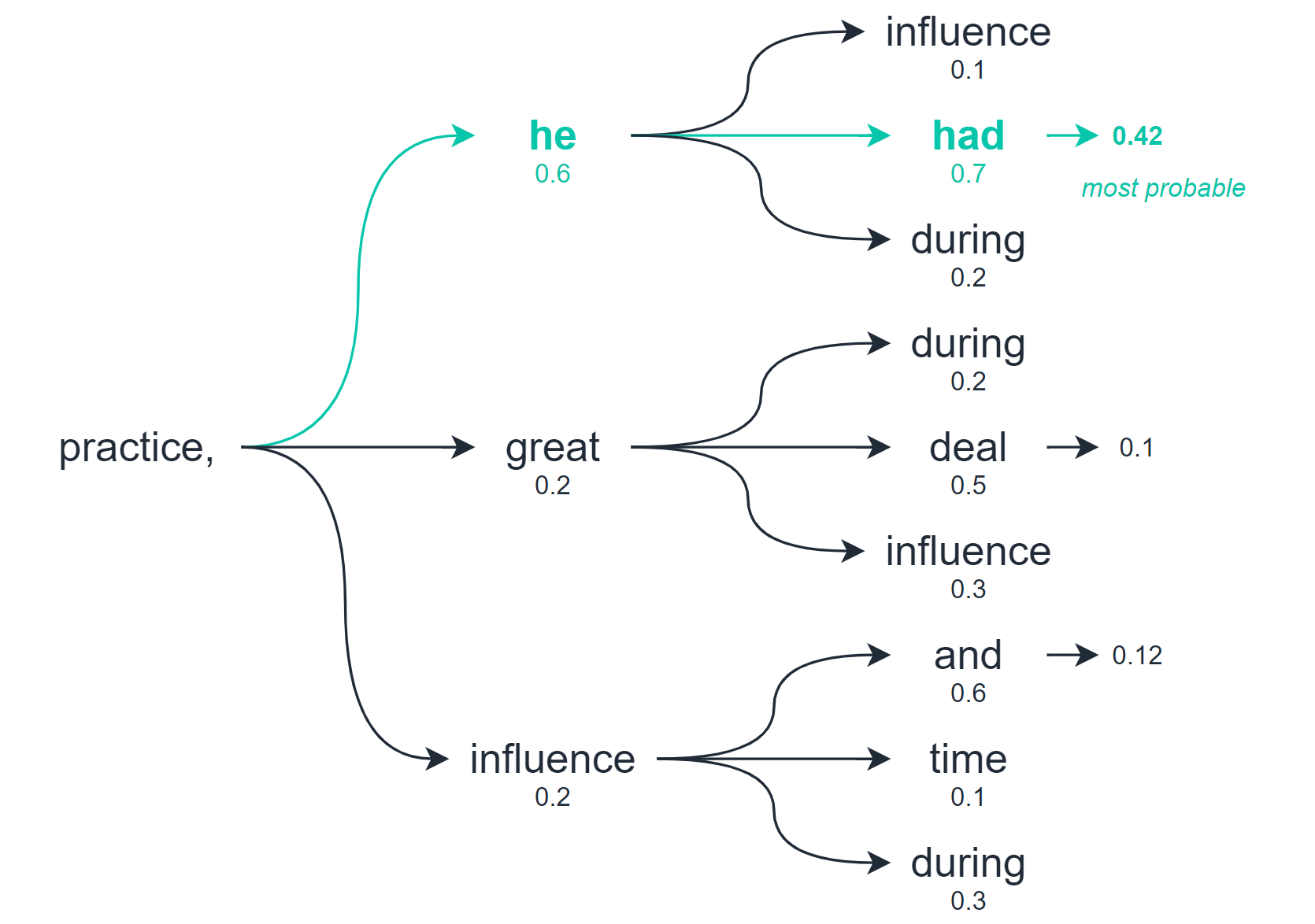
Beam Search
Beam search allows us to explore multiple levels of our output before selecting the best option.
Beam search, as a whole the ‘practice, he had’ scored higher than any other potential path
So whereas greedy decoding and random sampling calculate the best option based on the very next word/token only — beam search checks for multiple word/tokens into the future and assesses the quality of all of these tokens combined.
From this search, we will return multiple potential output sequences — the number of options we consider is the number of ‘beams’ we search with.
However, because we are now back to ranking sequences and selecting the most probable — beam search can cause our text generation to again degrade into repetitive sequences:
So, to counteract this, we increase the decoding temperature — which controls the amount of randomness in the outputs. The default temperature is 1.0 — pushing this to a slightly higher value of 1.2 makes a huge difference:
With these modifications, we have a peculiar but nonetheless coherent output.
That’s it for this summary of text generation decoding methods!
I hope you’ve enjoyed the article, let me know if you have any questions or suggestions via Twitter or in the comments below.
Thanks for reading!
If you’re interested in learning how to set up a text generation model in Python, I wrote this short article covering how here:
Conditional probability theory often leads to unique and interesting solutions to certain mathematical problems. There is a mix of excitement and disbelief when a complex probabilistic problem can be solved in a relatively simply manner. This is certainly the case with the Gambler’s Ruin Problem, a famous statistical scenario centered around conditional probabilities and experimental outcomes. What is possibly even more fascinating about this problem is that its structure extends beyond conditional probability into random variables and distributions, particularly as an application of unique Markov chains with interesting properties.
Elementary probability problems are based on mathematical descriptions of uncertain outcomes. Elementary statistics gives us a set of tools that we can use to determine probabilities of uncertain outcomes using theorems as well as demystifying complex scenarios. Solving the Gambler’s Ruin Problem is not a task that we must do on a daily basis, but understanding its structure helps us develop a critical and mathematical mindset when approaching situations rooted in uncertainty.
Note: This post requires that the reader understands elementary probability and statistical theory, which itself requires exposure to both calculus and linear algebra. It is also assumed that the reader has some basic knowledge on Markov chains.
Problem Statement
The Gambler’s Ruin Problem in its most basic form consists of two gamblers A and B who are playing a probabilistic game multiple times against each other. Every time the game is played, there is a probability p (0 < p < 1) that gambler A will win against gambler B. Likewise, using basic probability axioms, the probability that gambler B will win is 1 – p. Each gambler also has an initial wealth that limits how much they can bet. The total combined wealth is denoted by k and gambler A has an initial wealth denoted by i, which implies that gambler B has an initial wealth of k – i.Wealth is required to be positive. The last condition we apply to this problem is that both gamblers will play indefinitely until one of them has lost all their initial wealth and thus cannot play anymore.
Imagine that gambler A’s initial wealth i is an integer dollar amount and that each game is played for one dollar. That means that gambler A will have to play at least i games for their wealth to drop to zero. The probability that they win one dollar in each game is p, which will be equal to 1/2 if the game is fair for both gamblers. If p > 1/2, then gambler A has a systematic advantage and if p < 1/2 then gambler A has a systematic disadvantage. The series of games can only end in two outcomes: gambler A has a wealth of k dollars (gambler B lost all their money), or gambler A has a wealth of 0 dollars (gambler B has all the wealth). The main focus of the analysis is to determine the probability that gambler A will end up with a wealth of k dollars instead of 0 dollars. Regardless of the outcome, one of the gamblers will end up in financial ruin, hence the name Gambler’s Ruin.
Problem Solution
Continuing with the same structure outlined above, we now want to determine the probability aᵢ that gambler A will end up with k dollars given that they started out with i dollars. For the sake of simplicity, we will add an additional assumption here: all games are identical and independent. Every time the gamblers play a new game, it can be interpreted as a new iteration of the Gambler’s Ruin problem where the initial wealth of each gambler are different, depending on the outcome of the most recent game. Mathematically, we can think of each sequence of games that ends in gambler A having j dollars where j = 0, … , k. The probability gambler A wins given that a specific sequence occurs is aⱼ. Any sequence that ends in gambler A having k dollars means that they won, so aₖ=1. Likewise, any sequence than ends in gambler A having 0 dollars means that they are in ruin so a₀=0. We are interested in determining the probabilities for all values of i=1, … , k – 1.
Using event notation, we can denote A₁ as the event that gambler A wins game 1. Similarly, B₁ is the event that gambler B wins game 1. The event W occurs when gambler A ends up with k dollars before they end up with 0 dollars. The probability that this event occurs can be derived using properties of conditional probability.
Probability of winning using conditional probabilities
Given that gambler A starts with i dollars, the probability that they win is P(W)=aᵢ. If gambler A wins one dollar in the first game, then their wealth becomes i+1. If they lost one dollar in the first game, their fortune becomes i – 1. The probability that they win the entire sequence will then depend on whether they won they won the first game. When we apply this logic to the previous equation, we know have an expression of the probability of winning the entire sequence of games that depends on the probability of winning one dollar each game and the conditional probabilities of winning the sequence given the gamblers wealth.
Probability of winning using problem notation
The wealth of gambler A at any given point in time varies between the total initial wealth of both gamblers and zero. In other words, given i=1, … , k – 1, we can plug in all possible values of i into the equation above to obtain k – 1 equations that determine the probability of winning based on adjacent values of i. We can use elementary algebra to aggregate these equations into a standardized format that can be simplified into a single formula. This formula specifies a fundamental relation between the probability of winning each game p, the total initial wealth of both gamblers k, and the probability of winning given a wealth of one dollar a₁. Once we have determined a₁, we can iteratively loop through all k – 1 to derive the probability aᵢ for all possible values of i.
Fundamental relation
We will now consider two possibilities: a fair game and an unfair game, which depends on the value of p that we plug into the equation above. In a fair game, where p=1/2, the base of the exponent in the right side of the equation can be simplified to (1 – p)/p=1. We can then simplify the entire equation as follows: 1 – a₁=(k – 1)a₁, which can be rearranged to a₁=1/k. If we iterate over all previous equations that determine the probabilities of winning for different values of i, we arrive at a general solution for fair games.
Solution for a fair game
The equation above is a remarkable result: given that the game is fair, the probability that gambler A will end up with k dollars before they end up with zero dollars is equal to their initial wealth i divided by the total wealth of both gamblers k.
If p is not equal to 1/2 the game is unfair, as one of the two gamblers has a systematic advantage. We can similarly derive a general solution which depends on the value of p and the wealth parameters.
Solution to an unfair game
Note: If the reader is interested in learning the mathematical proofs to arrive at the general solutions, consult the references at the end.
A sequence of random variables X that represent different points in time defined by discrete time intervals can be referred to as a stochastic process. The first random variable in the process is known as the initial state, and the rest of the random variables in the process define the state of each process at time n. Markov chains are a specific kind of stochastic process where conditional distributions of future states depend only on the present state. That is, the conditional distribution of X at time n + j for j > 0 depends only on the state of the process at time n, not on any of the earlier states up to n – 1. We can express this mathematically using the following notation.
Markov chain
A Markov chain is finite if the number of states that can occur at any point in time is noninfinite. Consider a chain with k states. The probability distribution of a state at time n+1 taking a specific value j given the state at time n is known as the transition distribution of the Markov chain. These distributions are considered stationary if the distribution is the same for each time n. We can use the notation pᵢⱼ to denote these distributions.
Stationary transition distributions
The total number of different values that pᵢⱼ can take depends on the total number of possible states k, which we can arrange in a k by k matrix P known as the transition matrix of the Markov chain.
Transition matrix
Transition matrices have important properties that make them unique. Since every element of the matrix represents a probability, all elements are positive. Since each row represents the entire conditional distribution of the next state given the value of the previous state, the values in each row sum to 1. We can extend the probability calculations to multiple steps in a straightforward way by using the transition matrix. That is, we can calculate the probability that the Markov chain will move from a state i to a state j in multiple steps m by taking the transition matrix P to the power of m. That is, the m-step transition matrixPᵐ can be used to calculate the probabilities of specific states between any range of steps in the chain.
If we have a transition matrix where any of the diagonals pᵢᵢ are equal to 1, then the state i is considered an absorbing state. Once a Markov chain goes into an absorbing state, it cannot go into any other state thereafter. Another interesting property is that if a Markov chain has one or more absorbing states, the chain will be absorbed into one of those states eventually.
At the beginning of the Markov chain at time 1, we can specify a vector whose elements represent the probabilities that the chain will be in each state. This is known as the initial probability vector v. We can determine the marginal distribution of the chain at any time n by multiplying the initial probability vector v by the transition matrix P to the power of n – 1. For example, we can find the marginal distribution of the chain at time 2 by the expression vP.
A special case occurs when a probability vector multiplied by the transition matrix is equal to itself: vP=v. When this occurs, we call the probability vector the stationary distribution for the Markov chain.
Gambler’s Ruin Markov Chains
Using the theoretical framework for Markov chains, we can now apply these concepts to the Gambler’s Ruin problem. The fact that we are able to do this shows how intertwined probability and statistical theory can be. We initially framed the problem using exclusively conditional probability theorems derived from the basic probability axioms. Now we can formalize the problem even further and give it more structure using Markov chains. The process of taking an abstract concept and using various tools to analyze it and expand it underlines the magic of statistics.
The Gambler’s Ruin problem is essentially a Markov chain where the sequence of wealth amounts that gambler A has at any point in time determines the underlying structure. That is, at any point in time n, gambler A can have i wealth, where i also represents the state of the chain at time n. When the gambler reaches either 0 wealth or k wealth, the chain has moved into an absorbing state and no more games are played.
If the chain moves into any of the remaining k – 1 states 1, … , k – 1, a game is played again where the probability that gambler A will win p determines the marginal distribution of the state at that specific point in time. The transition matrix has two absorbing states. The first row corresponds to the scenario when gambler A has 0 wealth and the elements of the row are (1, 0, … , 0). Likewise, the last row of the transition matrix corresponds to the scenario when gambler A has reached k wealth and the elements are (0, … , 1). For every other row i, the elements are all zero expect for the terms with coordinates i – 1 and i + 1, which have values 1 – p and p respectively.
Gambler’s Ruin transition matrix
We can also determine the probabilities of states in multiple steps using the m-step transition matrixPᵐ. As m goes to infinity, the m-step matrix converges but the stationary distributions are not unique. The limit matrix of Pᵐ has all zeroes except in its first and last columns. The last column contains all probabilities aᵢ that gambler A will end up with k dollars given that they started out with i dollars, while the first column contains all the respective complements of aᵢ. Since the stationary distributions are not unique, that means that all of the probabilities belong to the absorbing states.
Gambler’s Ruin limit matrix
This last point is especially important because it confirms our initial logical sequence of steps when deriving the solution formulas to the Gambler’s Ruin. In other words, we are able to derive a general formula for the problem as a whole because the stochastic processes (sequence of games) that occur in the problem converge to one of two absorbing states: gambler A walks away with k dollars or gambler A walks away with 0 dollars. Even though infinitely many games can be played, we can still determine the probability that either one of these two events occur because the transition matrix of the Markov chain converges to both stationary distributions.
Conclusion
The Gambler’s Ruin Problem is a great example of how you can take a complex situation and derive a simple general structure from it using statistical tools. It might be difficult to believe that, given a fair game, the probability that someone will win enough games to claim the total wealth of both players is determined by their initial wealth and the total wealth. This is known not only at the beginning of the sequence, but also at each step. Using Markov chains, we can determine the same probabilities between any sequences of games using the transition matrix and the probability vector at the initial state. Consider this, the conclusion that we came to in the first section of this post was enhanced by use of an additional concept. Applying different perspectives to the same problem can open the door to insightful analysis. This is the power of theoretical statistical thinking.