
Datapane’s New Features: Create a Beautiful Dashboard in Python in a Few Lines of Code
Datapane now Supports Pandas Profiling, Code, Images, Customized Layout, and much more!
Motivation
After cleaning the data, creating beautiful visualizations, and getting some helpful insights, you want to share your findings with your social network, friends, or managers, but find it difficult to do so using Jupyter Notebook.
There are ways for you to share your notebook using Binder or GitHub, but they are not interactive, and it takes time for you to do so.
Is there a way that you can create a report for your findings like below in a few lines of code using Python?
That is when Datapane comes in handy.
What is Datapane?
Datapane is an API for people who analyze data in Python and need a way to share their results. I have explained some basic component of Datapane in the previous article such as:
- Pandas DataFrames
- Plots from Python visualization libraries such as Plotly, Bokeh, Altair, and Folium
- Markdown
but Datapane has introduced many more components since my last article including:
- DataTable
- Code, HTML, and files
- Layout, pages, and select
To install Datapane, type
pip install -U datapane
Sign up on Datapane to get your own token and use that token to login in Datapane:
import datapane as dp dp.login('YOUR_TOKEN')
DataTable
The DataTable block renders a pandas DataFrame as an interactive table in your report, along with advanced analysis options such as SandDance and Pandas Profiling.
Let’s create a report for iris dataset using the DataTable block. Use dp.DataTable to create a table. Use dp.Report(table).publish() to create a website for your report.
Output:
Click https://datapane.com/u/khuyentran1401/reports/iris/ to view the report. You should see something similar to what is shown below when clicking the link:
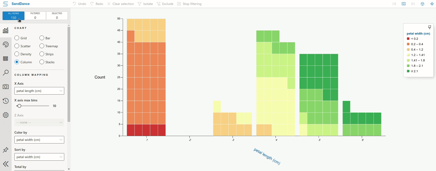
Click “Analyse in SandDance” to visualize the table like below.
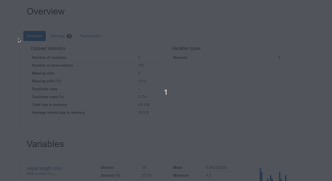
Click “Pandas Profiling” to generate a profile report from a pandas DataFrame. You should see something like below.
By using DataTable, not only do you have a nice table on a website, but you can also analyze the data using SandDance or Pandas Profiling without adding any code!
File and Code
Image
You can render an image or file in your report using datapane.File :
Code
Sometimes, you might not only want to show the output but also want to show the code snippet used to create that output. To render code in your report, simply wrapdatapane.Code around your code.
And a beautiful code like below will be rendered in your report!
Layout, Pages, and Select
The default view of a Datapane report is nice as it is, but if you want to customize it further, you can use components such as Group, Page, and Select.
Tabs and Selection
If you want to switch between multiple blocks interactively in your reports, such as switching between the output and the source code, you can use dp.Select .
The word cloud image above is the result of analyzing this linked article.
Now you can click the “WordCloud” tab to view the image and click the “Source code” tab to view the source code!
Group
If you want to have two or three components side-by-side, you can use dp.Group
Now your table and plot should lay side-by-side like below!
Page
Page is a higher-level component compared to Select and Group. Page allows you to have multiple pages within one report.
By running the code above, your report should have 2 pages such as WordCloud and Iris like below!
Bonus: An End-to-End Project Using Datapane
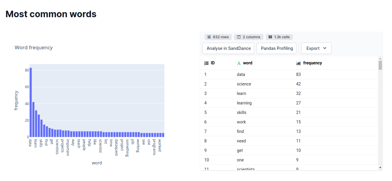
That’s it! If you want to see a complete project using Datapane’s components, I created an end-to-end project that generates a report summarizing an article, finding keywords, and getting the most common words of that article.
Below is the report of that project. Feel free to play with the source code here.
Conclusion
Congratulations! You have just learned how to use the new features of Datapane to create a beautiful report in Python. Instead of sharing boring code, now you can create a report that showcases your analysis results and share it with your teammates, stakeholders, or your social network!
I like to write about basic data science concepts and play with different data science tools. You could connect with me on LinkedIn and Twitter.
Star this repo if you want to check out the codes for all of the articles I have written. Follow me on Medium to stay informed with my latest data science articles like these: