
2021년 2월 14일 모바일 게임 매출 순위
| Rank | Game | Publisher |
|---|---|---|
| 1 | 리니지M | NCSOFT |
| 2 | 리니지2M | NCSOFT |
| 3 | 그랑사가 | NPIXEL |
| 4 | 세븐나이츠2 | Netmarble |
| 5 | Cookie Run: Kingdom | Devsisters Corporation |
| 6 | 기적의 검 | 4399 KOREA |
| 7 | Genshin Impact | miHoYo Limited |
| 8 | R2M | Webzen Inc. |
| 9 | 라이즈 오브 킹덤즈 | LilithGames |
| 10 | V4 | NEXON Company |
| 11 | 바람의나라: 연 | NEXON Company |
| 12 | 메이플스토리M | NEXON Company |
| 13 | 뮤 아크엔젤 | Webzen Inc. |
| 14 | KartRider Rush+ | NEXON Company |
| 15 | S.O.S:스테이트 오브 서바이벌 | KingsGroup Holdings |
| 16 | 미르4 | Wemade Co., Ltd |
| 17 | 리니지2 레볼루션 | Netmarble |
| 18 | 블레이드&소울 레볼루션 | Netmarble |
| 19 | 어비스(ABYSS) | StairGames Inc. |
| 20 | Pmang Poker : Casino Royal | NEOWIZ corp |
| 21 | FIFA ONLINE 4 M by EA SPORTS™ | NEXON Company |
| 22 | 찐삼국 | ICEBIRD GAMES |
| 23 | Roblox | Roblox Corporation |
| 24 | 컴투스프로야구2021 | Com2uS |
| 25 | PUBG MOBILE | KRAFTON, Inc. |
| 26 | Brawl Stars | Supercell |
| 27 | 카운터사이드 | NEXON Company |
| 28 | 한게임 포커 | NHN BIGFOOT |
| 29 | 검은강호2: 이터널 소울 | 9SplayDeveloper |
| 30 | A3: 스틸얼라이브 | Netmarble |
| 31 | Cookie Run: OvenBreak – Endless Running Platformer | Devsisters Corporation |
| 32 | AFK 아레나 | LilithGames |
| 33 | 그랑삼국 | YOUZU(SINGAPORE)PTE.LTD. |
| 34 | Lords Mobile: Kingdom Wars | IGG.COM |
| 35 | Age of Z Origins | Camel Games Limited |
| 36 | 블리치: 만해의 길 | DAMO NETWORK LIMITED |
| 37 | Gardenscapes | Playrix |
| 38 | 라그나로크 오리진 | GRAVITY Co., Ltd. |
| 39 | Dungeon Knight: 3D Idle RPG | mobirix |
| 40 | Homescapes | Playrix |
| 41 | Random Dice: PvP Defense | 111% |
| 42 | Empires & Puzzles: Epic Match 3 | Small Giant Games |
| 43 | Top War: Battle Game | Topwar Studio |
| 44 | Summoners War | Com2uS |
| 45 | 한게임포커 클래식 with PC | NHN Corp. |
| 46 | 명일방주 | Yostar Limited. |
| 47 | 검은사막 모바일 | PEARL ABYSS |
| 48 | 갑부: 장사의 시대 | BLANCOZONE NETWORK KOREA |
| 49 | FIFA Mobile | NEXON Company |
| 50 | 모두의마블 | Netmarble |
Using the right tools to visualize data -번역
데이터 시각화와 관련하여 대부분의 사람들은 무엇을해야하는지에 대한 직접적인 아이디어를 가지고 있습니다.산점도를 사용하여 두 변수 간의 관계를 표시합니다.상자 그림은 변수에서 개별 요소의 분산을 비교하는 데 사용됩니다.원형 차트를 사용하여 여러 클래스가 변수에 전체적으로 기여하는 방식을 나타낼 수 있습니다.시계열도는 누군가 또는 조직에 의해 시간에 따른 진행 상황을 표시하는 데 사용할 수 있습니다.
단단한 것 말고나는어떤 차트를 사용할지 결정하기 위해 소프트웨어 패키지를 사용하여 그래프를 만들고 차트를 개발하는 것이 중요하며이를 가능하게하는 데 사용할 수있는 여러 리소스가 있습니다.R을 통한 ggplot2, python을 통한 seaborn, Tableau, PowerBI, MS Excel은 차트를 작성하는 데 사용되는 유명한 플랫폼 중 일부입니다.
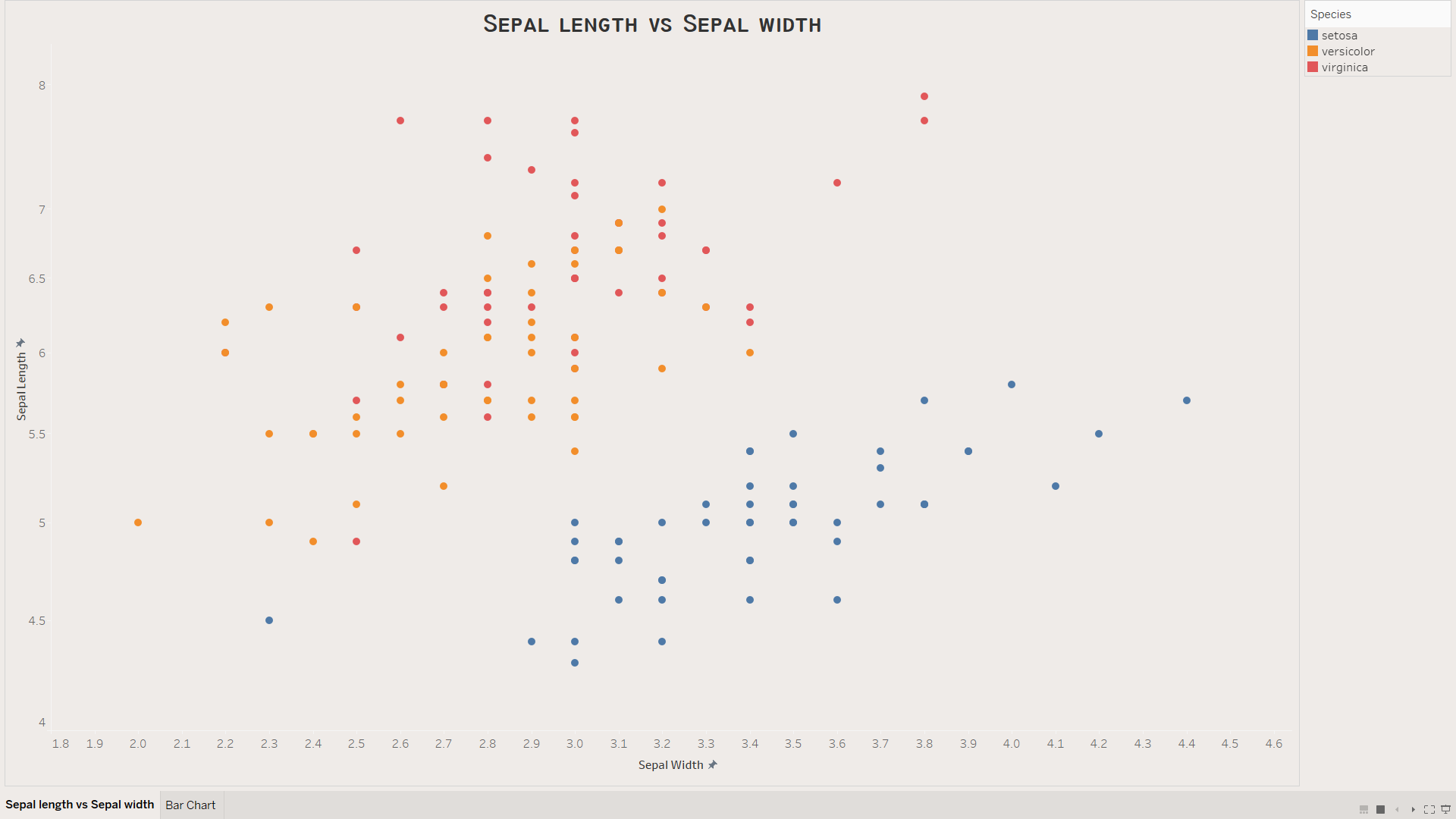
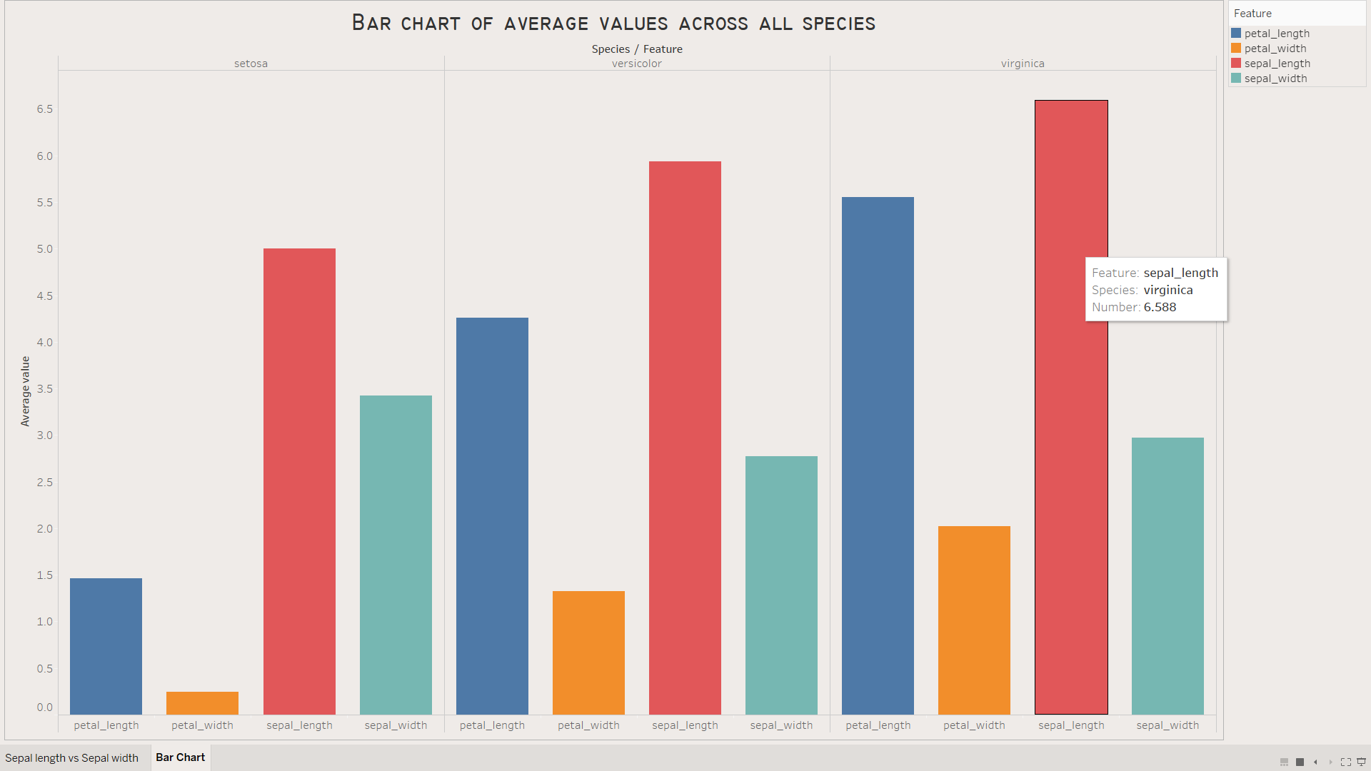
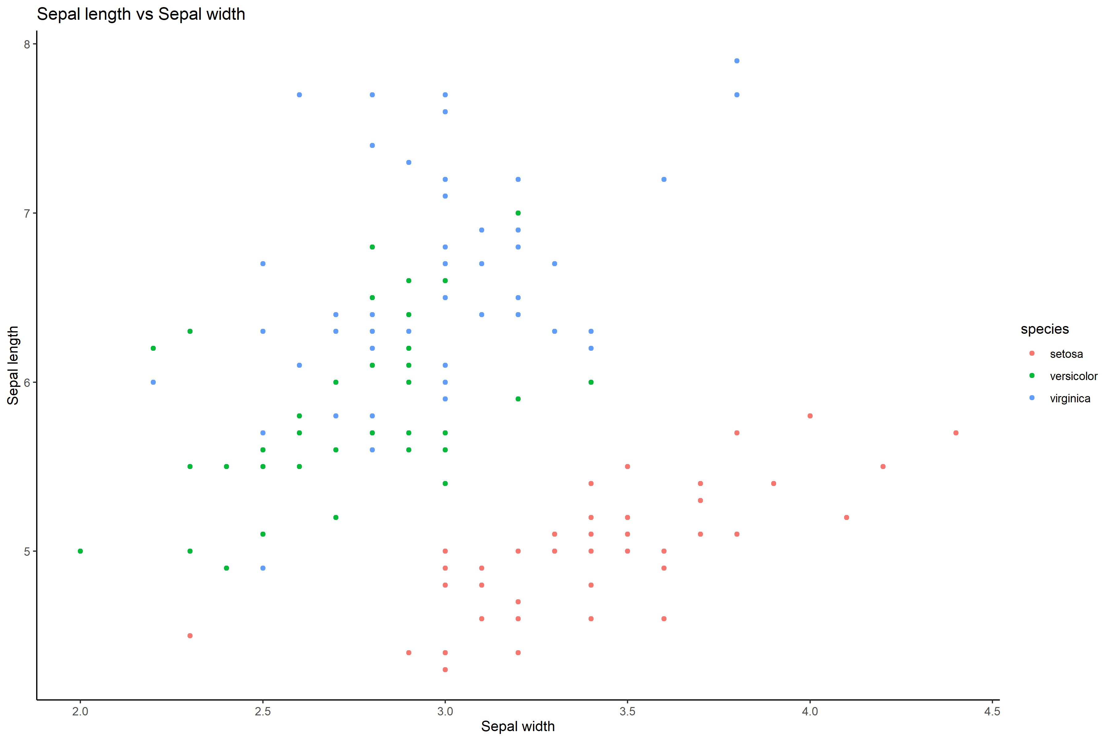
이 기사에서는 Tableau, seaborn 및 ggplot2의 세 가지 패키지 / 플랫폼에서 차트를 작성하는 데 필요한 프로세스에 초점을 맞출 것입니다.활용 된 데이터 세트는 널리 사용되는 홍채 데이터 세트입니다.홍채 데이터 셋에는 5 개의 변수가 있습니다.그중 4 개는 꽃잎 길이, 꽃잎 너비, 꽃받침 길이 및 꽃받침 너비의 연속 변수입니다.마지막 하나는 종이라는 범주 형 변수입니다.setosa, virginica 및 versicolor의 세 가지 클래스가 있습니다.
세 가지 플랫폼 모두에서 동일한 차트를 작성함으로써 차트의 품질을 비교하고 데이터 시각화 프로젝트에서 작업 할 때 사용할 차트를 결정할 수 있습니다.생성 된 두 차트는 다음과 같습니다.
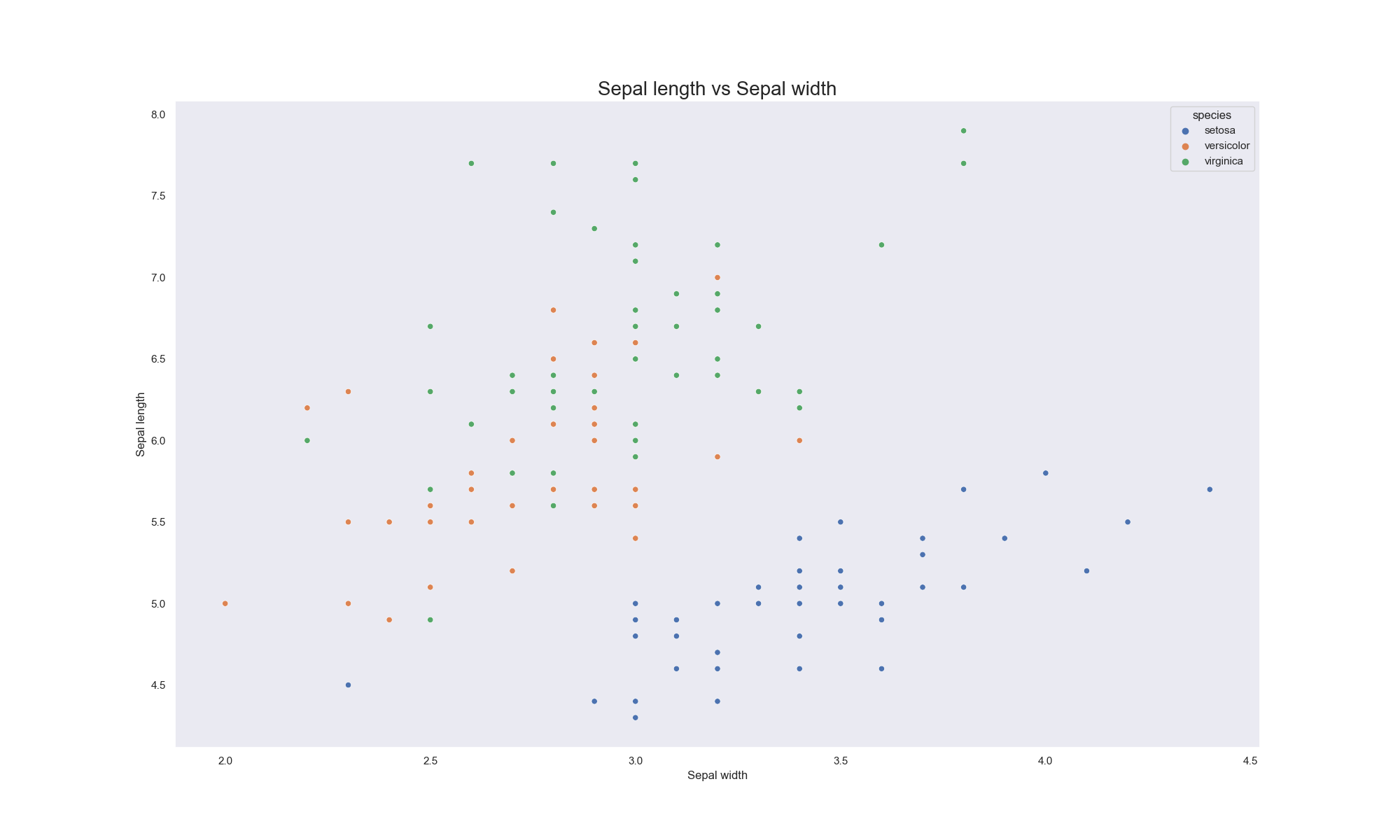
- 꽃받침 너비와 꽃받침 길이 간의 관계를 비교하는 산점도입니다.
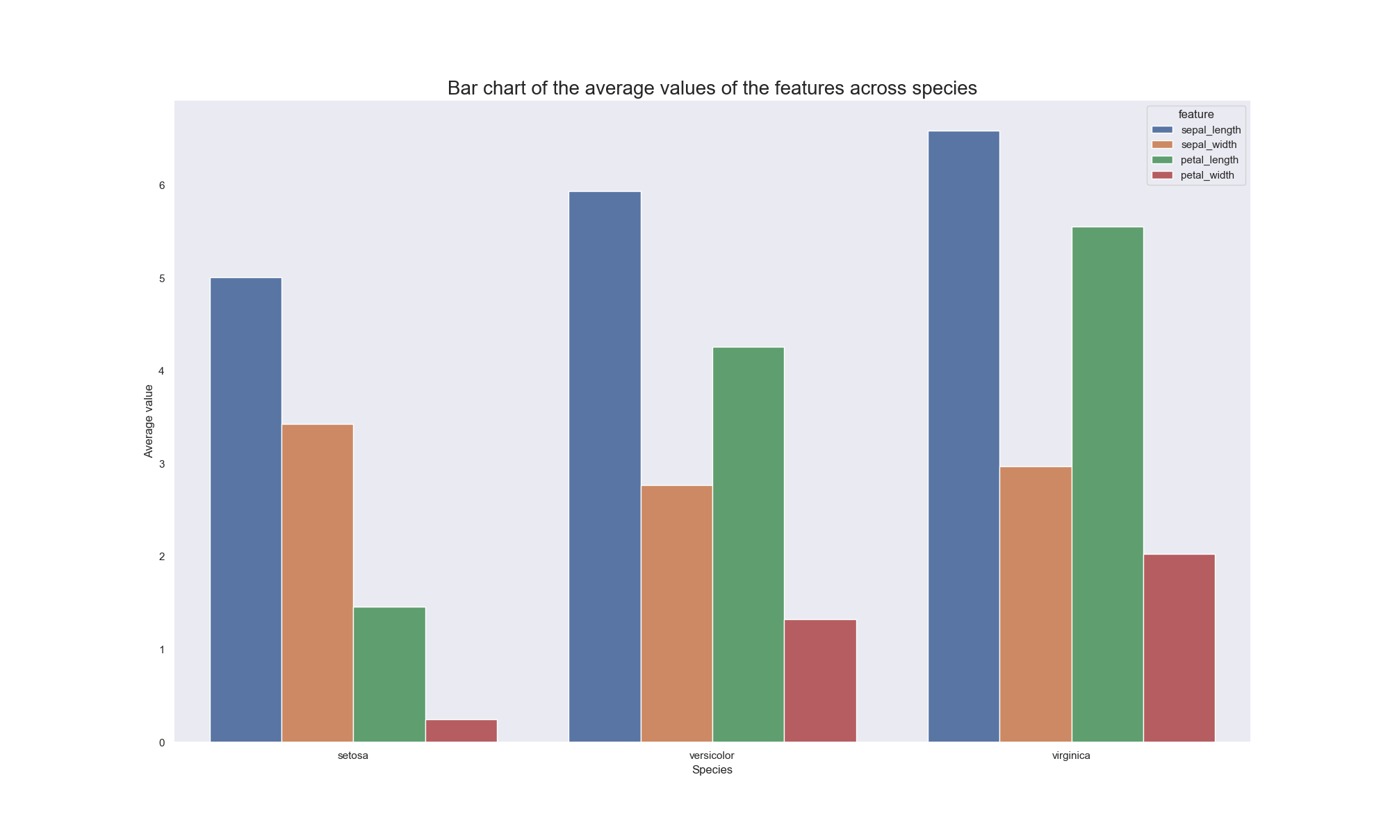
- 여러 종에 걸쳐 네 가지 변수의 평균 값을 비교하는 막대 차트입니다.
홍채 데이터 세트는 R-studio와 Jupyter 노트북 모두에서 기성품입니다.따라서 Tableau에서 사용하기 위해 쉽게 내보낼 수있었습니다.
Tableau
Tableau는 데이터 시각화를 가능한 한 쉽게 만들어주는 플랫폼입니다.Python 및 R에 비해 큰 장점은 데이터 세트를로드하거나 그래프를 생성하는 데 코드가 필요하지 않다는 사실입니다.끌어서 놓기 기능으로 인해 사용자는 변수를 조정하여 사용자에게 정보를 효과적으로 표시하는 차트를 작성할 수 있습니다.또한 차트를 아름답게하고 청중의 관심을 끌 수있는 다른 기능도 있습니다.
Tableau의 사용하기 쉬운 기능은 위의 비디오에서 확인할 수 있습니다.초보자를위한 Tableau 사용 기술을 습득하는 방법에 대한 가이드 역할을 할 수있는 책은 Ben Jones의Tableau와 데이터 통신 : 데이터 시각화 설계, 개발 및 제공.Tableau를 사용하여 작성된 다른 차트는 아래에서 볼 수 있습니다.
ggplot2
ggplot2는 R-studio에서 제공하는 놀라운 패키지입니다.Tableau와 달리 차트를 작성하려면 사용자가 패키지를 가져와야합니다.약간의 코딩이 필요하지만 코딩 구문은 매우 간단합니다.ggplot2로 간단한 차트를 작성하려면 두 가지 간단한 단계가 필요합니다.
첫 번째 단계는 tidyverse 패키지를로드하는 것입니다.ggplot2 패키지는 tidyverse 패키지에서 제공하는 많은 패키지 중 하나입니다.tidyverse 패키지를로드하면 사용자는 그래프를 디자인하는 동안 다른 패키지의 기능에 액세스 할 수 있습니다.tidyverse를로드하는 코드는 아래에서 볼 수 있습니다.
install.packages ( "tidyverse")
도서관 (tidyverse)
두 번째 단계는 코딩 구문을 사용하여 그래프를 생성하는 것입니다.코딩 구문은 아래에서 볼 수 있습니다.ggplot ()은 ggplot2 패키지를 호출하고 사용할 데이터를 식별합니다.geom_point ()는 점이있는 산점도가 원하는 그래프임을 나타냅니다.geom_point () 내에서 aes ()를 사용하면 x 및 y 축에 표시 할 변수를 쉽게 매핑 할 수있을뿐만 아니라 종에 따라 그룹화 할 수 있습니다.labs ()를 사용하여 그래프의 제목을 추가하고 x 및 y 축 모두에 레이블을 지정할 수 있습니다.theme_classic ()을 사용하여 테마를 클래식으로 설정하면 사용자가 테마 설정을 제어 할 수 있습니다.
사용자가 ggplot2를 통해 위에서 만든 것과 다른 차트를 그리는 데 관심이 있다면링크사용자를위한 가이드 역할을 할 수 있습니다.
ggplot (데이터 = df_iris) +
geom_point (aes (x = sepal_width, y = sepal_length, color = species)) +
labs (title = "Sepal 길이 vs Sepal 너비", x = "Sepal 너비", y = "Sepal 길이") +
theme_classic ()

Seaborn
Seaborn은 python에서 제공하는 패키지입니다.이는 그래프를 아름답게하기 위해 Python에서 제공하는 또 다른 데이터 시각화 패키지 인 matplotlib를 개선하는 역할을합니다.Seaborn은 사용자가 패키지를로드해야하고 원하는 플롯을 얻기 위해 코딩 구문을 사용한다는 점에서 ggplot2와 동일하게 작동합니다.다음은 seaborn 패키지 및 그래프를 쉽게 디자인 할 수있는 기타 유용한 패키지를로드하는 코드입니다.
seaborn을 sns로 가져옵니다.sns.set_theme (style = "dark")
% matplotlib 인라인
matplotlib.pyplot을 plt로 가져 오기
패키지를로드 한 후 다음 단계는 올바른 기능을 사용하여 차트를 그리는 것입니다.plt.figure ()를 사용하여 플롯의 크기를 결정할 수 있습니다.sns.barplot ()은 사용할 데이터 세트뿐 아니라 x 및 y 축에 배치 할 변수를받습니다.ggplot2와 마찬가지로 sns.barplot () 함수 내에서 플롯 모양에 대한 추가 변경이 이루어집니다.plt.title (), plt.xlabel () 및 plt.ylabel ()은 플롯에 레이블을 지정하는 데 사용됩니다.
사용자가 seaborn을 통해 위의 것과 다른 차트를 그리는 데 관심이 있다면링크사용자를위한 가이드 역할을 할 수 있습니다.
plt.figure (figsize = (20,12))
sns.barplot (x = "종", y = "숫자", 데이터 = n_iris2, 색상 = "특징", 팔레트 = "깊이")
plt.title ( "종별 특성의 평균 값에 대한 막대 차트", fontsize = 20)
plt.xlabel ( "종", fontsize = 12)
plt.ylabel ( "평균값", fontsize = 12)
Conclusion
위에서 설명한 세 가지 플랫폼은 모두 그래프를 디자인하고 구축하는 데 훌륭합니다.Tableau는 코딩에 관심이없는 사람이 차트를 쉽게 생성 할 수있는 좋은 방법입니다.ggplot2 및 seaborn은 사용자에게 그래프 모양을 제어 할 수있는 개방형 접근 방식을 제공하는 코딩 플랫폼입니다.데이터 시각화에 관해서는 상상력이 유일한 한계입니다.
다음은 데이터 시각화에 대한 권장 문서 목록입니다.
읽어 주셔서 감사합니다!
Using the right tools to visualize data
DATA VISUALIZATION
Using the right tools to visualize data
Tableau, ggplot2 & seaborn
When it comes to visualizing data, most people have a straightforward idea about what to do. They use scatterplots to display the relationships between two variables. Boxplots are used to compare the dispersion of distinct elements in a variable. Pie charts can be used to portray how different classes contribute as a whole to the variable. Time series plot can be used to display the progress made over time by someone or an organization.
Apart from having a solid idea of what chart to use, it is important to utilize a software package to create graphs and develop charts and there are multiple resources out there that can be used to make this possible. ggplot2 via R, seaborn via python, Tableau, PowerBI, MS Excel are among some of the famous platforms used to build charts.
This article will be focusing on the process it takes to build charts on three packages/platforms: Tableau, seaborn and ggplot2. The dataset that was utilized is the widely-used iris dataset. The iris dataset has five variables. Four of them are continuous variables: petal length, petal width, sepal length and sepal width. The last one is a categorical variable called species. It has three classes: setosa, virginica and versicolor.
By building the same charts across all three platforms, one can compare the quality of the charts and decide which one to use when working on data visualization projects. The two charts that were generated are:
- A scatterplot that compares the relationship between sepal width and sepal length.
- A bar chart that compares average values of the four variables across the different species.
The iris dataset is ready-made on both R-studio and Jupyter Notebooks. Therefore, it was easily exported for use on Tableau.
Tableau
Tableau is a platform that makes data visualization as easy as possible. Its huge advantage over python and R lies in the fact that it does not require code to load the dataset or to create graphs. Due to its drag and drop feature, it allows users to tinker around with the variables to build charts that effectively present information to its users. It also has other features that can be used to beautify charts and make them appealing to an audience.
Tableau’s easy-to-use ability can be witnessed in the video above. A book that can act as a guide for beginners on how to master the art of using Tableau is Ben Jones’ Communicating Data with Tableau: Designing, Developing, and Delivering Data Visualizations. Other charts that were built using Tableau can be viewed below.
ggplot2
ggplot2 is an amazing package that is provided by R-studio. Unlike Tableau, it requires its users to import a package to build charts. Although it requires some coding, the syntax for coding is quite straightforward. Building a simple chart with ggplot2 involves two easy steps.
The first step is to load the tidyverse package. The ggplot2 package is one of the many packages provided by the tidyverse package. By loading the tidyverse package, users would also have access to other package’s functionality while designing graphs. The code for loading tidyverse can be viewed below.
install.packages("tidyverse")
library(tidyverse)
The second step is to use the coding syntax to generate a graph. The coding syntax can be seen below. ggplot() invokes the ggplot2 package and identifies the data to be used. geom_point() signifies that a scatterplot with points is the desired graph. By using aes() within the geom_point(), it was easy to map out what variables should appear on the x and y axis as well as group them according to their species. The labs() can be used to add title for the graph and label both the x and y axis. Setting the theme to classic using theme_classic() makes it possible for the user to control the theme setting.
If a user is interested in plotting a chart different from the one created above via ggplot2, this link can act as a guide for the user.
ggplot(data = df_iris) +
  geom_point(aes(x = sepal_width, y = sepal_length, color = species)) +
  labs(title = "Sepal length vs Sepal width", x = "Sepal width", y = "Sepal length") +
  theme_classic()
Seaborn
Seaborn is a package that is provided by python. It acts as an improvement to matplotlib, another data visualization package provided by python, to beautify graphs. Seaborn functions just like ggplot2 in the sense that it requires its users to load a package and uses a coding syntax to obtain the desired plot. Below is the code for loading the seaborn package and other useful packages that will make it easy to design the graph.
import seaborn as sns; sns.set_theme(style = "dark")
%matplotlib inline
import matplotlib.pyplot as plt
After loading the packages, the next step is to use the right functionalities to plot a chart. plt.figure() can be used to decide the size of the plot. sns.barplot() takes in the variables to be placed on the x and y axis as well as the dataset to be used. Like ggplot2, further changes to the appearance of the plot are made inside the sns.barplot() function. plt.title(), plt.xlabel() and plt.ylabel() are used to label the plot.
If a user is interested in plotting a chart different from the one above via seaborn, this link can act as a guide for the user.
plt.figure(figsize = (20,12))
sns.barplot(x = "species", y = "number", data = n_iris2, hue = "feature", palette = "deep")
plt.title("Bar chart of the average values of the features across species", fontsize = 20)
plt.xlabel("Species", fontsize = 12)
plt.ylabel("Average value", fontsize = 12)
Conclusion
All three platforms discussed above are amazing for designing and building graphs. Tableau is a great way for someone who is not interested in coding to easily generate charts. ggplot2 and seaborn are coding platforms that provide users with an open-ended approach to control the appearance of their graphs. When it comes to data visualization, your imagination is your only limit.
Below is a list of recommended articles on data visualization:
- Tableau: Unleashing the Power of Visual Analytics
- How Data Visualization Works!
- Building bar charts using Matplotlib
- Creating a basic pie chart using Matplotlib
Thank you for reading!
2021년 2월 13일 모바일 게임 매출 순위
| Rank | Game | Publisher |
|---|---|---|
| 1 | 리니지M | NCSOFT |
| 2 | 리니지2M | NCSOFT |
| 3 | 그랑사가 | NPIXEL |
| 4 | 세븐나이츠2 | Netmarble |
| 5 | Cookie Run: Kingdom | Devsisters Corporation |
| 6 | 기적의 검 | 4399 KOREA |
| 7 | Genshin Impact | miHoYo Limited |
| 8 | R2M | Webzen Inc. |
| 9 | 라이즈 오브 킹덤즈 | LilithGames |
| 10 | V4 | NEXON Company |
| 11 | 바람의나라: 연 | NEXON Company |
| 12 | 메이플스토리M | NEXON Company |
| 13 | 뮤 아크엔젤 | Webzen Inc. |
| 14 | KartRider Rush+ | NEXON Company |
| 15 | S.O.S:스테이트 오브 서바이벌 | KingsGroup Holdings |
| 16 | 미르4 | Wemade Co., Ltd |
| 17 | 리니지2 레볼루션 | Netmarble |
| 18 | 블레이드&소울 레볼루션 | Netmarble |
| 19 | 어비스(ABYSS) | StairGames Inc. |
| 20 | Pmang Poker : Casino Royal | NEOWIZ corp |
| 21 | FIFA ONLINE 4 M by EA SPORTS™ | NEXON Company |
| 22 | 찐삼국 | ICEBIRD GAMES |
| 23 | Roblox | Roblox Corporation |
| 24 | 컴투스프로야구2021 | Com2uS |
| 25 | PUBG MOBILE | KRAFTON, Inc. |
| 26 | Brawl Stars | Supercell |
| 27 | 카운터사이드 | NEXON Company |
| 28 | 한게임 포커 | NHN BIGFOOT |
| 29 | 검은강호2: 이터널 소울 | 9SplayDeveloper |
| 30 | A3: 스틸얼라이브 | Netmarble |
| 31 | Cookie Run: OvenBreak – Endless Running Platformer | Devsisters Corporation |
| 32 | AFK 아레나 | LilithGames |
| 33 | 그랑삼국 | YOUZU(SINGAPORE)PTE.LTD. |
| 34 | Lords Mobile: Kingdom Wars | IGG.COM |
| 35 | Age of Z Origins | Camel Games Limited |
| 36 | 블리치: 만해의 길 | DAMO NETWORK LIMITED |
| 37 | Gardenscapes | Playrix |
| 38 | 라그나로크 오리진 | GRAVITY Co., Ltd. |
| 39 | Dungeon Knight: 3D Idle RPG | mobirix |
| 40 | Homescapes | Playrix |
| 41 | Random Dice: PvP Defense | 111% |
| 42 | Empires & Puzzles: Epic Match 3 | Small Giant Games |
| 43 | Top War: Battle Game | Topwar Studio |
| 44 | Summoners War | Com2uS |
| 45 | 한게임포커 클래식 with PC | NHN Corp. |
| 46 | 명일방주 | Yostar Limited. |
| 47 | 검은사막 모바일 | PEARL ABYSS |
| 48 | 갑부: 장사의 시대 | BLANCOZONE NETWORK KOREA |
| 49 | FIFA Mobile | NEXON Company |
| 50 | 모두의마블 | Netmarble |